A hospitality logo that needed to read from the pavement
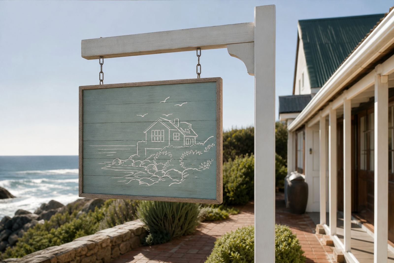
The client was a hospitality business in Sea Point, Cape Town, looking to replace a worn sign face with something sharper and easier to fabricate. The original logo had fine strokes and small details that looked neat on screen but would not reproduce well on a large exterior sign, especially once cut, printed, or mounted against textured material. Coastal light, salt air, and day to night viewing all mattered here, so the mark needed to stay clear in real-world conditions.
The brief was straightforward in theory but detailed in practice. Keep the brand shape recognisable, strengthen the line weight, tidy the proportions, and prepare files that would suit signage production. The client needed a version that could work for exterior panels, vinyl output, and future print use too. We were asked to keep the redrawn artwork true to the source while making it more practical for fabrication.
- Project location: Sea Point, Cape Town
- Use case: exterior hospitality signage
- Artwork type: logo redraw for production
- Main concern: thin details that would disappear at scale
Why a redraw worked better than simple bitmap tracing
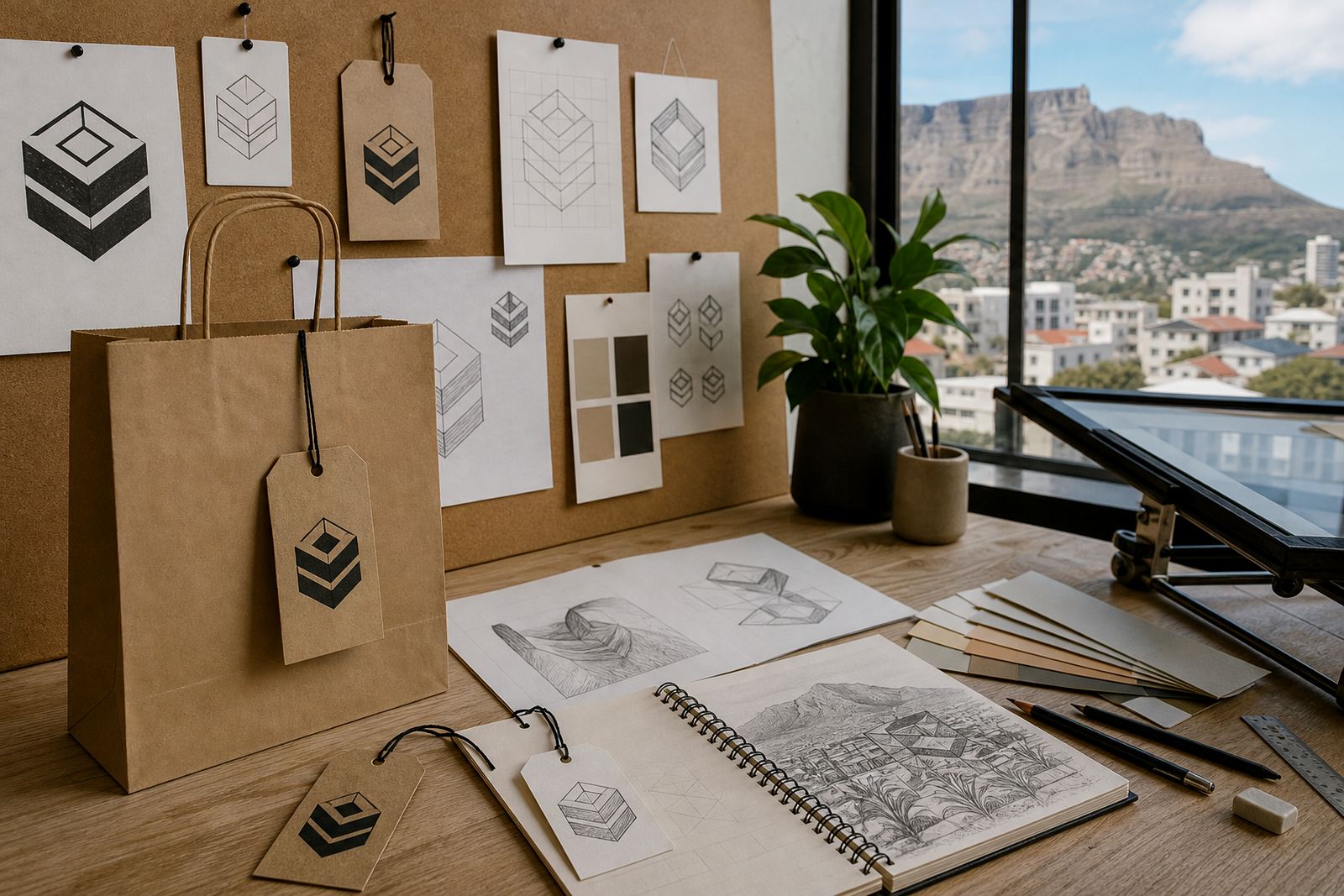
For this job, a quick bitmap trace would have copied the imperfections in the supplied artwork and left the sign maker with awkward corners and uneven curves. Bitmap tracing can be useful in some cases, but when a logo is going on a sign board, vehicle panel, menu header, or printed fascia, a proper redraw usually gives a cleaner result. We rebuilt the mark by hand as vector artwork so every curve, angle, and spacing decision could be controlled properly.
That approach let us thicken key strokes without making the logo look heavy, and we could simplify tiny details that would get lost once the artwork was scaled up. It also meant the final files could be adapted for different production methods without losing shape or sharpness. For hospitality work near the coast, that kind of control matters because exposure and weather can make weak artwork look rough quickly.
- We used hand redraw methods rather than relying only on automated tracing
- Fine details were simplified where needed for signage clarity
- The final artwork was built as clean vector paths for scaling
What we supplied for sign production
Once the redraw was approved, we supplied production-ready vector files in the formats most sign shops and print teams expect, including SVG, EPS, PDF and AI. That gives the client flexibility whether the sign is being routed, cut from vinyl, printed on aluminium composite, or prepared for another outdoor application. We also checked that the line weights stayed even and that the artwork would not break apart when enlarged.
Because the client intended to use the logo for exterior display, we kept the geometry disciplined and avoided tiny closed spaces that could trap dirt or disappear at distance. The layout was prepared with practical fabrication in mind, not just appearance on a screen. We also made sure the artwork could be shared easily between the client, designer, and sign maker without extra rework.
- SVG for web and flexible digital use
- EPS and AI for professional editing and production
- PDF for review, approvals, and print handover
Production constraints we had to solve
The biggest constraint was legibility. Exterior signage has to work from across the road, in bright sun, and after dark when only ambient lighting is available. In Sea Point that often means a mix of sea air, glare, and strong pedestrian traffic, so the sign needs to read fast. The original linework was too delicate for that environment, and the client wanted the logo to feel consistent whether viewed on a small mock-up or at full size on the building.
There was also the practical matter of ownership. We only redraw artwork supplied by clients who own it or have the rights to use it, because signage and brand artwork need to be legally clean before production. In this case the client had the correct permission to proceed, so we could move from source file to finished vector redraw without delay. That keeps the process straightforward for everyone involved, especially when a sign is already booked into a fabrication schedule.
- Improved legibility for distance viewing
- Adjusted stroke weight for outdoor production
- Prepared artwork for use across print and signage applications
Timeline and working process over two weeks
The project ran over two weeks from intake to final file handover. In the first stage we reviewed the source artwork, checked the usable elements, and identified which details needed to be redrawn from scratch. After that we mapped the logo as vector paths, refined the curves, and tested how the thicker linework behaved at different sizes. A proof was then sent for comment, with one round of practical adjustments focused on balance and readability.
By the end of the process the client had a cleaner mark that was ready for sign manufacture and general brand use. Nothing about the work was flashy, but it was solid, clean, and easy to hand over to a fabricator. That is usually what matters most when the logo is going onto a building, because the sign needs to be right the first time. There is no room for guesswork once cutting starts.
- Week 1: review, redraw, and vector build
- Week 2: refinements, proofing, and final file delivery
- Final output: production-ready artwork for signage use
What changed after the redraw
The finished artwork looked much stronger at sign size. Thin strokes were given more body, the spacing between shapes was corrected, and the overall mark became easier to reproduce across different materials. That means the hospitality business now has a logo that can be used on exterior signage, printed collateral, and future illustration work without needing to start over each time. It also reduces the risk of a sign shop making ad hoc fixes that change the brand.
For us, the best result is when the client can move forward without worrying about file problems. If this project needed another update later, we would approach it the same way again: start with the source rights, redraw the mark by hand, confirm the production constraints, and supply a full vector set that can stand up in real use. That method works well for businesses across South Africa, especially when the artwork has to perform in coastal humidity, strong sun, or night-time street conditions.
- Clearer artwork for exterior use
- Better consistency across print and signage
- Less risk of scaling issues during fabrication
Key facts
| Project | Sea Point Signage |
|---|---|
| Client type | Hospitality business |
| Location | Sea Point, Cape Town |
| Service | Hand-redrawn logo vectorisation for exterior signage |
| File formats supplied | SVG, EPS, PDF, AI |
| Timeline | 2 weeks |