When a startup needs a cleaner logo from day one
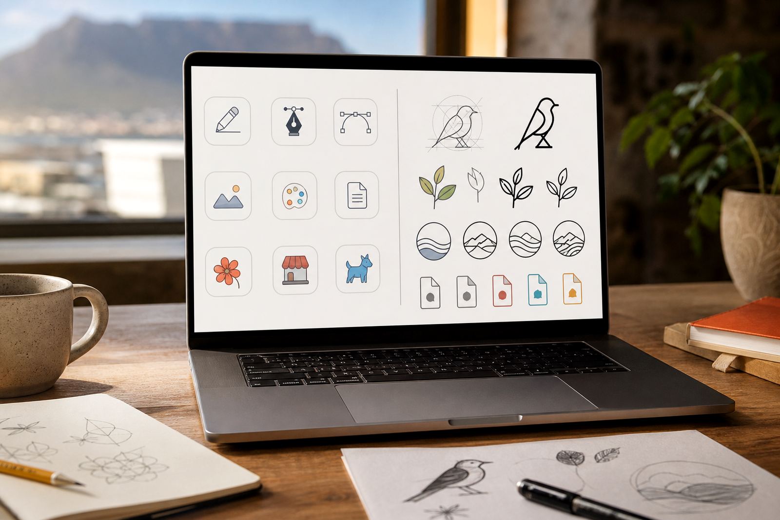
Most new businesses start with something practical rather than polished. It might be a logo drawn in a notebook, a rough PNG sent on WhatsApp, or a mark that was made quickly so the business could launch and get trading. For startups, the main job is to turn that first idea into artwork that can be sized properly and used without fuzziness. That is where vector redrawing helps.
We work with startups in Cape Town, Johannesburg, Durban, Pretoria and Bloemfontein who need artwork that can move from social media to invoices, packaging and shop signage without losing quality. A clean redraw gives you a proper file set, so the same logo can be used on a small sticker or a large fascia board. It also helps if you need to send artwork to a printer, sign maker or clothing supplier, because they usually need clean vector files rather than a low-res image.
For early-stage businesses, this is often more useful than waiting until everything is perfect. You can trade with a professional-looking mark now, then refine the visual system later as the brand grows.
Bitmap tracing or hand redraw, and when each one suits
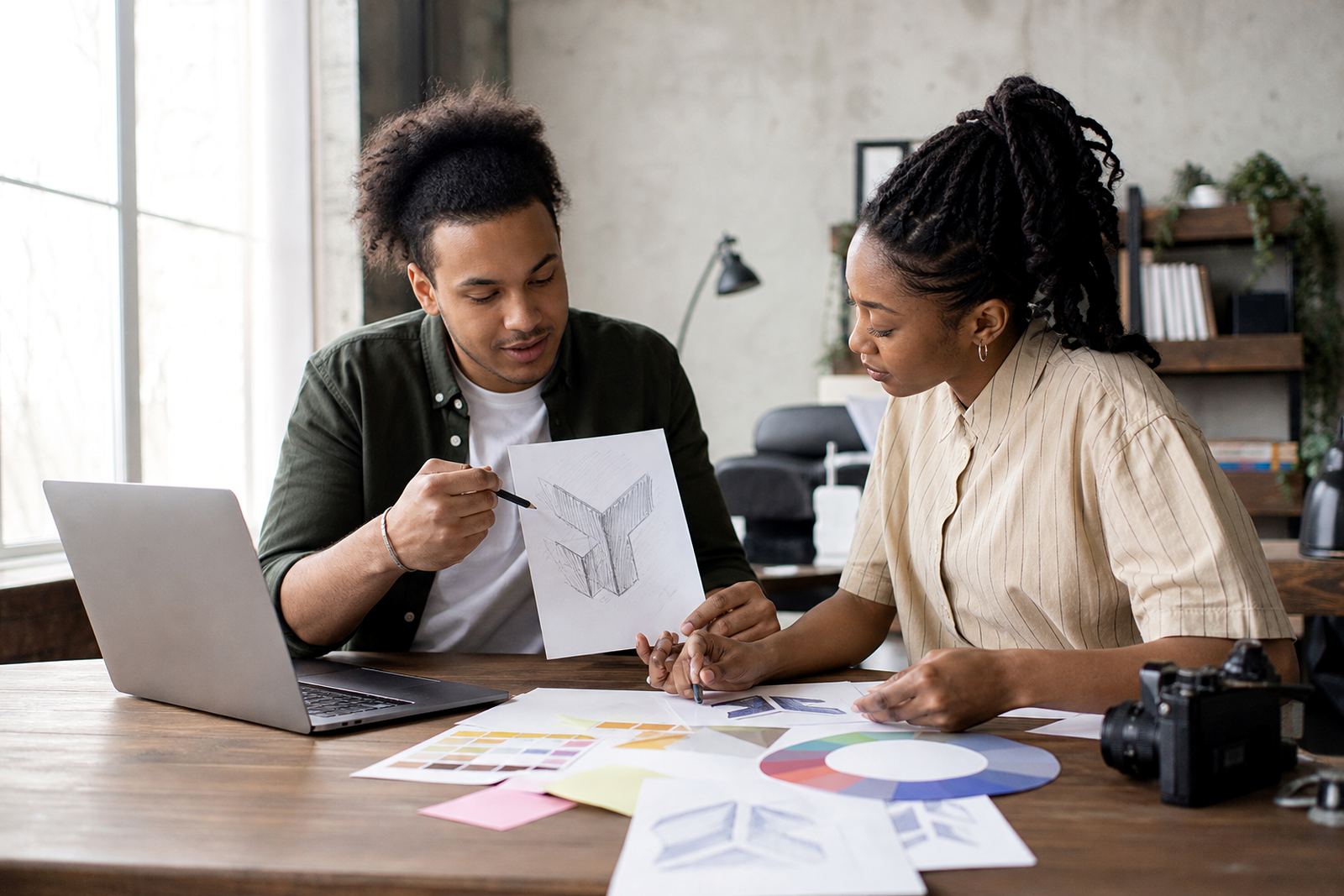
Not every logo needs the same treatment. Sometimes bitmap tracing is the right starting point, especially if the source artwork is already neat and has clear edges. Other times a hand redraw is better, particularly when the original has wobble, poor proportions or details that wont hold up at larger sizes. A hand redraw lets the artist rebuild the shape carefully rather than following every flaw in the source file.
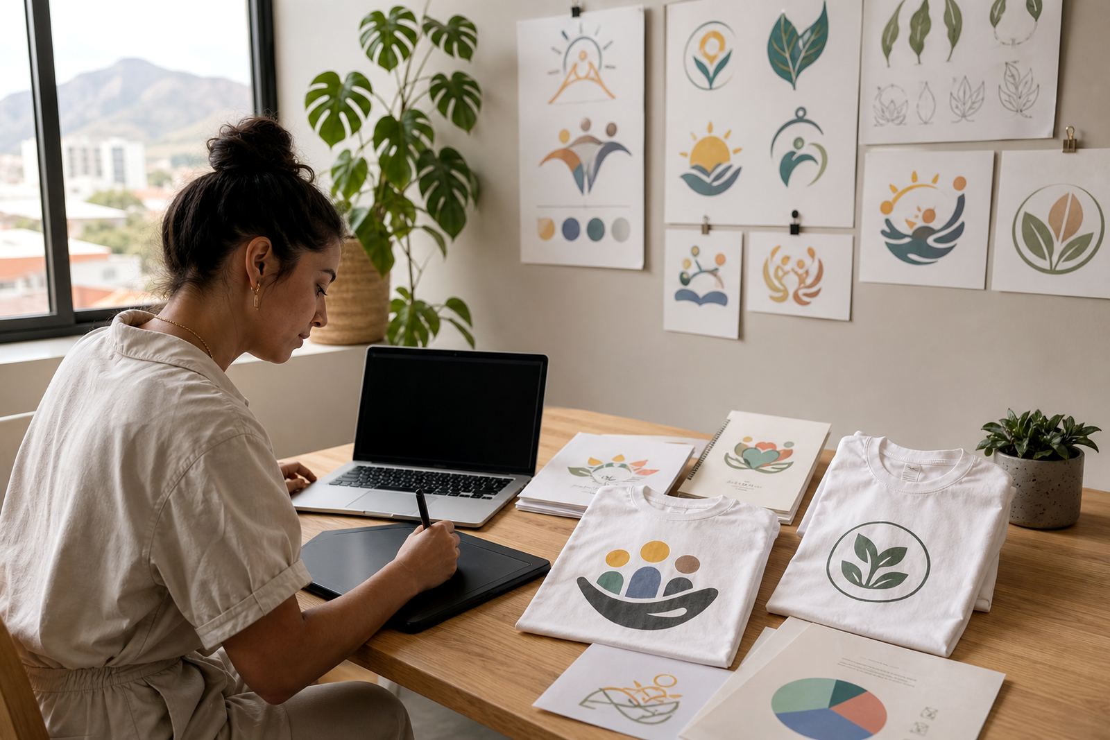
For startups, the choice often comes down to how the logo was first created and what you need it for. If you have a sharp image but only in a raster format, tracing can help convert it into a scalable vector. If the logo is rough, uneven or difficult to reproduce, a manual redraw is usually the better option. We also handle illustration work where the final result is more than a logo, such as mascot art, icons or a simple badge for packaging.
- Use tracing for clear artwork with solid edges and simple shapes
- Use hand redraw for uneven logos, sketch concepts or damaged artwork
- Ask for illustration if the brand needs a custom character, scene or symbol
- Keep the source file handy, even if it is only a phone photo or scan
What file formats a startup should ask for
Startups often need more than one file type from the same job. A printer may ask for a PDF, a sign maker may prefer EPS, and digital teams may need SVG. If you plan to work with different suppliers, it helps to have the full set ready from the start. We can provide vector artwork in SVG, EPS, PDF and AI formats, depending on how the files will be used.
Here is the practical way to think about it. SVG is useful for websites and digital use. EPS is commonly used in print and production. PDF is easy to send, preview and archive. AI is the editable working file for future changes. When a startup has all four, it makes life simpler when a supplier needs a different format for a job. It also helps avoid rushed redraws later when the brand starts growing.
One important note is rights. Customers must own the artwork they send us or have permission to use it. If the source material belongs to a former designer, photographer or another business, it should be cleared before redrawing begins. That saves time and avoids problems down the line, especially when a brand is ready to register, print or licence its materials.
Planning the layout before the first file goes out
A startup often thinks first about the logo itself, but layout matters just as much. Before final artwork is sent to printers or sign makers, it helps to decide how the logo will sit on a square social profile, a narrow label, a letterhead or a long shopfront panel. A design that works in one shape may need alternate versions for different uses.
We usually advise new businesses to think in terms of a small system, not one single logo. That can include a full logo, a stacked version, an icon, and a one-colour version for stamps or embossing. If the business trades in busy environments such as markets, delivery fleets or coastal areas with strong sun and humidity, simpler versions tend to hold up better. Coastal moisture in places like Cape Town and Durban can be hard on signage, so fewer tiny details often means better long-term legibility.
- Ask for horizontal and stacked versions
- Keep fine lines thick enough for small print and vinyl cutting
- Choose colours that work in both full colour and one-colour use
- Test the logo at very small sizes before approving it
Common mistakes startups make with early artwork
Many new businesses rush the artwork stage and end up paying twice. A common mistake is sending a low-resolution image and expecting it to scale up perfectly. Another is asking for a detailed illustration when the logo really needs simpler shapes for print, embroidery or cut vinyl. Tiny details, gradients and thin strokes can disappear or look messy once production begins.
Another issue is using different versions of the same logo across socials, brochures and product labels. That makes the business look unsettled. It is better to settle on one clean master file set and then adapt it carefully for each use. Startups also forget to keep an editable source file, which can be a problem if someone later needs to change a phone number, colour or layout. Saving the correct files now prevents a lot of back and forth later.
If your brand is still evolving, it is often better to start with a clean and practical version than a highly complex mark that is difficult to reproduce. A good logo should work on a business card, on a delivery label and on a truck door without fuss.
Budget ranges that make sense for a new business
Startup budgets are usually tight, so the right approach is to match the artwork to the stage of the business. A simple redraw of an existing mark will generally cost less than a full custom illustration or a logo that needs several layout versions. If the project includes multiple elements, such as an icon, badge, mascot or pattern, the scope will grow with each extra asset.
For planning purposes, many new businesses set aside a modest working budget for the first clean redraw, then keep a second amount available for extra artwork once the brand starts trading. If you are opening in a mall, on a busy street, or from a home office with a limited print run, it helps to prioritise the files that will be used first. A startup that needs only a basic redraw and standard file pack will spend less than one that needs full illustration, social graphics and packaging artwork at launch. It is also wise to leave room for revisions, because the final version often changes a little after the first review.
As a guide, think in stages rather than one large spend. Many startups begin with a smaller redraw budget and then add illustration, menu artwork, sticker artwork or packaging elements as the business grows. That keeps the work manageable and stops the brand from feeling stretched too thin too early.
Working with a South African studio that understands small business pressure
Based in Observatory, Cape Town, we work with startups across South Africa and know how quickly a new business needs to move. Our team has helped early-stage brands turn rough ideas into usable vector artwork for print, signage and digital use. The process is straightforward: send through the source artwork, explain where it will be used, and tell us what file types you need. From there, we shape the redraw or illustration around those requirements.
Our team includes Luyanda Mthembu, Ayesha Mafokeng, Pieter Skosana, Zanele Kajee, Teboho Molefe and Megan Khoza. That mix helps with redraws, illustration, prepress and final checks, which is useful when a startup needs artwork that must be ready for several suppliers at once. Clients reach us through the enquiry form on our contact page, and we work with businesses in Cape Town, Johannesburg, Durban, Pretoria, Bloemfontein, Port Elizabeth, Stellenbosch and Paarl.
For a new business, the aim is simple: get clear, usable files that can carry the brand through launch, early trading and the next round of growth. Clean artwork saves time, and it keeps the business looking sorted from the start.