Matching icon sets drawn for real brand use
Custom brand icons are useful when your business needs more than a single logo mark. You may need a set for your website, product ranges, menu boards, packaging sleeves, folders, wayfinding, or social posts. We create icons that belong together visually, so they feel like part of the same family rather than a mix of random symbols.
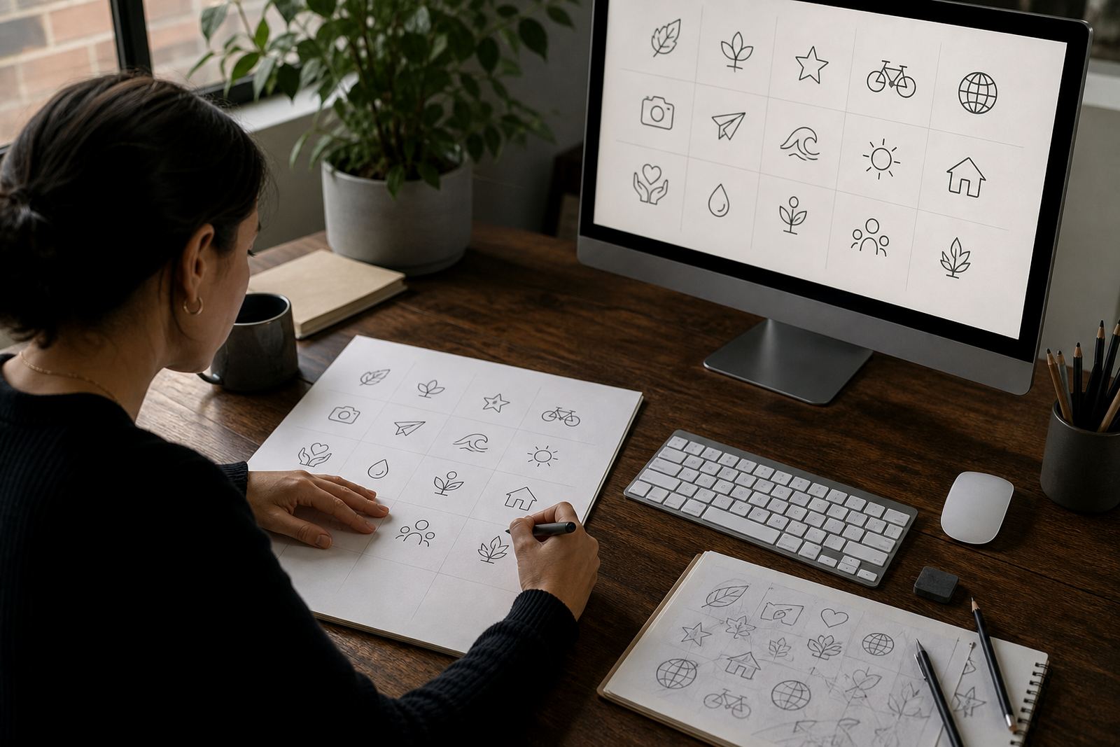
Each icon is drawn as vector artwork, which means it can be scaled from a small favicon to a large print panel without getting blocky. We keep the style consistent across the set, with the same line weight, corner treatment, spacing and level of detail. That matters when the icons are used on a Cape Town product label one day and a Johannesburg trade presentation the next.
- Simple outline icons
- Filled or solid icons
- Line icons with single-weight strokes
- Mixed sets for menus, labels and digital use
- One-off hero icons for campaigns or packaging
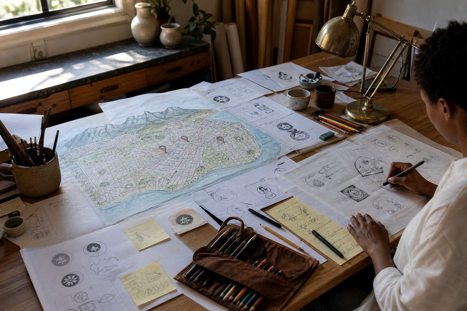
If you already have a logo or brand guide, we work from that so the icon set matches your existing colours and shape language. If you only have rough sketches or reference images, we can translate those into a usable vector set, provided you own the rights to the source artwork or have permission to use it.
How we redraw, trace or illustrate your icons
There is a difference between bitmap tracing and a hand redraw. Tracing starts with a raster image, such as a JPG or PNG, and converts it into vector paths. That can work for simple shapes, but it often keeps unwanted bumps, awkward corners and extra points from the original image. A hand redraw gives us more control, so we can clean up the form, balance the curves and make the icon sharper for professional use.
For some jobs, we trace a basic structure and then refine it by hand. For others, especially where the icon must feel original or the source is poor quality, we redraw it from scratch. If a business in Durban sends an old low-resolution logo snapshot from a scanned letterhead, the result is usually much better when we reconstruct the artwork rather than just following the pixels.
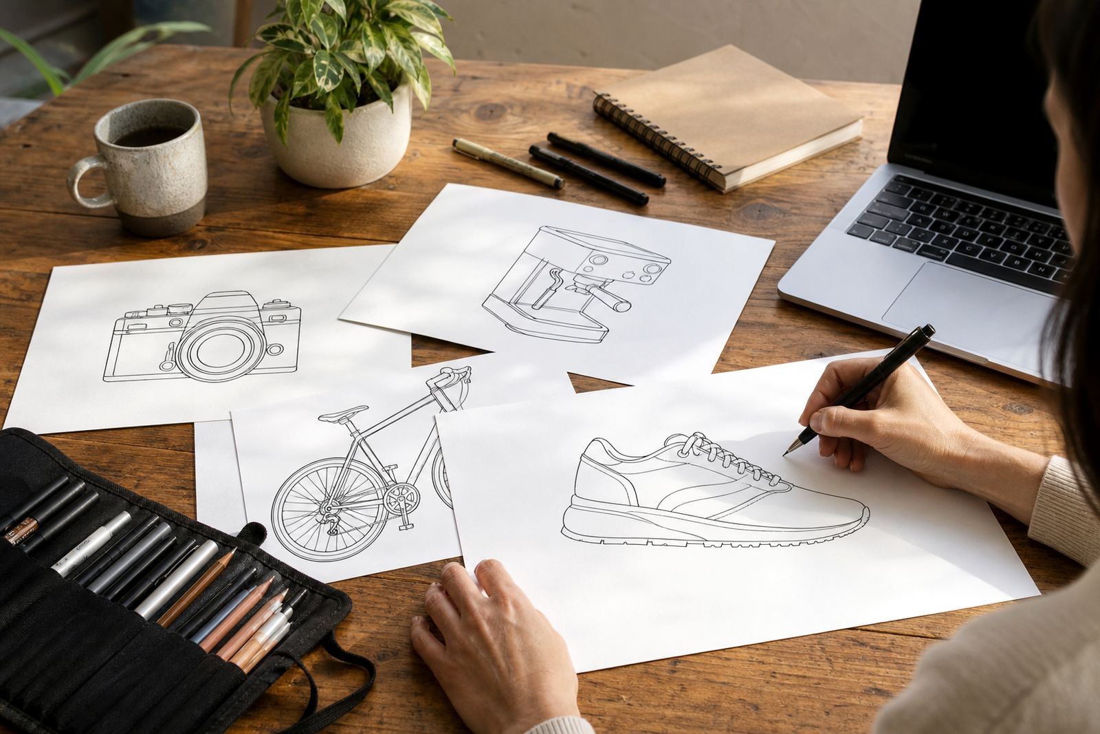
We also create hand-drawn illustrations where an icon needs a more personal touch. That might include a custom brewery glass, a retail symbol, a local landmark, or a product-related image. The aim is not to overwork it. It should be practical, easy to recognise and ready for daily use.
- Bitmap tracing for simple, clean source artwork
- Manual redraw for cleaner geometry and stronger curves
- Original illustration when the icon needs a custom look
- Consistent spacing and stroke control across the full set
What you get in the final icon package
We supply icons in vector file formats commonly used by designers, print shops and sign makers. That usually includes SVG, EPS, PDF and AI, depending on what you need. SVG is handy for web and app use. EPS and PDF are useful for printers, packaging suppliers and large-format work. AI is useful when your designer needs editable source files for future adjustments.
Your delivery is prepared so the artwork is practical in the real world. If the icons are going onto corrugated packaging, a restaurant menu, a municipal tender document or a vinyl decal, we set them up for that use.
- Editable vector master files
- Web-ready SVG exports
- Print-ready PDF and EPS files
- Source AI file where requested
- Single colour and reversed versions
- Basic usage notes for placing the icons correctly
When needed, we can include thin- and thick-line variants for small and large applications. That is useful for busy packaging or small digital spaces where fine detail can disappear. We make sure the set reads clearly at the sizes you plan to use, not just on a big screen in the office.
From brief to approved set, step by step
The process starts with your brief and source material. Tell us what the icons must represent, where they will be used, and whether you want them to match an existing logo or brand system. If you have references, sketches, old artwork or a style guide, send those through the enquiry form on our contact page. We only work with artwork that you own or are authorised to use.
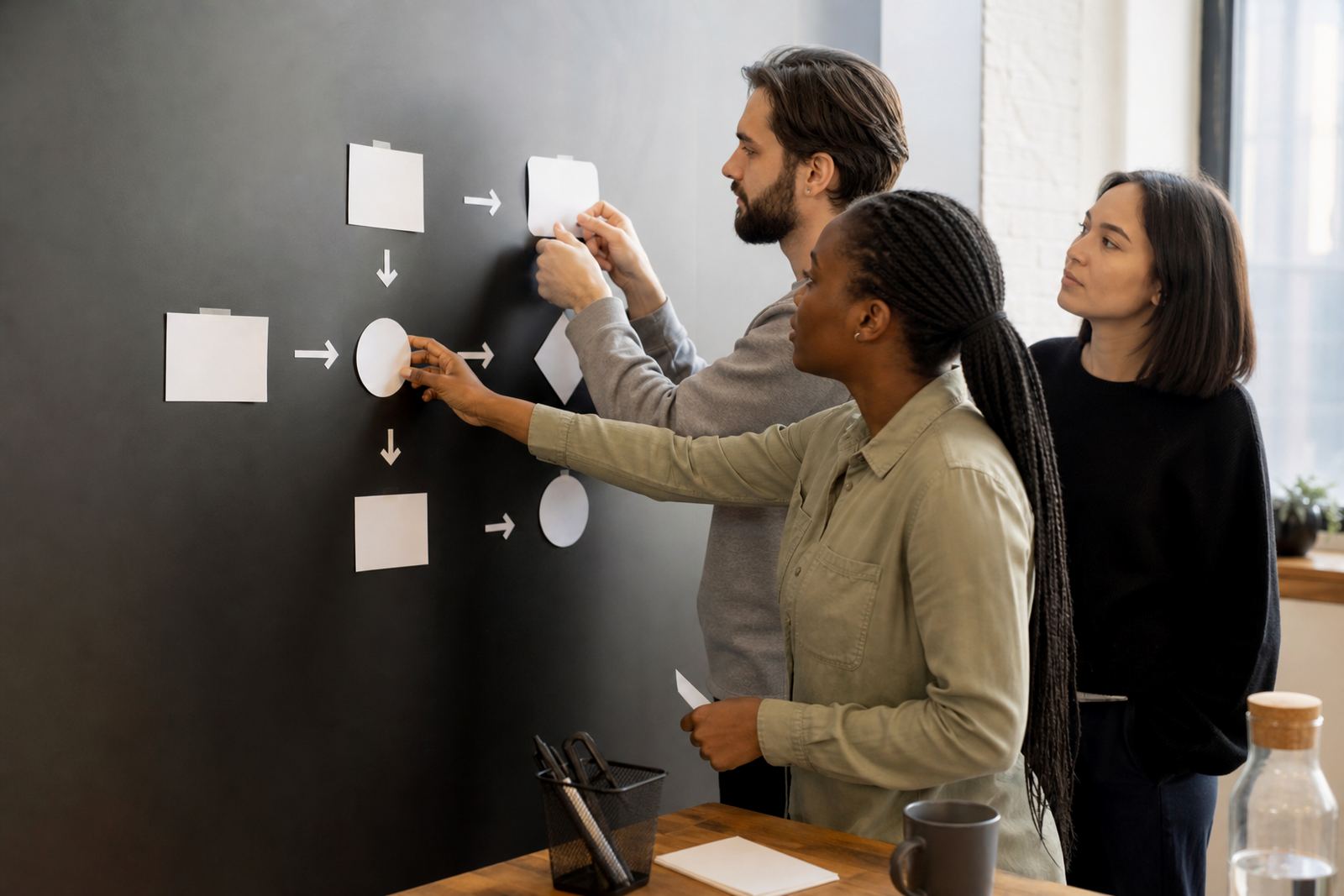
After that we map the style direction and propose the visual approach. Then we draw the first versions, check proportions, and refine the set until the icons work as a group. For businesses with branches in Stellenbosch, Paarl or Port Elizabeth, this also helps keep regional materials looking consistent across different teams and suppliers.
- Brief and rights check
- Style direction and reference review
- Initial vector redraw or illustration
- Revision round for shape, spacing and line weight
- Final export in the agreed file formats
Where the artwork is complex, we may split the work into batches so you can review the most important icons first. That makes sign-off easier and avoids surprises later. It also gives room to adjust details before the whole set is finalised.
Pricing that depends on scope, not guesswork
Pricing for custom brand icons depends on how many icons are needed, how detailed they are, whether they must be redrawn from poor source material, and how many file formats are required. A simple set of clean outline symbols takes less time than a custom illustration suite with multiple objects, perspective details and hand-finished curves.
We quote after reviewing the brief, the artwork supplied and the intended use. If you only need a few icons for a small business website, that will be different from a full packaging range or a multi-department corporate icon system. We keep the pricing approach clear so you know what is included before the work starts. No guesswork, no extras hidden in the fine print.
For ongoing brands, we can also update or extend an existing set later on. That is useful when a product line grows, a menu changes, or a business opens new branches and needs additional symbols in the same style.
- Number of icons required
- Level of redraw or illustration detail
- File formats and export variations
- Revisions needed before approval
- Ongoing additions to the same icon system
Keeping the set current as your brand grows
Icon systems work best when they are maintained, not left to drift over time. If a brand expands, the visual language should stay consistent. That might mean adding new icons for services, refreshing an old stroke weight, or preparing alternate versions for dark mode, print labels or signage. We can revisit the set at sensible intervals so the artwork does not go stale or uneven.
For many businesses, a review once or twice a year is enough, especially if the brand changes with seasons, promotions or product launches. If your team is using the icons across multiple branches, it helps to keep one approved source file and avoid local edits that can lead to mismatched shapes. That small bit of control saves plenty of headaches later.
Because vector files remain editable, maintenance is usually straightforward. You do not need to start from zero every time a new use case comes up. We can adjust colours, add missing items, or prepare a fresh export set for a new supplier or print run, without rebuilding the whole system.
Key facts
| Service type | Custom brand icon sets, redraws and hand-drawn vector illustrations |
|---|---|
| File formats | SVG, EPS, PDF and AI |
| Artwork method | Bitmap tracing, manual vector redraw or original illustration |
| Best for | Websites, print pieces, packaging, menus, labels and social graphics |
| Location | Observatory, Cape Town, serving businesses across South Africa |
| Source rights | Client must own or have permission to use all artwork supplied |