What the Claremont label project needed
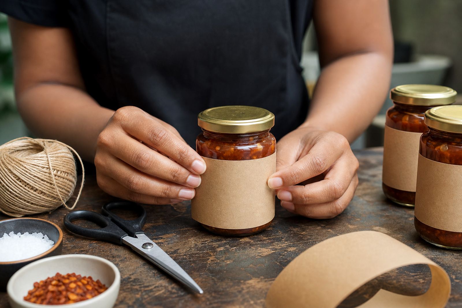
The client was a packaged food business in Claremont that was updating its label range for retail shelves and direct sales. The artwork they had was usable, but not ideal for print: the logo had soft edges, the illustration carried uneven line weights, and a few details would have broken up once reduced to label size. On small packs, that can mean muddy outlines, weak text reading, and inconsistent colour blocks.
Our brief was to clean up the logo, redraw the artwork as proper vector files, and keep the familiar look that customers already associated with the product. The labels had to work across different pack sizes, and the artwork needed to stay clear in both full colour and one-colour use. Because food packaging is tightly regulated, we also had to keep clear space for mandatory wording, barcodes, ingredients and batch details, so the illustration could not crowd the label.
- Client type: packaged food brand
- Location: Claremont, Cape Town
- Use case: retail labels and small-format packaging
- Main need: logo refinement and illustration redraw
Why we did not trace the artwork only
For this project we did not rely on simple bitmap tracing alone. Tracing can be useful when the source image is very clean, but it often follows every wobble and compression artefact in the file. When a logo has been scanned, screen-grabbed or exported too many times, tracing can leave you with jagged corners, lumpy curves and nodes that are harder to manage later. That is fine for a quick fix, but not when the label has to print cleanly at a few different sizes.
Instead, we redrew the logo by hand and rebuilt the illustration as vector artwork. That gave us better control over curves, joins and line thickness, and it let us simplify a few small areas that were causing clutter at label size. The result was a cleaner mark that still felt like the original, just more precise and easier to use across print, digital and packaging layouts.
- Bitmap tracing works best for simple, clean source files
- Hand redraw is better when shapes need control and consistency
- Vector artwork scales without losing edge sharpness
- Smaller labels need fewer tiny details, not more
How we rebuilt the logo and illustration
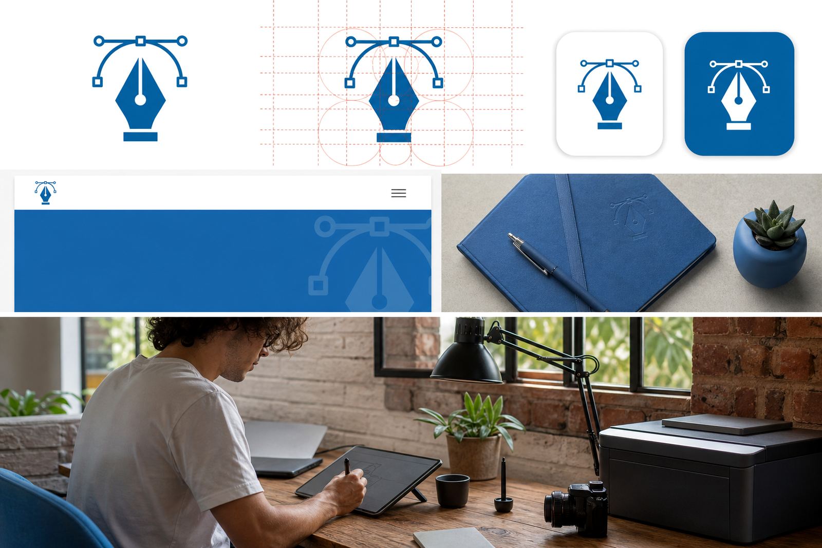
The work started with a careful review of the supplied files and a check of which elements were essential to keep. We then redrew the logo geometry, matched the spacing and cleaned up the line work so that the mark would print clearly on both coated and matt label stock. In the illustration, we simplified unnecessary texture, tightened the outlines and separated the artwork into clean editable layers. That made it easier for the client’s packaging team to place the files into new label layouts later on.
We supplied the artwork in common vector file formats used for packaging and print production: SVG, EPS, PDF and AI. Those formats give printers and designers the flexibility to scale, edit and output the files without the quality loss you get from low-resolution images. We also made sure the artwork would behave well in typical South African print conditions, where a label may need to work across several suppliers and press setups.
- Logo redraw for cleaner edges and stronger legibility
- Illustration rebuilt as editable vector layers
- Delivered in SVG, EPS, PDF and AI
- Prepared for label print, packaging mockups and future resizing
Project constraints that shaped the final artwork
Food labels bring their own set of limits. There is often very little room to work with, and every millimetre matters. The illustration needed to sit beside ingredients, barcode space, nutrition details and statutory copy without making the pack feel crowded. The client also wanted a label that still looked like their brand, so we could not overwork the artwork or replace it with something too decorative. It had to stay familiar, just tighter and more practical.
We kept the palette controlled, reduced fine detail where it would disappear in print, and checked the line thickness at small sizes. That included making sure the brand mark remained readable when reduced for a 150 ml pack as well as a larger family size pack. The artwork also had to be rights-clean. The client confirmed they owned the original logo and illustration rights, or had permission to use the material supplied, before we handled the redraw. That step is important and often overlooked.
- Limited label space and mandatory product information
- Artwork had to suit multiple pack sizes
- Fine detail was reduced for print clarity
- Client confirmed rights to the source material
Timeline and working stages over two weeks
The project ran over two weeks, with the first week focused on review, redraw and layout decisions, and the second week on refinements and file preparation. We usually work in stages like this for packaging jobs because it allows the client to check practical details before the files go out for print. It also keeps small production issues from becoming expensive press corrections later on.
In week one, we mapped the logo structure and reworked the illustration into clean vectors. In week two, we checked line consistency, spacing, export settings and print readiness. The client reviewed the final artwork and asked for a few small adjustments to label balance, which we handled before release. That back-and-forth was straightforward and helped lock in a cleaner final result. No drama, just the usual packaging checks.
- Week 1: source review and hand redraw
- Week 1: vector rebuild and artwork simplification
- Week 2: refinements, proof checks and export
- Week 2: final file delivery for label production
What changed on the shelf after the redraw
Once the redrawn artwork was placed into the label system, the brand looked more settled and easier to read. The logo held its shape better at small sizes, and the illustration stopped fighting with the product information. That made the pack feel more intentional on shelf, especially when viewed from a distance in a busy retail setting. The client could also reuse the files for new pack sizes without starting over each time.
Just as important, the artwork became simpler to manage for printers and designers. With clear vector files in place, the client had a cleaner base for future label updates, seasonal variants and other packaging runs. If we were doing the same job again, we would follow the same process: start with rights confirmation, redraw the key elements by hand, simplify what does not carry at small size, then deliver properly prepared vector files for print.
- Cleaner shelf presence and better small-size legibility
- Less clutter around mandatory label information
- Reusable artwork for future pack changes
- Better handover to printers and packaging teams
Best-fit follow-up work for food brands
This project sits well alongside other packaging and branding work we do for South African businesses. For food brands, the most useful follow-up jobs are usually related to consistency across labels and support artwork for marketing material. Once the main logo redraw is in place, it is much easier to build matching assets that carry the same line quality and spacing across a range of products.
That can include product icons, simple badge marks, menu-style artwork for deli ranges, pattern work for sleeves or cartons, and illustration sets for social media. We also handle print-focused files for stickers, infographics, maps and scene illustrations when a brand needs more than a single logo. For clients in Cape Town, Johannesburg, Durban, Pretoria, Bloemfontein and beyond, the point is the same: keep the artwork clear, keep the files usable, and make sure the brand stays consistent from one pack to the next.
- Custom Brand Icons
- Packaging Illustration
- Sticker Illustration
- Pattern Illustration
- Infographic Illustration
Key facts
| Project | Claremont Food Label |
|---|---|
| Client type | Packaged food brand |
| Location | Claremont, Cape Town |
| Services | Logo redraw, illustration redraw, print-ready vector files |
| File formats supplied | SVG, EPS, PDF, AI |
| Timeline | 2 weeks |