A Sandton brief with tight rules
The client was a technology business based in Sandton, Gauteng, with a wordmark that had been passed through several uses over time. It looked fine at a distance but broke up when reduced for message signatures, slide covers and small label work. They wanted a cleaner version that stayed true to the original character while giving the lettering better weight and spacing.
The brief was practical. Keep the same name treatment, improve readability and prepare artwork that could go from screen use to print without fuss. The client also needed the file set to be easy for a local design team to open and work with, whether the job was a brochure, vehicle decal or a simple digital banner.
- Client type: technology firm
- Location: Sandton, Gauteng
- Need: wordmark redraw with cleaner structure
- Use cases: digital, print and signage applications
Why we chose a hand redraw instead of tracing
We looked at the supplied artwork and tested two routes. A bitmap trace would have been quicker, but it would have kept the rough edges and uneven curves that were already causing problems. For this job, a hand redraw made more sense because the letterforms needed proper correction rather than a fast lift-and-shift.
With a wordmark, even tiny shifts matter. We adjusted the joins, matched stroke balance across letters and tightened the kerning so the name sat evenly from left to right. That sort of work is slower than automatic tracing, yet it gives better control over corners, counters and spacing. The result is easier to reproduce on screens, boards and print runs where quality needs to stay consistent.
- Bitmap tracing is useful when a source is simple and the finish can stay rough
- Hand redraw works better when letter spacing, curve balance and clean edges matter
- Final vector artwork scales cleanly without pixel loss
Building the final vector set
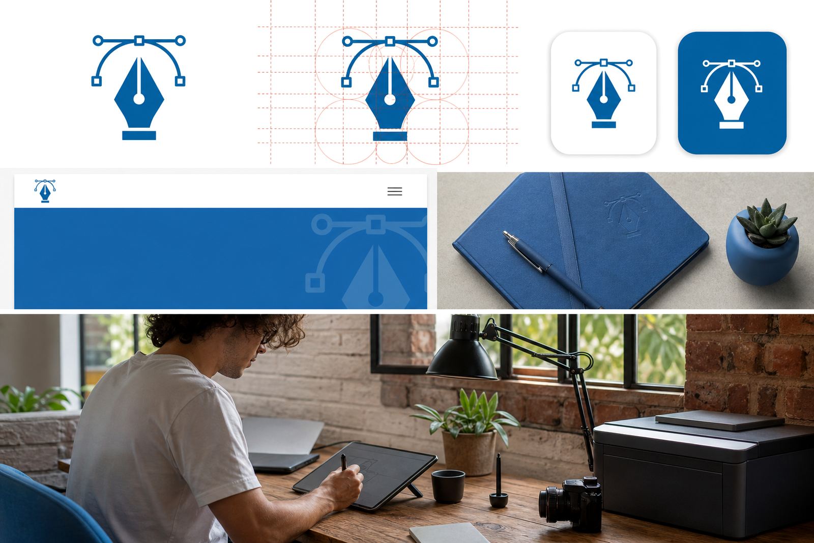
Once the structure was approved, we prepared the wordmark in vector format and checked it against common production uses. We supplied SVG and AI for editable working files, then exported supporting PDF files for print handover. The files were kept clean, with separate shapes where needed so a designer can adjust colour or line weight without rebuilding the whole mark.
We also checked the artwork in both light and dark presentation spaces so it would remain legible across different backgrounds. That matters for a tech firm that may use the same mark on a website header, a conference pull-up banner and an internal document template. The wordmark had to remain clear when reversed out, printed on coated stock, or placed beside other content on a busy layout.
- Delivered formats: SVG, AI and PDF
- Prepared for screen use, print, signage and internal documents
- File structure kept editable for future colour changes
Timeline and working process over three weeks
The project took just over three weeks from first contact to final handover. Week one centred on the brief, reference review and a clean redraw of the letterforms. Week two covered spacing checks, shape corrections and presentation of the corrected version for client review. In week three we prepared the final exports and checked the files for output issues.
That process gave the client room to compare versions without rushing the decision. It also reduced the usual back-and-forth that happens when a logo has not been properly rebuilt. Because the final artwork was made as vectors from the start, the handover was straightforward and ready for use across departments.
- Week 1: brief review and redraw
- Week 2: spacing, shape and proportion refinements
- Week 3: final export and quality check
What changed in the finished wordmark
The finished version kept the original idea but read more clearly at smaller sizes. We cleaned up the line rhythm, corrected a few uneven terminals and made the spacing feel more deliberate. The mark now carries better on screens, where old artwork often looks shaky or compressed, and it also prints more cleanly on coated and uncoated stock.
The client asked for a wordmark that could be used without special handling every time. That meant fewer surprises for the marketing team and fewer production issues for print vendors. It also meant the artwork could move between branches or suppliers without being rebuilt from scratch. For a business in a busy market like Sandton, that kind of practical consistency saves time.
- Improved legibility at small sizes
- Cleaner curves and more even spacing
- Better reproduction for print and digital use
What we would repeat for similar redraws
If we were starting a similar wordmark redraw again, we would follow the same approach: confirm ownership or usage rights before any work begins, review the source files carefully and choose hand redraw over auto tracing when the mark needs proper correction. That protects both the client and the artwork process.
We would also keep the handover practical. A business should receive files it can actually use, not just a pretty proof. For this reason we prefer giving a compact set of clean vector files that cover everyday needs, from a simple PDF for print to SVG for web use. It keeps the work useful long after the first project is complete, and it avoids the usual mess when a low-resolution image gets stretched later on.
- Always confirm rights to the supplied artwork
- Use hand redraws where line quality and spacing need proper control
- Deliver the formats the team will use most often
Key facts
| Project | Sandton Tech Wordmark |
|---|---|
| Client type | Technology firm in Sandton, Gauteng |
| Service | Logo redraw and vector wordmark refinement |
| Methods | Hand redraw, spacing correction, vector preparation |
| Files supplied | SVG, AI and PDF |
| Timeline | 3 weeks |