Project brief: a badge that had to work everywhere
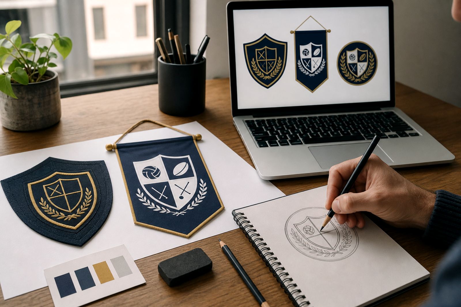
The client needed one badge that could move between very different uses without losing its shape or meaning. On a blazer badge, the lines had to stay readable under thread. On certificates, the crest needed to look sharp at print resolution. For event banners, the same artwork had to hold together at a much larger scale without looking soft or overcomplicated.
This kind of job comes up often with schools, clubs and training bodies. The original badge was available only as a low quality bitmap, so the first task was to rebuild it properly. We did not trace the image and call it done. Instead, we redrew the badge by hand in vector form, checking each line, curve and enclosed shape so it would reproduce cleanly in embroidery, print and digital layouts.
Because the badge would be used in more than one department, we kept the artwork practical from the start. That meant clear line weights, balanced spacing and a version that stayed neat when scaled down. It also meant making sure the client had files that could be sent straight to a printer, embroiderer or sign maker without extra cleanup.
What made this badge tricky
School emblems often carry small details that do not survive rough handling. Thin outlines disappear in stitching, fine text fills up on certificates, and tiny internal shapes can merge when a banner is viewed from across a hall. The brief called for a faithful redraw, but also for practical adjustments where needed so the badge would remain usable in the real world.
- Original artwork was supplied as a bitmap, not editable vector artwork
- Some details were too fine for embroidery and needed careful simplification
- The badge had to stay recognisable at small sizes for labels and letterheads
- The same file set needed to suit CMYK print, digital use and stitch planning
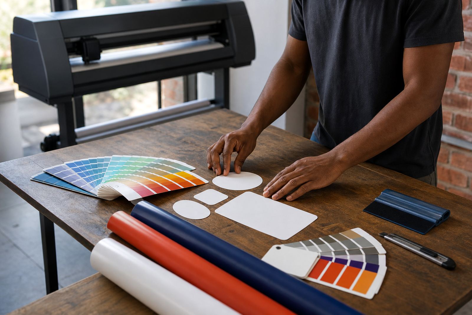
- Colour matching had to be sensible for both print and thread conversion
We worked with the supplied artwork and cleaned up the geometry by hand. Where the source image was unclear, we reconstructed the forms from visible structure rather than guessing from blur. That is usually the safest route when a badge has to be used for formal school material. A traced file can be quick, but it often carries the flaws of the source image and makes later production harder.
Hand redraw versus bitmap tracing
For this project we used a hand redraw method rather than simple bitmap tracing. Bitmap tracing can be useful for a quick outline, especially when a source image is very clean. But when a badge includes shields, scrolls, books, stars or fine lettering, tracing often locks in uneven curves and jagged edges that show up later in print or embroidery.
A hand redraw gives better control over the final result. We can straighten awkward angles, clean up symmetry, set consistent stroke widths and make sure the badge will hold its form across SVG, EPS, PDF and AI files. It also makes it easier to create production friendly variations, such as a one colour version for embroidery and a full colour version for certificates and event use.
The client was able to keep one master artwork set and use it across departments without rebuilding it each time. That saves time when a school has different suppliers involved, and it reduces the chance of one supplier working from an old or broken file.
Files supplied for embroidery, print and signage
Once the redraw was approved, we supplied a practical file set for real use. The artwork was set up as clean vector files and saved in formats that suit most production workflows. The badge was prepared so that a printer, embroiderer or layout artist could open it and work without having to reconstruct the design.
- SVG for editable digital use and web friendly artwork
- EPS for print and supplier handover
- PDF for proofs, sharing and general production use
- AI for design teams that need an editable working file
We also checked the badge at different sizes to see where detail needed support. For embroidery, we kept the shapes clear and avoided fragile points that could break in stitching. For certificates, the linework was made crisp enough to print cleanly on standard office and press stock. For banners, the badge stayed readable from a distance without needing extra outline treatment.
Timeline and working process over three weeks
The full project was completed over three weeks from first enquiry to final file handover. Week one focused on review of the supplied badge, identifying what could be retained and what needed rebuilding. Week two covered the redraw itself, with attention to shape accuracy, spacing and line consistency. Week three was used for checks, file preparation and final export in the required formats.
Because the client needed the badge for multiple uses, we reviewed the artwork against each application before closing the job. That included a close look at stitch friendliness, print clarity and how the badge would sit on banners and certificates. It is often the second and third checks that save a project from later problems, especially when the artwork has been copied around by different people over time.
- Week 1: source review and structure mapping
- Week 2: hand redraw and vector construction
- Week 3: quality control, export and handover
The client approved the final badge with only minor adjustments to spacing and one internal line. That kind of small correction is normal on formal crests, and it helps keep the final mark neat.
What the school could do with the finished badge
The rebuilt badge gave the school a cleaner base for everyday use. It could now be sent to different suppliers without worrying that the artwork would fall apart. The same badge worked on embroidered items, printed certificates and large event banners, which meant the school did not need separate versions made by different people. That keeps the brand more consistent across departments and events.
The strongest result was not only visual. It was practical. The school now has files that can be reused, edited if needed, and scaled without losing quality. For a busy admin team, that matters. There is less back and forth, fewer file problems and less time spent fixing old artwork at the last minute.
If we were asked to do a similar badge again, we would start with the production use first, then draw to suit. In other words, we would ask where the badge is going before finalising the linework. That approach works well for schools in Cape Town and beyond, especially when one badge has to live on cloth, paper and signage at the same time.
Useful specifications from the project
This project was handled from Observatory, Cape Town for a school client in Rondebosch. The badge redraw was completed for use across embroidery, certificates and event banners, with a focus on production ready files rather than decorative effects. The end result was a cleaner version of the crest that could be reused by multiple suppliers.
Our team on the job included client services, artwork rebuild, illustration and quality control. That matters on identity work because a small error in a badge can end up on uniforms, documents and event material for years. We checked the artwork carefully before release, especially where tiny shapes or narrow spaces could cause trouble.
Key facts
| Project | Rondebosch School Badge |
|---|---|
| Client type | School client |
| Town | Rondebosch, Cape Town |
| Service | Hand redrawn vector badge artwork |
| Uses | Embroidery, certificates and event banners |
| File formats | SVG, EPS, PDF and AI |