A wine label mark that needed cleaner lines
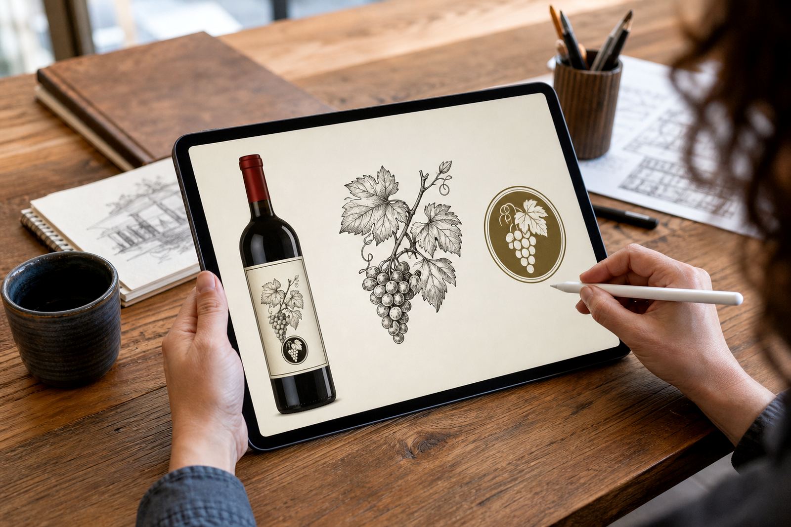
The client was a wine business in Stellenbosch looking for a tidier version of an existing emblem for label use. The original artwork had character, but it was not ready for a small printed label where thin lines, tight curves and uneven edges can disappear once the press gets hold of it.
The brief was simple on paper and picky in practice. Keep the feel of the original wine icon, make the linework more consistent, and supply artwork that could be used on labels, tasting room print, social graphics and other brand items without losing quality. They also needed files that their printer could handle without extra fuss, which is usually where a good vector redraw saves time.
For this kind of work, the line between bitmap tracing and hand redraw matters. Tracing can work when the source is already clean, but a hand redraw is better when the artwork has rough edges, weak symmetry or details that need judgement rather than automatic conversion. This job called for the second route.
What we kept, what we changed
We started by studying the original mark and breaking it down into simple parts: bottle shape, grape detail, stem lines and the outer frame. Some parts needed to stay exactly as they were in feel, while others needed a firmer hand so the icon would read clearly at label size. The aim was not to make it look generic, but to make it usable.
In the redraw, we cleaned the line weight, corrected the curves and balanced the spacing so the icon would sit properly on a label layout. We also made sure the artwork would hold up when reduced for caps, neck labels and smaller promotional items. That matters in wine packaging because a mark can look fine on a screen and still fail once it is printed at 20 mm wide.
- Preserved the recognisable shape and character of the original emblem
- Smoothed out uneven linework and awkward joins
- Improved symmetry for better label alignment
- Adjusted small details so the icon stays legible at low size
Working files and output formats for print
The final artwork was supplied as clean vector files in SVG, EPS, PDF and AI formats. Those formats are useful because the artwork can scale without soft edges or blur, whether it is going onto a wine label, a brochure, a stamped card or a larger sign. We also prepared the icon with print use in mind, so the file structure would be practical for a designer or printer to work with.
Because labels can be sensitive to ink build-up and fine detail, we checked the artwork for line thickness, shape clarity and simple colour use. The result was a tidy single-colour mark that could be reversed out or placed in dark or light versions depending on the label stock. In a coastal climate or a cellar with changing humidity, paper and print choices still matter, so it helps when the artwork itself is already well behaved.
- SVG for digital and flexible web use
- EPS for print production and professional layout work
- PDF for sharing and proofing
- AI for editable vector editing
Timeline, approvals and practical checks
The project ran over two weeks from first review to final handover. That included assessing the source artwork, redrawing the icon, checking proportions, preparing the export files and making a final round of adjustments after feedback. The client wanted the work handled carefully, not rushed, because label artwork has a habit of showing every small mistake once it is on press.
We kept the process straightforward. The client sent through the artwork they had rights to use, along with notes on where the icon would appear and how small it might need to print. We then supplied a proof for review and made the final corrections before delivery. That approach works well when the goal is accuracy rather than reinvention.
- Week 1: source review and redraw draft
- Week 2: refinement, file checks and final delivery
- Proofing included small-scale label checks
Results on label and beyond
The finished icon gave the business a cleaner mark that could be used confidently across labels and supporting brand material. It kept the original wine identity intact, but it now prints more neatly and fits into tighter layouts without looking cramped. For a winery or wine-related business, that is often the difference between artwork that only looks good in one place and artwork that can work across the full range.
We would take the same approach again for any Stellenbosch label project where the original art has a strong idea but needs technical cleanup. Hand redraw is often the best option when the source file is rough, low resolution or built from old artwork that has been copied and pasted too many times. If there is heritage in the mark, we try to keep it. If there is clutter, we strip it back.
That is especially important when the client needs to own or have the rights to the artwork supplied. We only work from material that can be used properly, because print jobs and brand files should never leave a business exposed later on.
What we would use again for a wine emblem
For another wine icon or label mark, we would follow the same practical sequence: review the source, decide whether bitmap tracing is enough or whether a hand redraw is safer, then prepare tidy vector files for print and digital use. If the icon needs to sit beside a full label layout, we would also check how it behaves against the font choices, foil areas and crop marks.
In our experience, a good redraw is not just about making lines prettier. It is about making sure the artwork can do its job in the real world, from small labels and tasting notes to larger collateral used around the farm, showroom or shipping carton. That keeps the mark usable across South Africa, whether it is going to Cape Town, Johannesburg, Durban, Pretoria or Bloemfontein.
- Keep the strongest features of the original emblem
- Redraw for clarity instead of relying only on automatic tracing
- Test at small label size before final sign-off
- Supply editable vector files that are easy to reuse
Key facts
| Project | Stellenbosch Wine Icon |
|---|---|
| Client type | Wine business in Stellenbosch |
| Service | Hand-drawn logo redraw and vector icon illustration |
| Output formats | SVG, EPS, PDF and AI |
| Timeline | 2 weeks |
| Use case | Label artwork and related brand material |