A sketch that needed to work harder on packaging
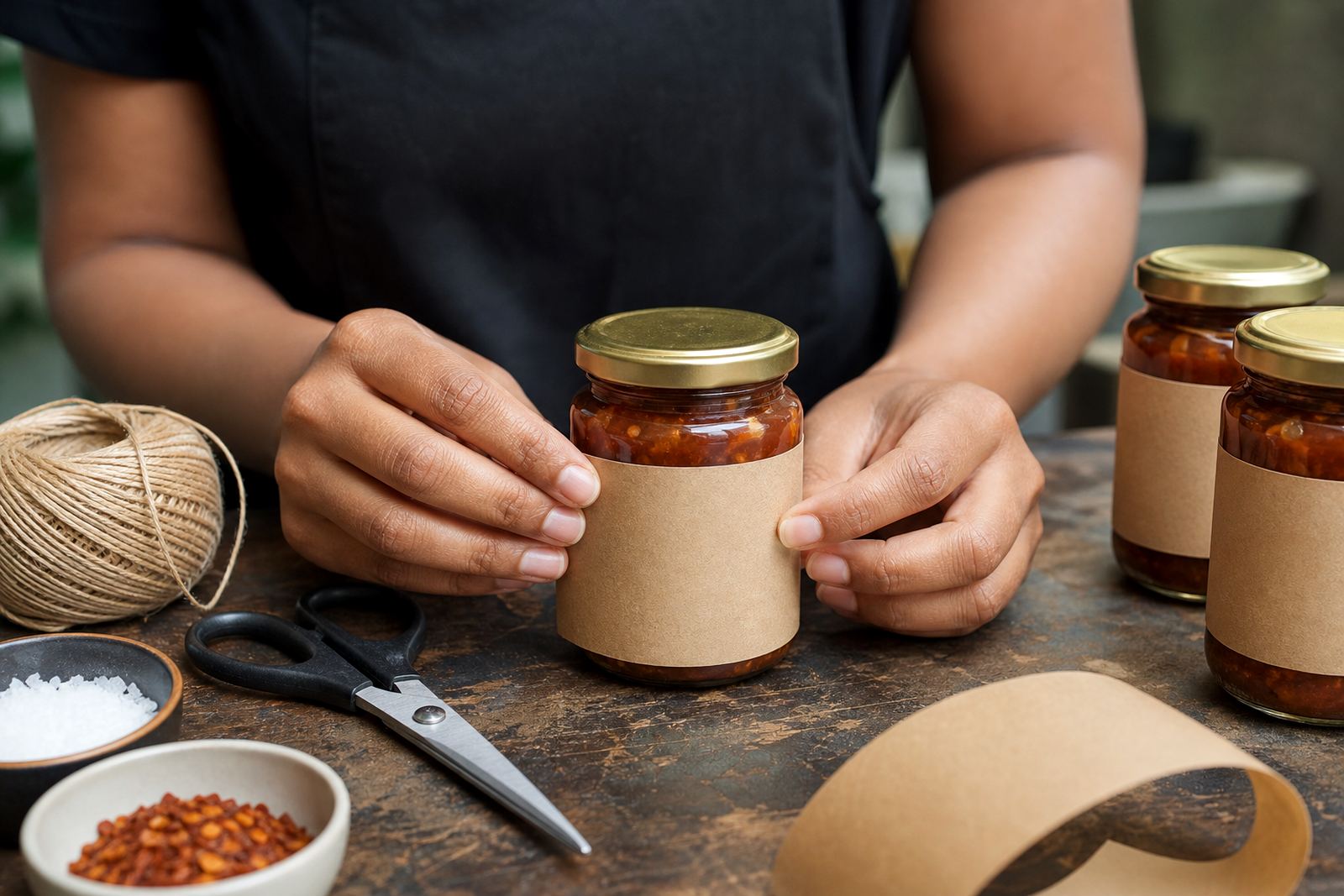
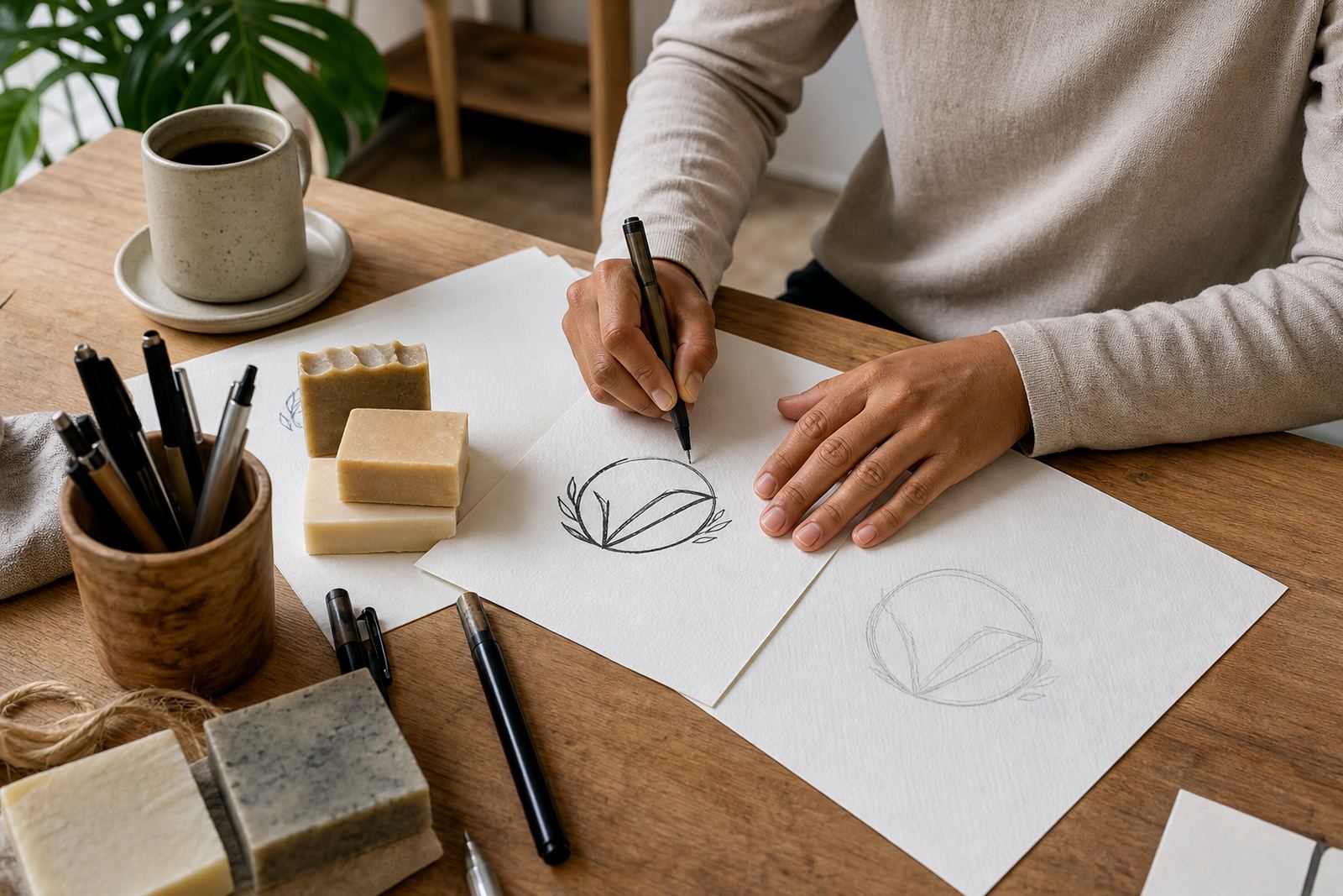
The client was a small craft business in Pietermaritzburg with a hand-drawn logo that looked good on paper but fell apart once it was scaled down for packaging. The lines were uneven, the lettering was inconsistent, and the mark lost clarity on short-run labels where the print room could not afford fuzzy edges or weak detail.
The brief was simple: keep the character of the original sketch, but turn it into a proper vector mark that could be used on packs, stickers and social graphics without losing its shape. The business also needed artwork that could be handed to different suppliers over time without having to explain the logo from scratch each time.
- Client type: craft and packaging business
- Town: Pietermaritzburg, KwaZulu-Natal
- Starting point: scanned sketch with uneven linework
- Main use: packaging, labels and small-format print
Why we chose a hand redraw instead of simple tracing
For this job we did not rely on bitmap tracing alone. Tracing can be useful when a file only needs a quick clean-up, but it tends to keep the same wobbles, flat spots and awkward angles that were in the original scan. With a logo that had to sit neatly on packaging, we needed better control over curves, spacing and weight.
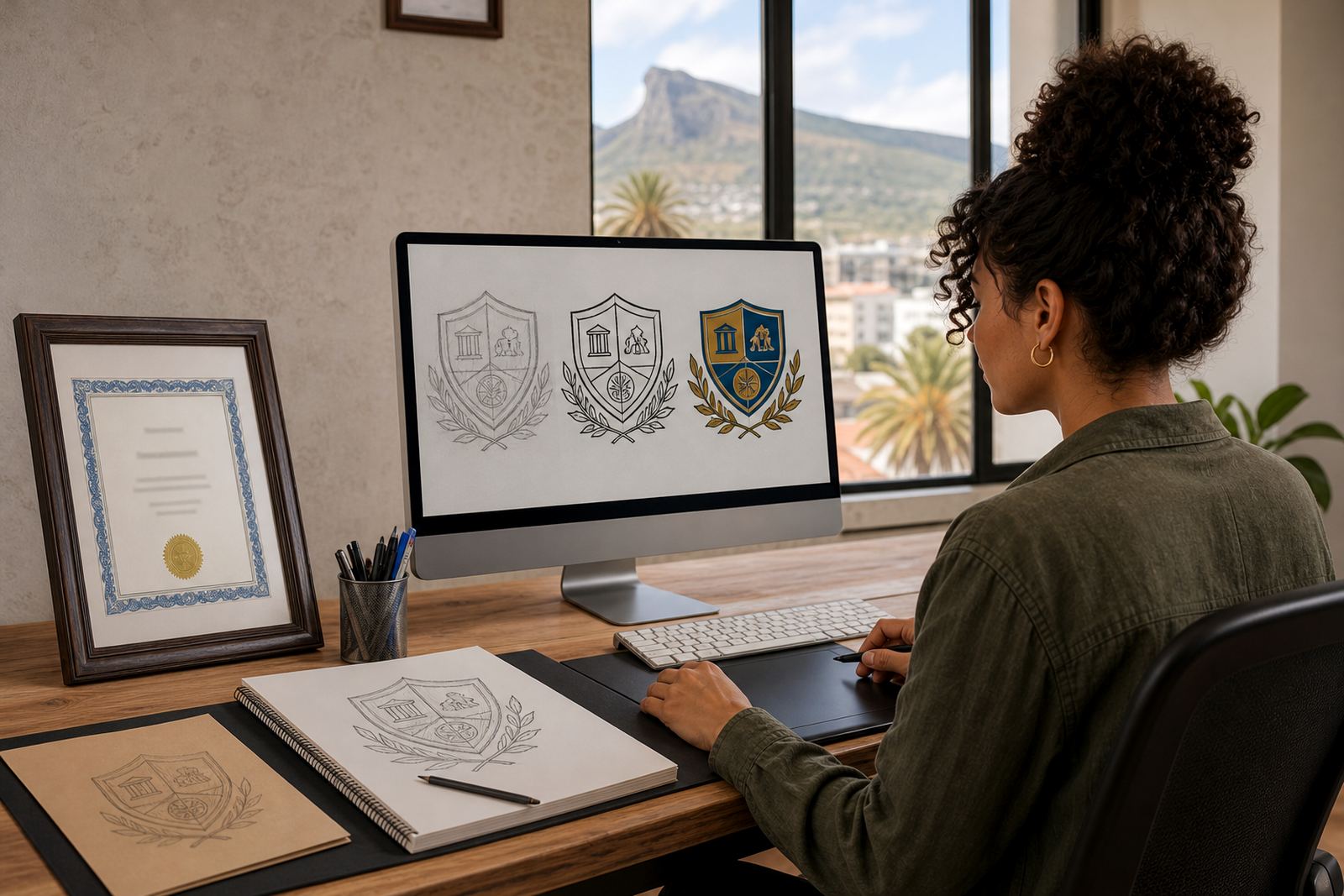
We redrew the mark by hand as vector artwork, then refined the forms so the icon, text and any supporting details worked together at small sizes. That meant adjusting anchor points, smoothing curves and balancing the line weight so the final result would reproduce properly on different stocks, from matt labels to coated cartons. In the end, the logo looked cleaner but still felt like the original idea, not overworked or plastic.
- Method used: hand redraw with vector cleanup
- Why not pure tracing: better control over line quality and spacing
- Outcome: clearer mark at reduced sizes
- Files prepared for print and digital use
What we supplied for the full brand toolkit
The finished artwork was delivered in the formats most South African print and design teams ask for: SVG, EPS, PDF and AI. That gave the client a set of files that could be opened, scaled and sent on without quality loss. We also organised the files so the packaging supplier could work from a clean master, which saves time later when a dieline or label size changes.
Because the business wanted practical use across several packaging items, we kept the mark flexible. The artboard was set up for easy placement on labels, header cards and simple promotional artwork. We also checked the line thickness against likely production limits so the final design would still read properly on smaller labels and during shorter print runs.
- SVG for web and digital use
- EPS for professional print workflows
- PDF for easy sharing and proofing
- AI for editable master artwork
Artwork rights, approvals and a clean handover
Before we began, the client confirmed they owned the sketch and had the right to use the artwork supplied for redrawing. That matters with any redraw or illustration job, because we can only work from material the client is allowed to use. Once that was clear, we moved through the proof stage in a practical way, with one round of tidy adjustments to line balance and spacing before final export.
The approval process was straightforward. The client wanted the identity preserved, but also needed it to look more confident on packaging and on future brand items. We kept the communication focused on usable details such as contrast, legibility and reproduction size rather than trying to overcomplicate the mark. It kept the job moving, and the final sign-off was easy enough.
- Rights confirmed before work started
- One revision round for refinements
- Final artwork exported in multiple formats
- Master files prepared for future use
Timeline, from first brief to final files
The project took just over two weeks from the first brief to delivery. The opening stage covered the redraw and structure pass, where we converted the sketch into vector form and sorted the main proportions. The second stage handled refinement, spacing and output checks, including how the artwork would hold up on smaller packaging panels and in one-colour use.
By the second week the mark was ready for final handover, with all core files supplied and named clearly. The client could then pass the artwork to a packaging printer without needing extra explanation. For a small maker in Pietermaritzburg, that kind of file discipline is useful because production schedules can shift and it helps when different suppliers are involved.
- Week 1: redraw, structure and vector build
- Week 2: refinement, proofing and final export
- Total project span: 2 weeks
- Delivery format: editable and print-ready files
What changed for the packaging range
The biggest change was clarity. The logo moved from a rough sketch to a mark that could sit cleanly on packaging, with sharper edges and better balance. That made it easier to place on small labels, folded cartons and sticker sheets without the artwork getting muddy. It also gave the client a more professional base for future product lines.
Just as important, the new vector version was easier to work with across different uses. A packaging designer could scale it up, a printer could separate it correctly, and the client could reuse it for social graphics without the usual patchwork of screenshots and low-resolution copies. For a business growing steadily in KwaZulu-Natal, that saves a lot of back-and-forth later on.
- Cleaner presentation on packaging
- Better legibility at small sizes
- More flexible use across print and digital
- Reduced risk of poor reproductions from old files
What we would repeat for similar redraws
We would follow the same approach again for any craft or packaging client with a strong sketch and a clear use case. Start by confirming ownership of the source artwork, then choose between simple tracing and a full hand redraw based on how much control the final mark needs. For packaging, hand redraw usually wins because it gives better spacing and cleaner edges.
We would also keep the file handover just as tidy next time. Multiple formats, clear naming and a sensible revision stage make life easier for printers, resellers and anyone else who needs the artwork later. That is especially useful when the business is serving customers across South Africa and has to send files to different towns without delay.
- Confirm rights to the source artwork first
- Use hand redraw where packaging clarity matters
- Supply SVG, EPS, PDF and AI every time
- Keep revisions focused on legibility and fit
Key facts
| Project | Pietermaritzburg Maker Mark |
|---|---|
| Client type | Craft business with packaging requirements |
| Location | Pietermaritzburg, KwaZulu-Natal |
| Service | Hand-redrawn logo vectorisation and illustration cleanup |
| File formats supplied | SVG, EPS, PDF, AI |
| Timeline | 2 weeks |