How the brief arrived from Salt River
The client was a long-standing business in Salt River, Cape Town, with a crest that had been used for years on certificates, letterheads and internal documents. The only usable reference was a scanned printout, and the mark had aged in the usual way: soft edges, broken lines, uneven blacks and a few small distortions from copying and re-scanning. They needed the crest rebuilt so it could be used cleanly on new stationery, signage artwork and digital files without losing the older feel that people already recognised.
The brief asked for careful vectorisation rather than a loose redraw. That meant matching the proportions, keeping the decorative details in the right places, and making sure the final artwork would reproduce properly at small sizes and on large format output. Because the original was only available as a printed certificate, there were also practical limits. We had to work from the visible reference, avoid inventing elements that were not present, and preserve the shapes that gave the crest its identity.
- Client type: established local business in Salt River, Cape Town
- Source material: printed certificate scan only
- Goal: rebuild the crest as clean vector artwork
- Use cases: print, digital, signage and archive files
What we could preserve and what had to be rebuilt
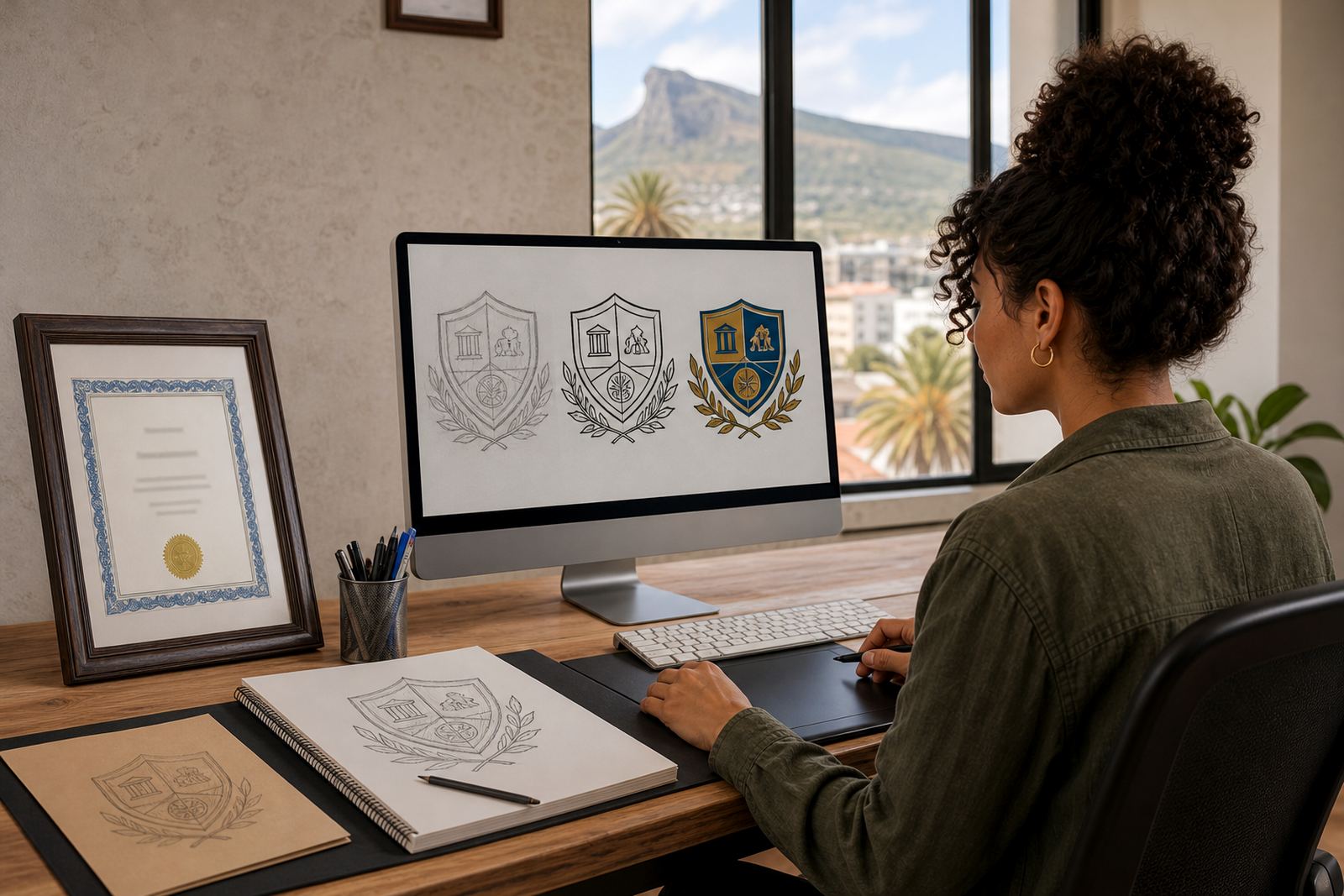
The first step was to separate the parts of the crest that were readable from those that had to be reconstructed. In a job like this, bitmap tracing can be a starting point, but it usually leaves you with rough curves and a file that still behaves like a photo. We used the reference to study the line weight, symmetry, spacing and any worn details, then redrew the crest by hand as editable vector artwork. That approach gave us cleaner control over the crown, border shapes, inner line work and text placement where it could be verified.
Where the certificate print had softened edges or patchy ink, we corrected the geometry without changing the overall look. The aim was not to modernise the crest beyond recognition. It was to make it usable again. Small errors in a certificate scan can become obvious once a logo is enlarged, especially on coated stock or signage panels in bright light. A hand redraw lets us fix those issues properly, rather than simply tracing the noise from the source file.
- Hand redraw used for key shapes and line control
- Bitmap tracing reviewed only as a reference step
- Broken lines and distorted curves corrected manually
- Original crest character retained, not redesigned from scratch
The production process over two weeks
The project ran over two weeks from intake to final delivery. During week one, we cleaned the scan, checked the proportions and mapped the main elements of the crest. Once the structure was set, we redrew the artwork in vector form and tested the details at different sizes. Week two was for refinement, with careful adjustment of spacing, joins, line balance and output checks for both print and digital use. The file had to be reliable, not just visually close.
Because many South African businesses still need artwork that works across old and new production methods, we prepared the crest in multiple vector formats. That means the client can open it in different workflows and supply it to printers, sign makers or internal teams without quality loss. We also kept the artwork tidy for prepress use, so it behaves well when converted for municipal submissions, vinyl cutting, embroidery digitising or certificate layouts.
- Timeline: 2 weeks total
- Week 1: scan cleanup, structural rebuild, vector redraw
- Week 2: refinement, file testing, final export
- Output checked for print, screen and prepress handling
Files supplied for practical day to day use
For Salt River Crest, we supplied the artwork in SVG, EPS, PDF and AI format so the client would have the right file for each job. SVG works well for digital and web use, EPS is widely used in print and production, PDF is convenient for sharing and proofing, and AI remains useful for design handover and later edits. We also set up the artwork so the main crest could be used in a single colour version where needed, which helps when printing on forms, invoices or material with limited ink coverage.
South African businesses often need artwork that can handle different conditions, from coastal humidity in Cape Town to hot inland storage and long print runs in Johannesburg or Durban. Vector artwork is more forgiving than a flat scan because it stays sharp at any size and does not break down when scaled. That matters when a crest is used on a certificate, a board, a label or a small social graphic. The client now has files that can move between suppliers without being redrawn every time.
- SVG for digital use
- EPS for production and print shops
- PDF for proofs and handover
- AI for editable master artwork
Rights, reference material and client approval
Before any redraw begins, we make sure the customer owns the artwork they send or has the right to use it. That matters with old logos, inherited marks and certificate scans, because a clean rebuild still depends on proper permission. In this case, the client confirmed that the crest belonged to their business and that the reference material could be used for reconstruction. Once that was clear, we could work methodically without any doubt about the source.
Approval was handled against side by side comparisons of the reconstructed crest and the original certificate reference. We checked the structure, the spacing and the overall balance before release. Where there were worn or blurred sections on the source, we explained the limits of the reference and chose the most faithful reading rather than guessing. That kept the final artwork honest and practical for future use.
- Customer must own or have rights to supplied artwork
- Reference image used only as the basis for reconstruction
- Approval checked against the printed certificate
- Final artwork kept faithful to the original crest
What the client gained and what we would do again
The finished result gave Salt River Crest a clean, usable logo file that can now be deployed across print, packaging inserts, social graphics and formal documents without the rough edges of the original scan. It also gave the business a proper archive set for future use, which is often the part clients value most after the immediate job is done. Once a crest has been rebuilt properly, there is less time wasted on patching old files or asking suppliers to work from poor references.
If we were to do the same job again, we would approach it the same way: verify the rights, study the source carefully, reconstruct the crest by hand, and test the final files across common print and digital uses. That is especially important for older marks with family or heritage value, because a rushed trace can flatten the detail and make the emblem look generic. A careful redraw protects the original identity while making the artwork easier to use in the real world.
- Cleaner reproduction across print and digital platforms
- Ready for future edits, scaling and supplier handover
- Useful for certificates, stationery and internal branding
- Best result comes from careful reconstruction, not quick tracing
Key facts
| Project | Salt River Crest |
|---|---|
| Location | Salt River, Cape Town |
| Service | Logo redraw and vector reconstruction |
| Source material | Printed certificate scan |
| Timeline | 2 weeks |
| Files delivered | SVG, EPS, PDF, AI |