A Randburg brief with mixed format needs
The client was an events team based in Randburg who needed one visual identity to work across a busy programme. They had artwork that looked fine on a screen at small sizes, but it started to soften on large banner layouts and picked up rough edges when it was stretched for different uses. Their main need was simple, keep the look familiar while making it practical for social graphics, stage signage and printed collateral.
The brief also had a few real world limits. The artwork had to remain legible on mobile, still read clearly on a pulled up banner, and stay clean when used beside sponsor information. Because event work often changes late, we kept the layout choices practical and easy to adapt without having to rebuild everything from scratch.
- Client type: event organiser in Randburg
- Use case: social media graphics, banners and event collateral
- Primary goal: redraw the identity for cleaner scaling
- Secondary goal: keep the visual style consistent across formats
Tracing old artwork versus a proper redraw
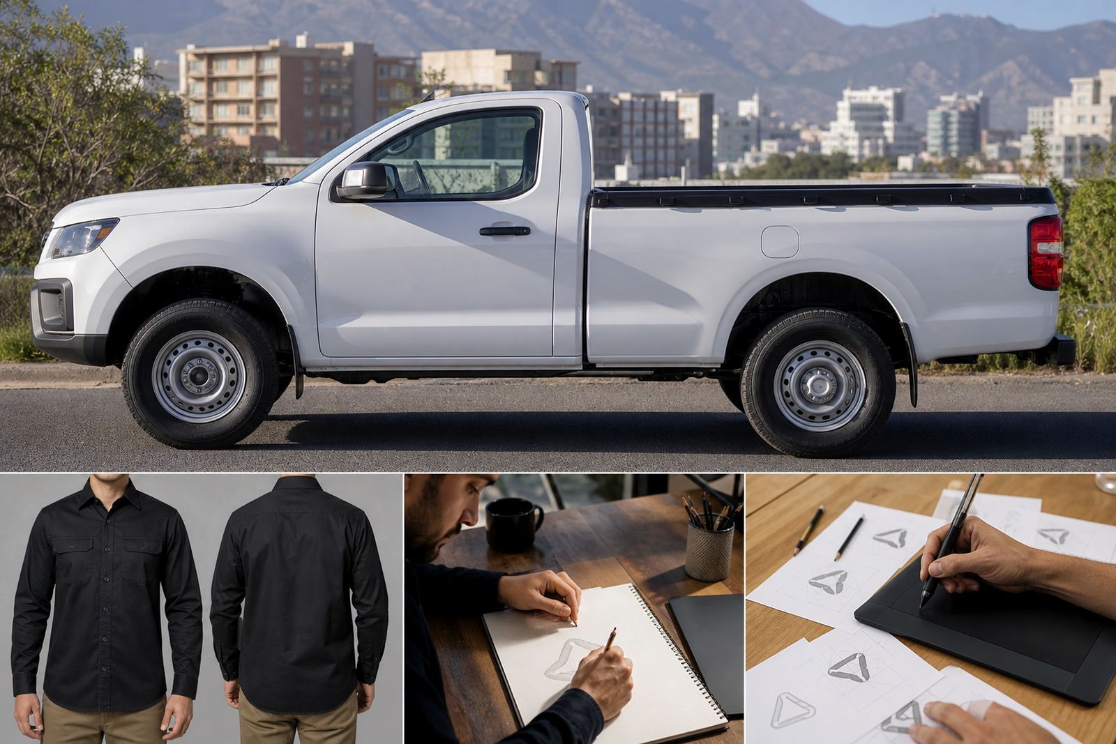
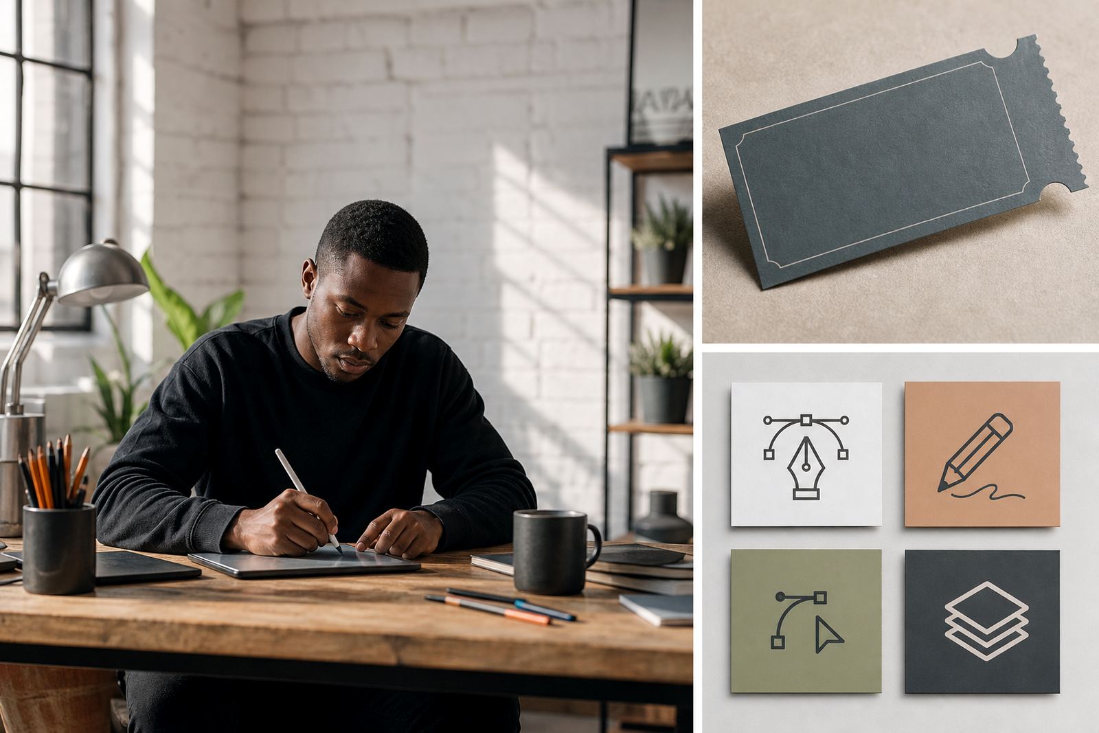
We first checked whether the supplied artwork was best suited to bitmap tracing or a full hand redraw. A traced bitmap can be useful when the original art is basic and only needs a tidy edge, but for this job the source file had uneven curves and small details that would have carried those flaws through every output. So we redrew the key elements by hand and rebuilt the artwork as vectors, which gave us far better control over corners, curves and spacing.
That approach also made it easier to separate the identity into flexible parts. The main mark could sit alone, while supporting illustration details could be used for banners, digital headers and smaller social formats. Once the structure was clean, we prepared files in SVG, EPS, PDF and AI so the client could pass the artwork on to printers or internal designers without needing to start again.
- Hand redraw for cleaner line work and better proportion control
- Vector output for scaling without visible pixelation
- File set supplied in SVG, EPS, PDF and AI
- Artwork set up for both print and digital applications
How the event identity was adapted for social and banner layouts
The event identity needed more than one version, because social media graphics and banner artwork do not behave the same way. We created a primary lock-up for general use, then adjusted spacing and emphasis so the mark could sit comfortably in vertical, square and wide layouts. In some cases the illustration needed to breathe more, in others it had to be tightened so it would not disappear behind programme text or sponsor bars.
We also prepared supporting artwork in a way that made future changes easier. The client could reuse the same core vector elements for new dates, venue names and route details without losing visual consistency. That saves time when the event programme shifts, and it keeps the whole identity looking like one family rather than a set of unrelated pieces.
- Square, portrait and landscape layout options supplied
- Banner-friendly spacing for large format use
- Social-ready versions for cropped and mobile-led placements
- Editable vector components for future event updates
What we supplied over the three week project
The project ran over three weeks, which gave enough room for the redraw, review rounds and final prep. Week one focused on analysing the source material and establishing the clean line structure. Week two covered the full vector redraw and the first round of layout adaptations. Week three was used for refinements, file packaging and quality checks, including a careful look at line weights, alignment and spacing so the final files would print cleanly.
We supplied a practical handover set rather than a single finished image. That included the main vector artwork, simplified versions for tighter spaces and export-ready formats suited to common print and digital workflows. The result was an identity that behaved properly on banners and in social posts, without the jagged edges that often appear when older artwork is pushed too far.
- Timeline: 3 weeks from source review to final handover
- Deliverables: master vector files plus adapted layout versions
- Checks: line weight, alignment, scaling and output readiness
- Use cases covered: print, digital and event signage
What changed after the redraw
After the redraw, the identity felt far more settled across formats. The event team had artwork that could be enlarged for banners without losing shape, and the social graphics no longer looked squeezed or patchy at smaller sizes. The biggest improvement was consistency, because the same core elements carried through each version without the odd distortions that can creep in when files are copied around by different suppliers.
It also made the admin side easier. The client had a single clean source for future event use, which means the next round of venue boards, programme graphics or sponsor lock-ups can be handled quicker. That matters when an event schedule moves around a bit, and you need artwork that behaves well under pressure.
- Cleaner presentation across all event formats
- Better legibility in small and large applications
- Less rework needed for future event updates
- Consistent visual style across print and social use
When we would repeat this approach
We would use the same process again for any South African event identity that needs to travel across multiple formats. If the source art is rough, low resolution or built in a way that causes trouble for printers, a hand redraw gives better control than a quick trace. That said, if the artwork is already well made and only needs light cleanup, tracing can still be the right route. The key is choosing the method that suits the original file, not forcing one method onto every job.
For this kind of project, our focus stays practical: keep the artwork owned by the client or properly cleared for use, build files that can be edited later, and prepare outputs that work for real event deadlines. That approach suits teams in Randburg and elsewhere, whether they are planning a local activation or a nationwide rollout.
- Best for event identities that need multiple format versions
- Works well when the source artwork is weak or inconsistent
- Suitable for clients across Cape Town, Johannesburg, Durban, Pretoria and Bloemfontein
- Always subject to the client holding rights to the artwork supplied
Key facts
| Project | Randburg event graphic |
|---|---|
| Service type | Logo redraw and event illustration adaptation |
| Location | Randburg, with delivery for South African event use |
| Timeline | 3 weeks |
| Files supplied | SVG, EPS, PDF, AI |
| Artwork note | Client to own or have rights to all supplied source artwork |