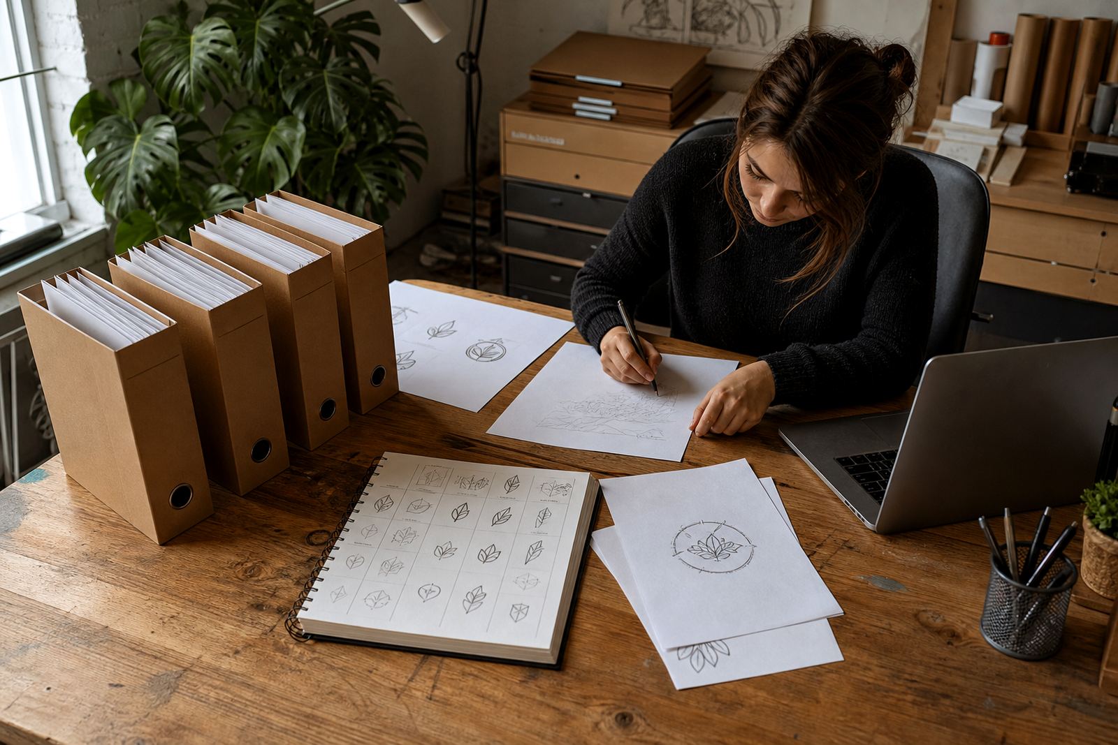
Why badge logos need more than a quick trace
A badge logo often carries several parts in one compact shape: outer rings, inner panels, text, symbols and small separators. When those parts are traced too fast, the result can look heavy on one side, cramped at the top or uneven around the border. That may be fine on screen for a moment, but it can fall apart when scaled down for a sticker, letterhead or embroidered cap.
In our work from Observatory, we look at the original artwork as a build, not just an outline. If the badge has small text or tight curves, those details need to be redrawn with care so the finished file still holds its shape at A4 size, on a vehicle sign or on a 20 mm label. A clean badge should feel steady, even if the original artwork arrived as a low-resolution bitmap.
Spacing is what keeps the badge readable
Good spacing is not only about making the logo look neat. It helps each element breathe so the eye can separate the ring from the icon, the icon from the text, and the text from the border. Without enough space, the badge can read as a dark blob once it is reduced for packaging or social use.
- Check the gap between the outer border and inner artwork.
- Keep letter spacing consistent, especially on curved text.
- Leave enough room for a thin border to survive cutting and trimming.
- Allow for small shifts when the badge is printed on textured stock or uneven fabric.
For South African businesses that use the same badge on invoices, uniforms and labels, spacing must work across different print methods. A badge that looks fine on a bright monitor may need a wider counter or cleaner break between shapes to survive the real world, especially where paper stock is warm, humid or a bit rough.
Symmetry matters, even when the original is imperfect
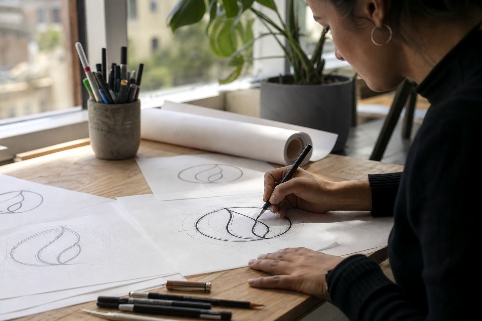
Many badge logos are meant to feel balanced, but the source artwork does not always match that intention. One side may sit higher, the circle may be slightly oval, or the central emblem may lean. If we only trace what is there, those flaws stay in the final vector file. Careful redraw work fixes the structure, not just the outline.
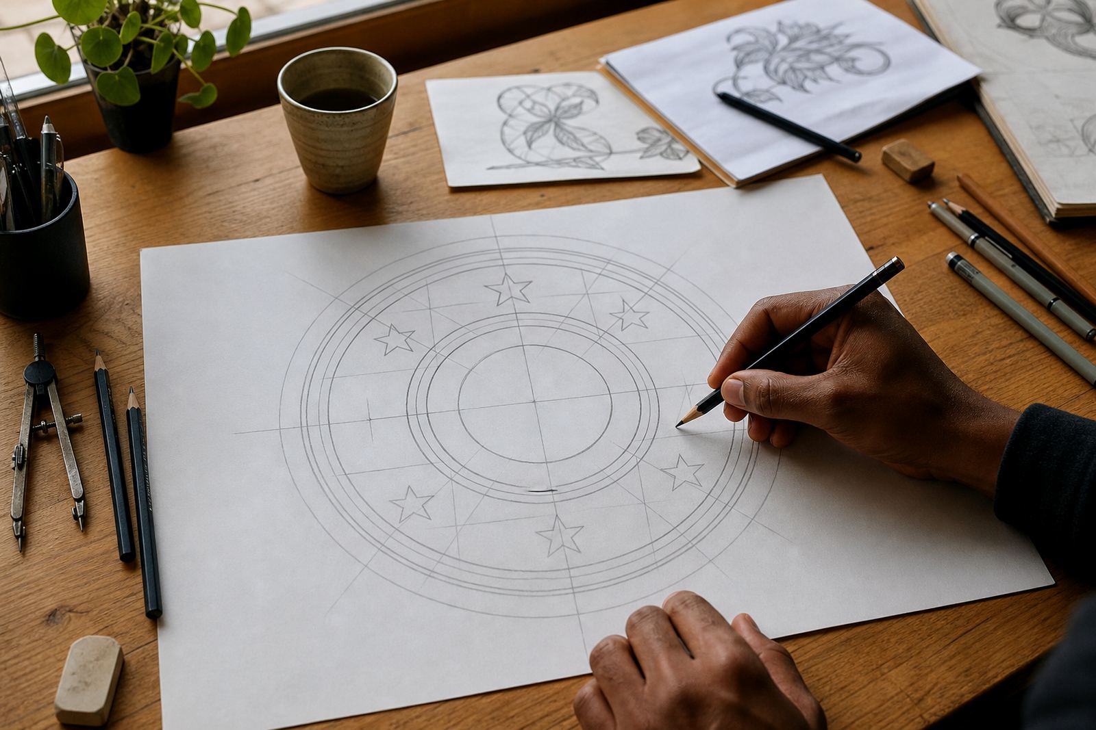
That means checking centre points, mirror lines and arc consistency. A badge should sit squarely whether it is viewed on a shopfront in Pretoria or a menu cover in Stellenbosch. When the shape is symmetrical, the logo also scales better into SVG, EPS, PDF or AI formats for later use by printers, sign writers and prepress teams.
- Align the central icon to the true geometric centre, not the scanned centre.
- Match curve weights on both sides of the badge.
- Keep any star points, leaves or laurel details evenly spaced.
- Test the logo at small sizes before approving the final redraw.
Border clean-up is where many badge redraws fail
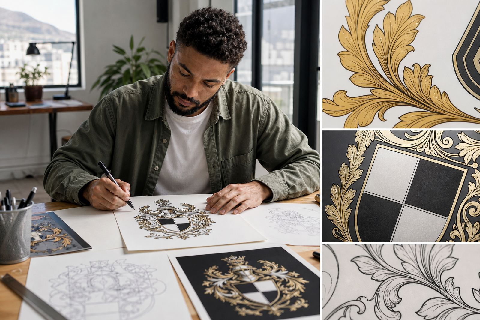
Badge borders often carry the most wear in old artwork. You may see cracked outlines, broken joins, dirty scan edges or thick and thin spots where the original image was compressed. If those issues are copied into a vector file, they can show up more clearly in print than in the source image.
We usually redraw the border by hand so the edge is smooth and the joins are clean. That is different from simply tracing the bitmap automatically, which can leave wobbly curves and tiny points that are hard to edit later. A hand redraw gives better control over stroke weight, corner treatment and the small spaces where text sits against the ring. It also helps when the badge has to be cut from vinyl or printed onto a curved surface.
For coastal clients in places like Cape Town or Port Elizabeth, border clean-up also matters because printing on certain materials can show flaws more clearly in strong light or humid conditions. A tidy edge saves time at proof stage and helps the mark hold together on the final piece.
When tracing is enough and when hand redraw is better
Not every badge needs the same approach. If the artwork is crisp, simple and already built with clear vector shapes, tracing may be enough for a straightforward file clean-up. But when the image is low-resolution, distorted, or full of fine detail, a hand redraw is usually the better route. It gives more control over line weight, spacing and balance.
Bitmap tracing can be useful as a starting point, yet it often copies noise as well as shape. A hand redraw is slower, but it lets us rebuild the badge properly, especially where the text is small or the border has repeated motifs. Customers must own the artwork they send us or have the rights to use it, since we only work on material that can be handled lawfully. That protects both the client and the final file.
- Use tracing for clean, simple artwork with clear edges.
- Choose hand redraw for damaged scans, faded logos or complex badges.
- Request vector outputs in SVG, EPS, PDF or AI for flexible production.
- Keep a copy of the approved artwork for future reprints and updates.
A local example from a Cape Town badge redraw
A small hospitality business in the Southern Suburbs came to us with a worn badge that had been used on menus, aprons and takeaway stickers for years. The circle was uneven, the inner line was heavier on one side, and the wording on the outer ring had started to feel cramped. The owner wanted the badge to still feel familiar, but cleaner and easier to use across print and signage.
We rebuilt the border, adjusted the symmetry and opened up the letter spacing. The final version worked better on a black-and-white stamp, a full-colour menu header and a small sticker for packaging. That kind of edit is common for businesses across South Africa, from Johannesburg to Bloemfontein, because one badge often needs to work in several places at once. Good spacing and clean borders make that possible.
The point is simple: a badge logo should not rely on luck. It needs structure, measured proportions and enough breathing room for real-world use, not just a quick screen view.
What to send when you want a badge redrawn properly
The better the starting material, the better the redraw process goes. If you have the original artwork, a clean scan, a photo of the sign, or the best file you can find, send that through the enquiry form on our contact page. If there are specific uses, such as embroidery, foil blocking or vinyl cutting, say so upfront. That helps shape the final file correctly from the start.
We also find it useful to know where the logo will be used most often. A badge for packaging in Paarl may need different spacing from one used on a restaurant sign in Durban or on branded folders in Pretoria. With the right brief, the final vector artwork can be prepared in the formats needed for print, signage and everyday business use. Small details matter here, and a neat badge often saves a lot of back-and-forth later on.
- Send the clearest source artwork available.
- State the main use case, such as print, signage or apparel.
- Note any text that must stay exactly as written.
- Ask for vector files if the logo will be reused often.