Why crests need more than a quick trace
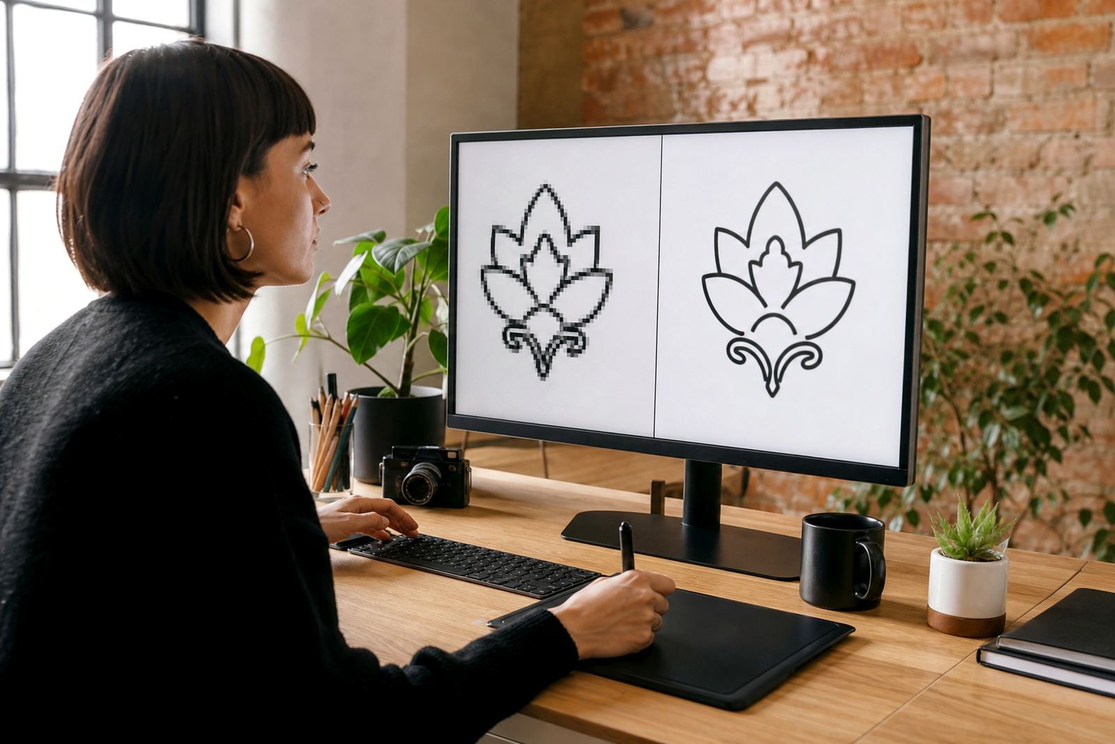
A crest is usually packed with detail, and that detail is what causes trouble when a logo is copied from a low quality image. A bitmap trace can follow the outer shape, but it often blurs fine edges, fills in small gaps and leaves uneven curves around scrolls, crowns and shields. For a mark with history, that is not good enough.
We treat crest redraws as reconstruction work. That means looking at the reference image, identifying the parts that matter most, then rebuilding the mark as clean vector artwork that behaves properly at different sizes. If the original is a faded JPEG from an old letterhead or a photograph of a signboard in Cape Town, the job is not simply to trace over it and hope for the best.
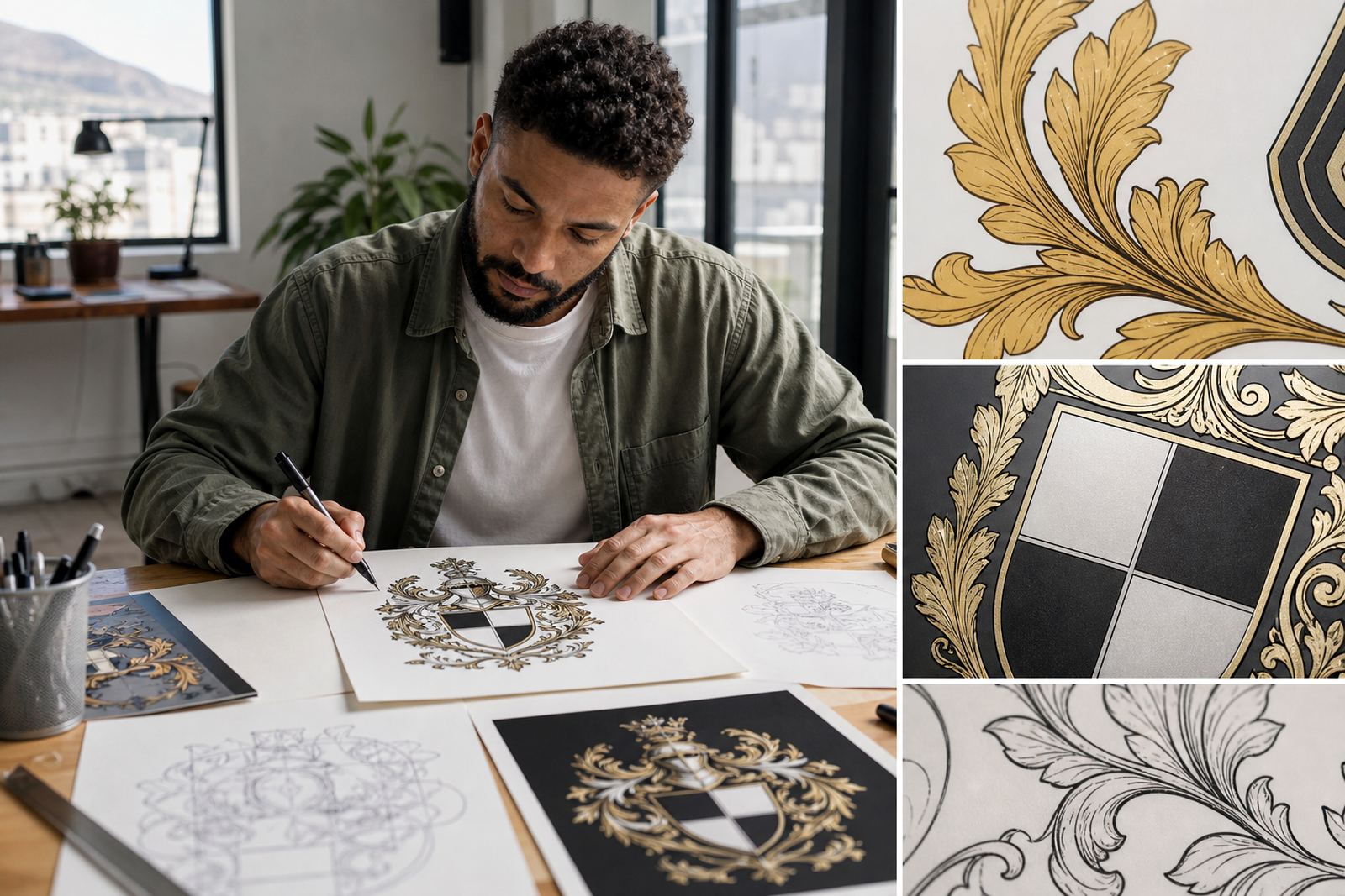
Hand redraws are often the right choice when the emblem has delicate line work, floral detail or lettering that should sit neatly in the final file. The aim is not to make it look modern. It is to make it accurate, tidy and usable.
When bitmap tracing is useful, and when it is not
Bitmap tracing can be helpful for very simple artwork, especially if the source is high contrast and the shapes are broad. It can also be a starting point for cleaning up some elements. But ornate badges usually need manual correction, because tracing alone tends to exaggerate flaws in the source image.
For crests, the problems are easy to spot once the artwork is enlarged. You may see broken curves, thickened corners, muddy line weights or letterforms that no longer match the original. A school crest, club badge or heritage emblem can lose its character fast if every part is treated the same way. That is why a careful redraw is usually the better route.
- Use bitmap tracing only when the source is very clear and the shapes are simple.
- Choose hand redraws for shields, wreaths, ornate borders and fine lettering.
- Check how the artwork behaves at small sizes, not only on a big screen.
- Ask for editable vector files such as SVG, EPS, PDF or AI for future use.
Keeping the detail without making the file messy
One of the main skills in crest rebuilding is knowing how much detail to keep. Too little and the emblem looks stripped down. Too much and the file becomes hard to manage. The right balance depends on where the artwork will be used. A municipal plaque, a restaurant menu, a security uniform patch and a vehicle decal all need different levels of simplification.
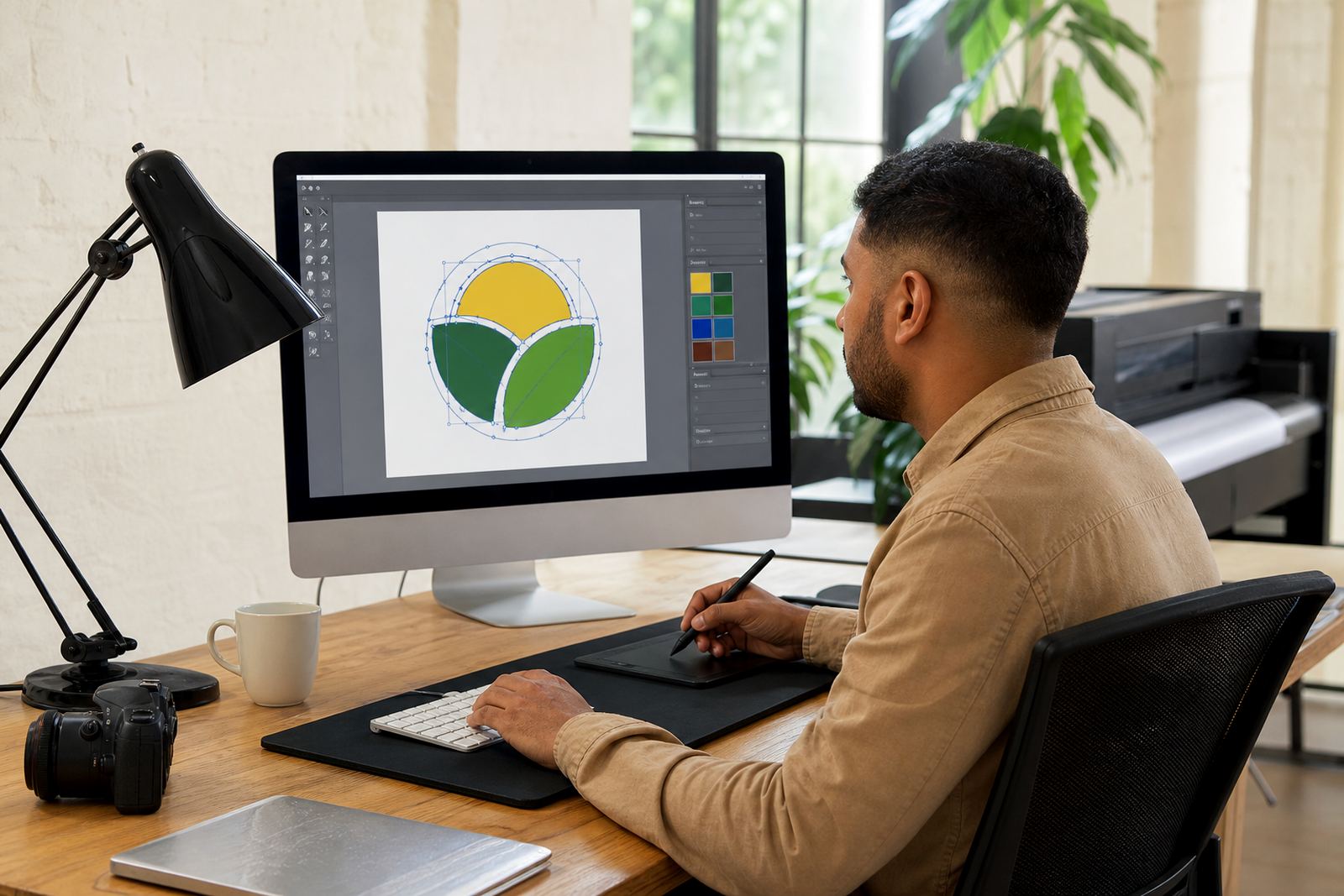
We usually separate the art into clean layers, so the shield, text, ornamental lines and supporting elements can be adjusted without disturbing the whole mark. That matters when a client needs a version for embroidery, a version for signage and a version for small digital use. It also helps when the crest has to work in one colour for stamps, foils or internal forms.
For businesses in places like Pretoria or Bloemfontein, where documents often need to stay formal and precise, a clean vector rebuild avoids the blotchy look that comes from using a stretched image file. The result is sharper and easier to control in print, on screens and on packaging.
The checks we make before a crest is rebuilt
Before any redraw starts, the source file needs to be checked properly. We confirm the best available version, note which details are essential, and establish whether the customer owns the artwork or has permission to use it. That point matters. If the client does not have rights to the image, it should not be rebuilt.
Then we look at the elements that will cause issues during production. Fine serifs, narrow gaps, dense hatching and tiny motto text are all areas where a crest can fail if it is not handled carefully. In coastal areas like Durban or Port Elizabeth, we also think about how the final file will hold up on outdoor signs and decals where humidity and weather can expose weak file preparation.
- Confirm ownership or rights to the source artwork before work begins.
- Identify small text that may need redrawing rather than copying exactly.
- Check whether the crest must be used in full colour, one colour or reverse only.
- Plan for print use, social media use and signage use from the start.
A local example from Observatory to the rest of the country
A common request comes from a Cape Town business with an old crest used on stationery, invoices and a faded shop sign. The original artwork might have come from a scanned image or a phone photo, and over time the lines have been distorted. In one case, the shield had unequal sides, the lettering had gaps, and a wreath on either side was no longer symmetrical. The team needed the logo redrawn for new menus, sticker labels and a clean PDF for print.
The solution was not to tidy the image by eye and call it done. The shield proportions were rebuilt, the lettering was redrawn to match the original feel, and the decorative border was simplified so it could reproduce clearly at small sizes. The final artwork could then be supplied as SVG, EPS, PDF and AI, making it easier for the client to hand over to printers, sign makers and anyone else who needed it.
That kind of work is common across South Africa. A business in Johannesburg may need a badge logo for uniforms. A group in Stellenbosch may need a heritage emblem for packaging. The need is the same: keep the identity intact while making the artwork practical for everyday use.
What a good crest redraw should give you
A proper crest rebuild should leave you with files that are ready for real use, not just a nice picture on a screen. The artwork should scale from a small social icon to a large sign without falling apart. It should also be easy to edit if a printer asks for a different format or a sign writer needs a cleaner outline.
Good vector files also make it easier to control colour. If a crest is going onto a label, menu, sticker sheet or badge, the file needs to hold its shape in black, white and full colour. That saves time later and reduces the risk of costly rework. It is a practical step, not a fancy one.
For ornate crests and emblems, the real value lies in accuracy. The line work should feel deliberate, the spacing should be even, and the artwork should still read clearly when viewed from a distance or on a small screen.
That is why rebuilding crests is best handled with patience, a steady hand and attention to the parts people usually overlook.