Why signage asks for a different kind of logo file
Signage is unforgiving. Once a logo is pushed up to a metre wide, every weak line, jagged edge and fuzzy corner becomes visible. That is why a logo made for social media or a website often needs to be redrawn before it can be used on boards, cut vinyl, acrylic faces or metal lettering. A clean vector file keeps the shape consistent whether it is 30 mm high on a label or 3 metres wide on a pylon sign.
For businesses in Cape Town, Johannesburg, Durban, Pretoria and Bloemfontein, the same practical rule applies: if the artwork has to be cut, routed, printed or painted, it should be easy to scale without losing clarity. A sign maker can work faster and with fewer corrections when the logo has proper outlines, solid geometry and tidy spacing between elements.
In coastal towns and humid areas, this matters even more. Salt air, strong sunlight and municipal sign requirements all put pressure on the finished product, so the artwork must be prepared carefully before anything goes to production.
Bitmap tracing and hand redraws are not the same thing
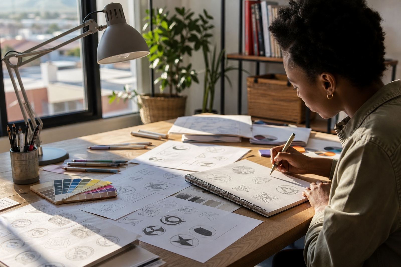
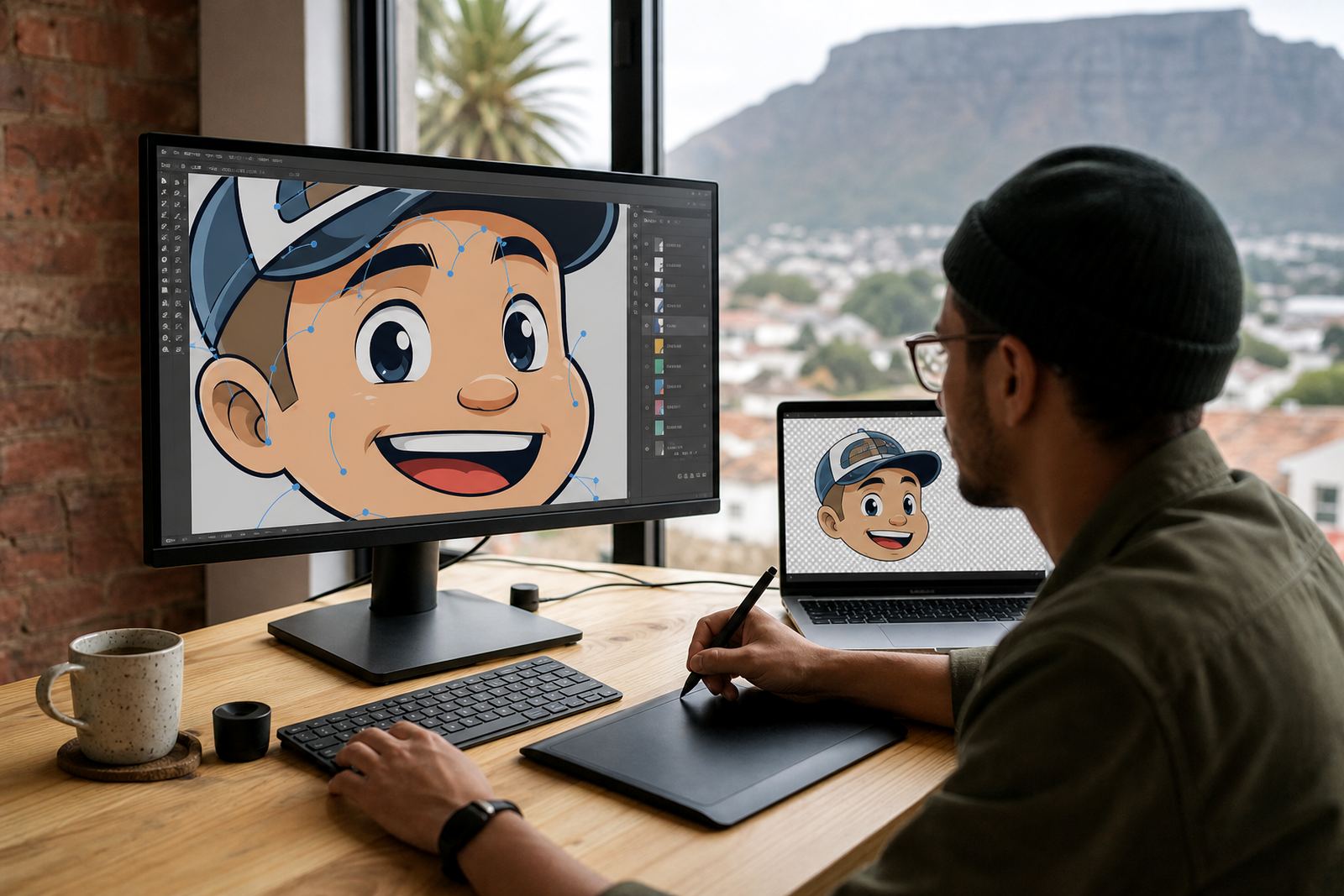
Many customers send a JPEG or PNG and ask for it to be “made vector”. There are two broad ways to do that. Bitmap tracing follows the pixels in the image and converts them into paths. A hand redraw rebuilds the logo from scratch, using the original artwork as a guide but correcting weak curves, uneven joins and poor spacing along the way.
Tracing can be useful when the source image is fairly clean and the logo is simple. But if the file is blurry, compressed or has gradients that will not suit signage, a manual redraw is usually the better choice. It gives more control over corners, stroke weight and alignment, which is important when a sign will be viewed from a driveway, across a street or from a shop floor.
We also look at whether the image contains details that are too fine for cutting. Small text, hairline rules and tiny decorative marks may need to be simplified so the final sign is readable and durable. That extra judgement is often what saves a client from costly rework later on.
What makes a logo easier to cut, print and mount
A logo that works for signage should be built with fabrication in mind. Thin strokes, overlapping effects and tiny internal shapes can create problems when the artwork is scaled up or cut out of vinyl, acrylic or aluminium composite. Good signage artwork keeps the structure direct and gives the installer enough space to work with.
Here is what usually helps most:
- Clear outer shapes with no unnecessary detail
- Consistent line weight across the mark
- Text that stays legible at a distance
- Separate colour areas that can be produced cleanly
- Enough spacing so cut vinyl does not lift at small points
- Vector paths that do not contain stray anchors or broken joins
When a logo has these qualities, it is easier to apply on a flat panel, a curved vehicle surface or an illuminated sign box. It also reduces the chance of production delays when the sign writer needs to check measurements against municipal rules or building requirements.
The best file types to ask for after the redraw
Once the logo has been redrawn properly, the working file should be supplied in formats that suit different trades. The most useful vector formats are SVG, EPS, PDF and AI. Each one serves a slightly different purpose, but they all preserve scale and shape without the image becoming blurry.
In practice, sign makers often want one file for cutting and another for print proofing, especially when the artwork has multiple colours or special alignment needs. A PDF is often convenient for reviewing layout, while EPS and AI are widely used in production workflows. SVG is useful for clean digital use and can also help when a sign needs to match online and physical branding.
It is also sensible to ask for a version with text outlined, plus a version with fonts noted where needed. That way, if a future update is required, the artwork can still be managed properly without guesswork.
A local example: a Cape Town shopfront with wind, glare and distance
Think of a small business in Observatory, Cape Town, fitting a new shopfront sign on a street with steady foot traffic and plenty of passing cars. The logo may look neat on a business card, but if it contains fine script, tiny shadows or a delicate badge, it can disappear once it is scaled for the exterior. Afternoon glare, coastal light and the viewing angle from the pavement all work against busy artwork.
In that situation, a hand redraw can make the logo stronger without changing its character. The main letters can be opened up slightly, the symbol can be simplified and the spacing between parts can be adjusted so the sign reads well at a glance. If the sign is for a retail unit, takeaway counter or workshop entrance, that clarity often matters more than decorative detail.
A practical redraw also helps when the sign needs to be repeated on window vinyl, a wall panel and a vehicle door. One clean master file keeps those applications consistent, and that consistency is often what customers notice first.
When to redraw, when to trace, and when to simplify
Not every logo needs a full rebuild, but many do. The choice depends on the condition of the source file and how the logo will be used. If the artwork is already clean and geometric, a careful trace may be enough. If the logo has been copied from a low quality image, contains old effects or was never set up for production, a full hand redraw is usually safer.
There are also times when simplification is the right answer. For example, a detailed illustration might work on a brochure but not on a cut acrylic sign. In that case, the logo can be redrawn into a stronger sign version while the full artwork is kept for print or digital use. That is often the best balance between brand detail and real-world production.
Customers should always own the artwork they send, or have the right to use it. That protects both sides and avoids problems when the logo is being adapted for sign fabrication, packaging or promotional materials.
What to send before production starts
Good results start with decent source material. Even if the original logo is old, a clear copy gives more to work with. If there are colour references, previous prints, sketches or notes about which parts must stay unchanged, send those too. The more context there is, the less back and forth later.
A useful brief usually includes the following:
- The best available logo file or image
- Where the sign will be used, such as a wall, window, vehicle or pylon
- The size of the final sign if known
- Whether the logo will be cut, printed, routed or laser cut
- Any parts that must remain exact, such as a symbol, letter shape or colour arrangement
- Confirmation that you own the artwork or have permission to use it
For businesses across South Africa, that preparation saves time and helps the finished sign install properly first time. It also gives the redraw artist a better chance of matching the look the client already trusts while making it practical for fabrication.