When a mascot needs more than a quick trace
A mascot that looks fine on screen can fall apart the moment it is scaled up for a banner, stitched onto workwear, or placed on a printed menu. Bitmap tracing can be useful when the source is clean and simple, but it usually follows the pixels that are already there. If the original art has fuzzy edges, odd shading, or poor proportions, a straight trace can lock those problems into the final file.
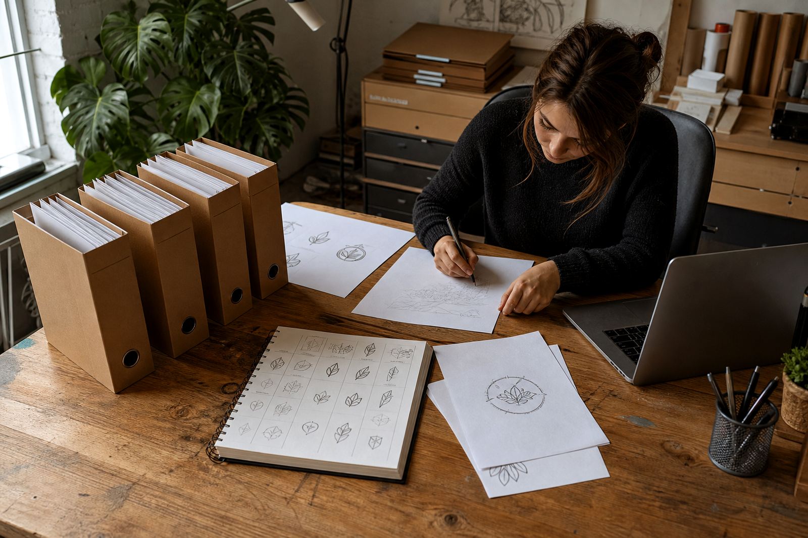
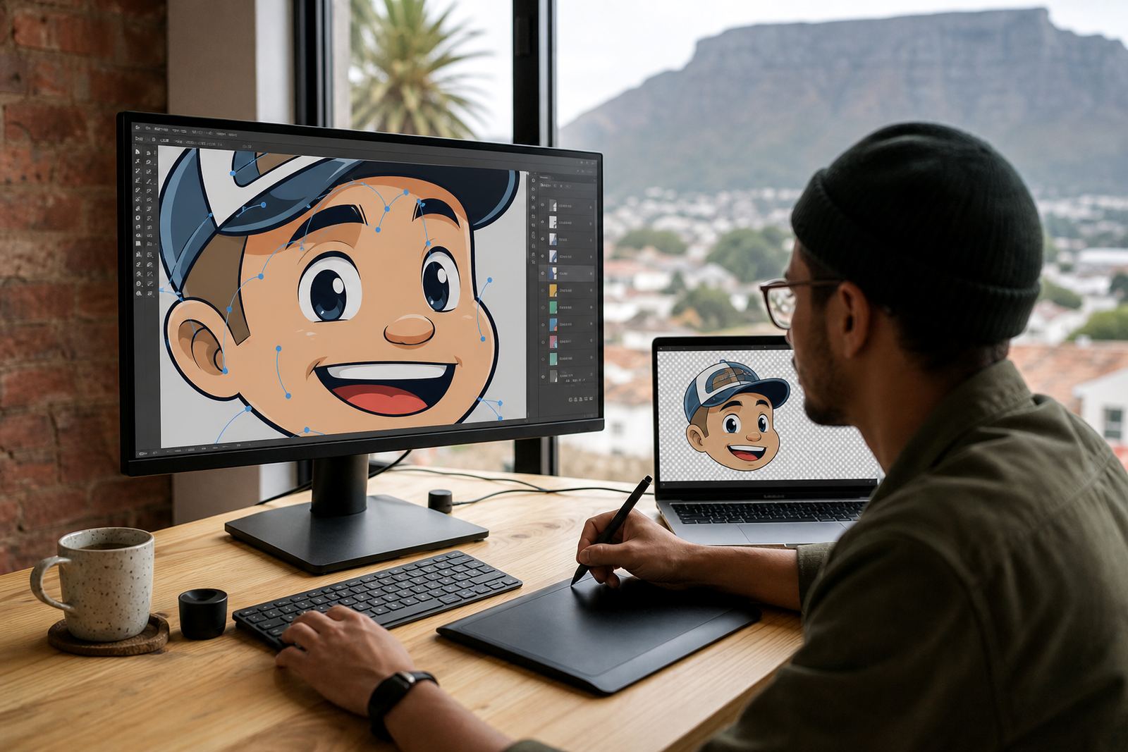
A proper hand redraw looks at the shape, weight and structure of the mascot first. That matters when you need a logo asset that can work in a 20 mm print on a sticker and also on a shopfront board in Cape Town wind. The aim is not to copy every rough mark. It is to rebuild the character so it behaves like a usable brand mark.
For businesses in Observatory and across South Africa, this is often the point where the artwork shifts from being a drawing to being an asset. That is a different job, and it needs different decisions.
Start with the rights to the artwork and the source file
Before any redraw begins, make sure you own the artwork or have clear rights to use it. That includes sketches from a former designer, artwork from an old campaign, or a mascot that has been passed around your team for years. If the rights are unclear, a redraw can create problems later when the logo is used on packaging, signage or uniforms.
The best starting point is the cleanest source you have. A high-resolution file helps, but even a small bitmap can be useful if the lines are readable. If the image is badly compressed, or if someone has already resized it too many times, it may need more rebuilding than tracing. That is often the case with older files used by firms in Johannesburg or Durban where the logo has been copied through many hands.
- Keep the original file, even if it looks rough.
- Send any sketches, old artwork, or previous versions you have.
- Share notes about colours, line weight and anything that must stay recognisable.
- Confirm that you have the right to ask for the artwork to be redrawn.
Why hand redraws usually read better than bitmap tracing
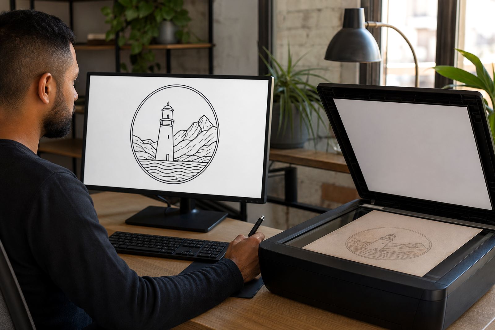
Bitmap tracing is fast, but it often reproduces uneven curves, broken outlines and detail that does not belong in the final mark. A hand redraw lets the artist tidy the proportions, simplify clutter and rebuild the mascot for practical use. That can mean changing the thickness of the outline, reducing internal detail, or adjusting the face so it still reads at small size.
This is especially important with mascot faces, hands and clothing, where tiny errors can make the character look off. In a traced file, one eye may sit higher than the other, or a paw may have a shape that becomes awkward once the file is enlarged. A hand redraw gives the artist room to fix those issues and keep the personality intact.
For print work in the Western Cape, the difference can be very noticeable.There is less risk of surprises, which matters when the final use is a sign board or a courier carton.
Choosing the right vector file format for real use
Once the mascot has been rebuilt, the file format needs to suit how the artwork will be used. SVG is useful for digital applications and web use. EPS and AI are common working files for design and print production. PDF is often handy for sending artwork to printers, sign makers and packaging teams because it opens easily and keeps the artwork intact.
One file type is not enough for every job. A good handover usually includes the main vector file and a PDF version for sharing. If the mascot will be used by different teams in Cape Town, Pretoria or Bloemfontein, it helps to keep the file names clear and the artwork organised. That way the right version is used for embroidery, the right version for packaging, and the right version for digital graphics.
- SVG for flexible digital use and smaller web graphics.
- EPS for print shops and older production workflows.
- PDF for easy viewing and sending to suppliers.
- AI for editable working files in design production.
What to simplify without losing the mascot’s character
The challenge in mascot rebuilds is to simplify without stripping out the personality. Too much detail can turn into noise when the artwork is reduced. Too little detail, and the mascot stops feeling like itself. The trick is to keep the features people recognise first, then remove anything that does not support the mark.
That might mean keeping a bold outline, a strong facial expression and one or two key accessories, while dropping tiny texture marks or complicated shading. For a mascot used on stickers, menus or social graphics, this is usually the better route. The art becomes easier to reproduce and less likely to blur out on small formats.
It also helps with local production conditions. In humid coastal areas like Stellenbosch or Port Elizabeth, some printed materials can shift slightly in handling. A cleaner mascot with fewer fragile details gives suppliers a better chance of a sharp result, and less rework after proofing. It also keeps the character legible when the print is small or the material is textured.
A local example: from rough sketch to usable brand asset
Consider a small Cape Town takeaway that starts with a hand sketch of a rooster mascot. The drawing has charm, but the outline is uneven and the feet are drawn in a way that works on paper only. The owner wants the rooster on packaging, a menu, a sticker sheet and a simple badge for staff aprons. A bitmap trace would capture the unevenness, but it would not solve the practical issues.
A redraw begins by deciding what must stay. The beak shape, the posture and the expression are kept. The legs are simplified, the tail is cleaned up, and the outline is rebuilt so it reads well at a distance. The final files are delivered as SVG, EPS, PDF and AI, with versions prepared for print and digital use. The mascot still feels hand-drawn, but it is now suitable for real production.
That kind of rebuild is common for businesses that have grown from a one-off sketch into a proper brand system. The artwork no longer needs to just look good once. It needs to work across several jobs, several suppliers and several towns without losing its shape.
What to send when you want a mascot redrawn properly
If you are ready to have a mascot rebuilt, send the clearest source available and a short note on where it will be used. Mention whether it needs to work on packaging, social graphics, signage, uniforms or print items. If there are old versions of the mascot, include those too, even if they are messy. Sometimes the old file contains a detail that people still expect to see.
It also helps to say which parts are non-negotiable and which parts can be improved. A good redraw is not just about cleaning lines. It is about making a mascot that behaves well in production and still feels like your business. For companies across South Africa, from Observatory to Bloemfontein, that practical step can save time later on.
When the artwork is sorted properly at the start, the rest becomes easier. Printers ask fewer questions, file versions stay organised, and the mascot can be used with confidence instead of being patched up each time it appears.