Why colour references matter before any redraw starts
When a business asks for a logo redraw, the first thing we look for is a clear colour reference. A brand colour can appear slightly different on a faded business card, a phone photo, a stitched shirt, or a sun-worn signboard. If we do not have a reliable reference, the redraw may be neat, but the colour can drift from what customers expect.
That matters for South African businesses that use the same logo on shopfronts, invoices, uniforms and social graphics. A colour that looks fine on a screen in Observatory may print too dull on a label, or too bright on a banner in Bloemfontein. Matching starts with the source material, then we check how it behaves in different file formats and uses.
- Best references are original artwork files, printed brand guides, or a clear file sent from the owner of the logo.
- If you only have a photo or scan, send the cleanest version you can find, with even lighting and no shadow.
- If the logo has been used for years, a few examples from signs, packaging or stationery help us identify the intended colour.
What to send so the colour stays as close as possible
The more complete the reference, the easier it is to keep the redraw close to the existing brand look. We often work from old artwork, printed samples, rough scans and screenshots, but the strongest result comes from a file that shows the logo in its intended colours. If the artwork belongs to your business, or you have permission to use it, we can work with it. If not, it is better to sort the rights first before any redraw begins.
Colour notes are useful too. Even simple wording like deep navy, warm red, charcoal, or forest green gives a starting point. If you know the original print method, for example litho, digital print or embroidery, say so. That helps when we are matching a logo for a marine-facing business in Durban, where humidity can affect labels, or for a Cape Town bakery that needs the same tone on paper bags and glass decals.
- Send any existing artwork in the highest quality available.
- Include one or two examples of how the logo is used in real life.
- Mention if the logo must suit signwriting, laser cutting, embroidery or small-scale print.
- If the old files are missing, tell us what colour has been used most consistently over time.
Bitmap tracing versus hand redraw: the colour difference
People often think all redraws are the same, but there is a clear difference between tracing a bitmap image and redrawing a logo by hand. Bitmap tracing follows the edges of an image file and can be useful for quick recovery of simple shapes. But if the source is fuzzy, low resolution or colour-shifted, the result can inherit those problems.
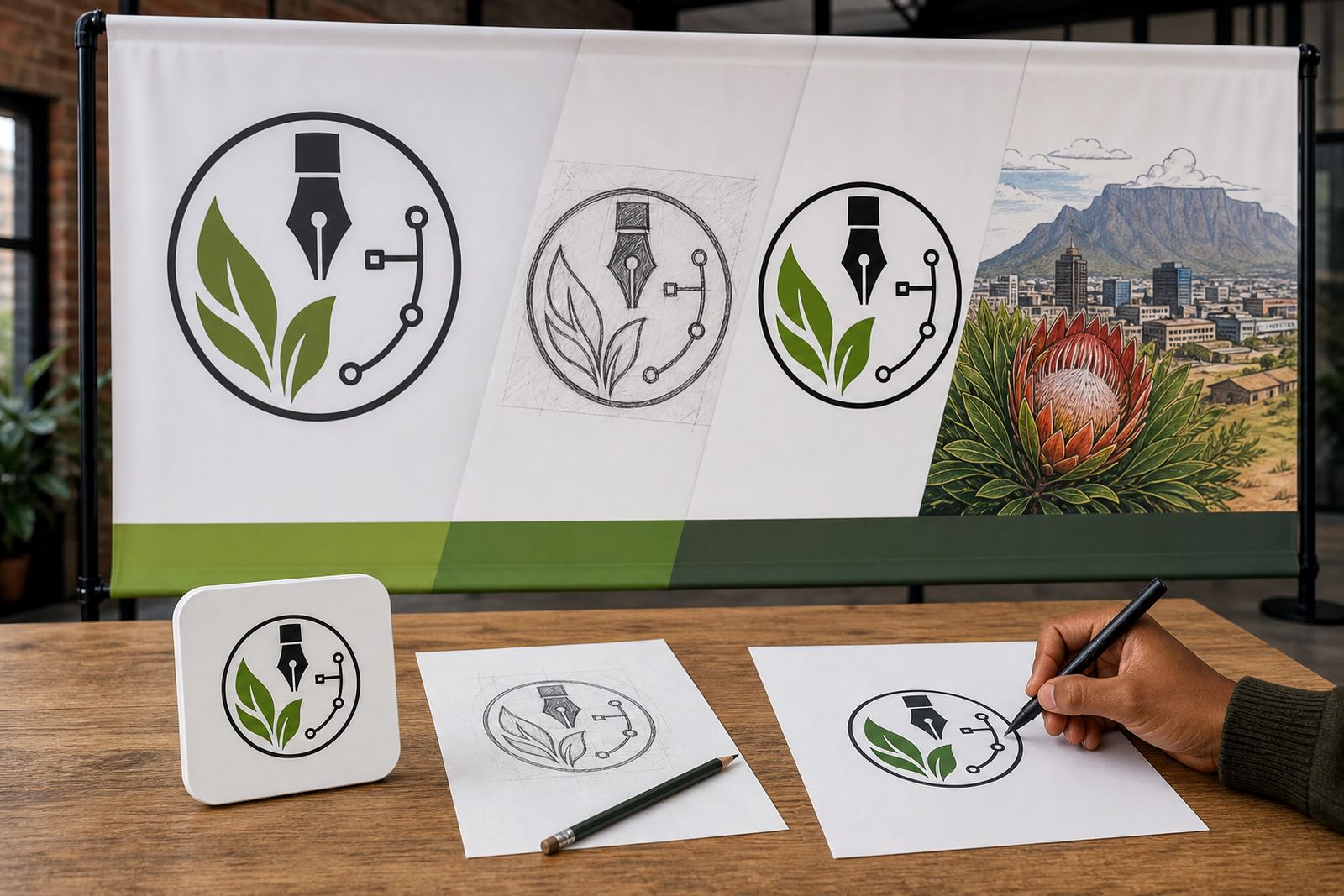
A hand redraw gives more control. We rebuild the logo as clean vector artwork, then check each colour area, shape and line against the reference. That is especially helpful when the artwork has a lot of small colour changes, uneven edges, or old print artefacts. For illustration work, hand drawing also gives us more freedom to keep the style tidy without losing the character of the original.
For many brands, the best result is not a simple trace. It is a careful redraw with a proper eye on colour balance, spacing and how the artwork will behave in SVG, EPS, PDF or AI formats. Those files can be used for print, signage and digital work without the rough edges that come from a low quality image.
How we handle tricky colours in South African conditions
Local conditions can change how a logo colour looks.For businesses in Johannesburg, Pretoria and Cape Town, the same colour may need small adjustments depending on the surface and method.
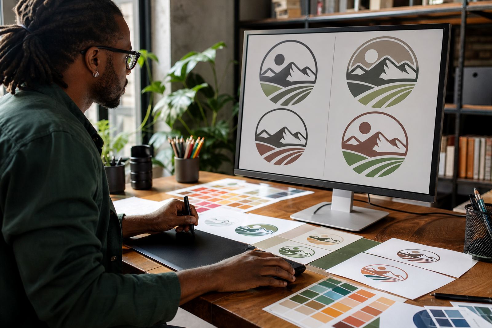
We usually work by first matching the logo as closely as possible to the supplied reference, then checking whether the colour still reads well in practical use. A red that works on a website may look too dark on a courier envelope. A pale blue might lose clarity on a white van. Colour matching is not just about the screen, it is about what the customer sees in the real world.
That is why we often suggest keeping one master version of the logo in vector format, then preparing separate export versions for print and screen. It saves time later and keeps the brand steadier across offices, branches and packaging lines.
- Use the same colour reference for every new supplier where possible.
- Ask for a clean master file and separate exports for each use.
- Check the logo on both white and dark backgrounds before sign off.
File formats that help preserve the right colour
Once the redraw is complete, the format you receive matters. SVG is useful for websites and digital graphics. EPS is often used for print and sign work. PDF is practical for sharing and approving artwork. AI is the working file format many designers use when further edits are needed. A good logo redraw should be prepared so the colour stays consistent across these formats, not only in one preview image.
Vector artwork also helps with resizing. A logo can be used on a small sticker in Stellenbosch, then enlarged for a building sign in Port Elizabeth, without losing edge quality. If the colour has been matched properly at the master stage, each export will stay much closer to the same visual result. That is especially useful for businesses with more than one branch or supplier.
- SVG for web and digital use.
- EPS for print, signage and production workflows.
- PDF for approvals and everyday sharing.
- AI for editable master artwork.
A practical example from an Observatory brief
Say a family business in Observatory brings in an older logo that has been used on cartons, invoices and delivery labels for years. The scanned file is soft, and the blue looks different on each sample because of age and paper type. We would ask for any clean version the business still has, plus a few photos of the logo in use. Then we compare the colours carefully and redraw the artwork so the shape is cleaner while staying close to the original look.
In that sort of brief, the owner usually wants the logo to work for a new set of menu cards, a sign above the shop, and social graphics for branch announcements. We would keep the colour stable across all versions, then supply the correct files for each use. The result is not a new identity, but a tidier version of what people already recognise.
That is the real value of colour matching. It protects recognition while giving you artwork that is usable, sharable and ready for production.