Why vector logos keep their shape at any size
Vector artwork is built from points, lines and curves rather than fixed pixels. That means a logo can be scaled up for a building sign in Cape Town or reduced for a social media icon without turning soft or blocky. For businesses that need the same mark on invoices, uniforms, vehicle graphics and packaging, this is the safest way to keep the brand consistent.
When a logo is set up properly, the edges stay crisp and the proportions stay balanced. A clean vector file also gives printers and signwriters a far better starting point, especially when the job must be repeated across different materials. In South Africa, where one brand may need artwork for litho, digital print, embroidery and vinyl, that flexibility saves time and avoids rework.
- SVG files work well for digital use and web friendly artwork.
- EPS files are commonly used for print and sign production.
- PDF files are useful for sharing approved artwork with suppliers.
- AI files keep editable vector layers for future updates.
When bitmap tracing is useful and when it falls short
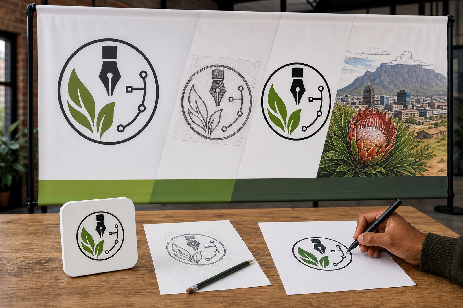
Bitmap tracing can be a practical starting point when the only source is a low resolution image, scan or old photo. Software can detect shapes and convert them into vectors, which is useful for simple logos with solid edges. But tracing alone does not always solve the real problem. If the source is fuzzy, damaged or has uneven strokes, the result can keep those flaws and make them more obvious when enlarged.
That is why tracing works best for basic artwork and not for detailed marks with small text, delicate lines or uneven shading. A traced file can still need manual clean-up, otherwise the curves may look lumpy and the corners may be off. For businesses that want a proper file for long term use, tracing should be treated as a tool not a final answer.
- Best for simple logos, icons and flat shapes.
- Needs clean-up where the source image is blurred or pixelated.
- Can struggle with fine lettering and complex line work.
- Should be checked at large and small sizes before release.
Why a hand redraw often gives a safer result
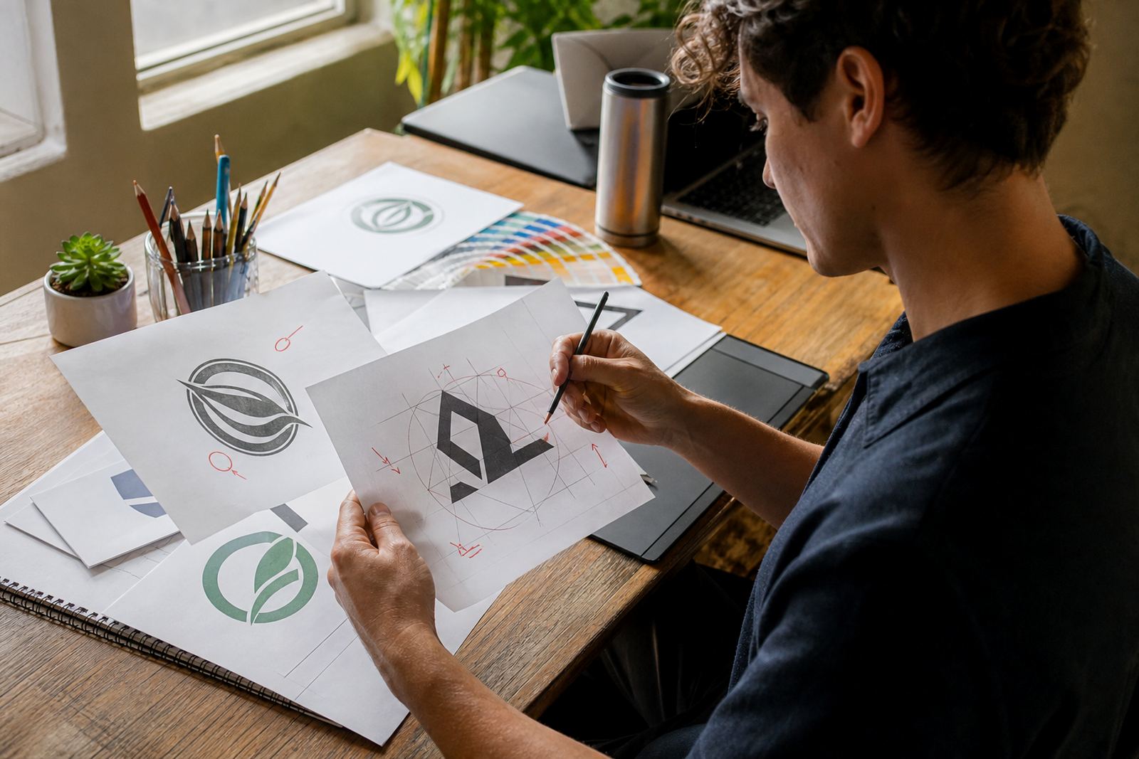
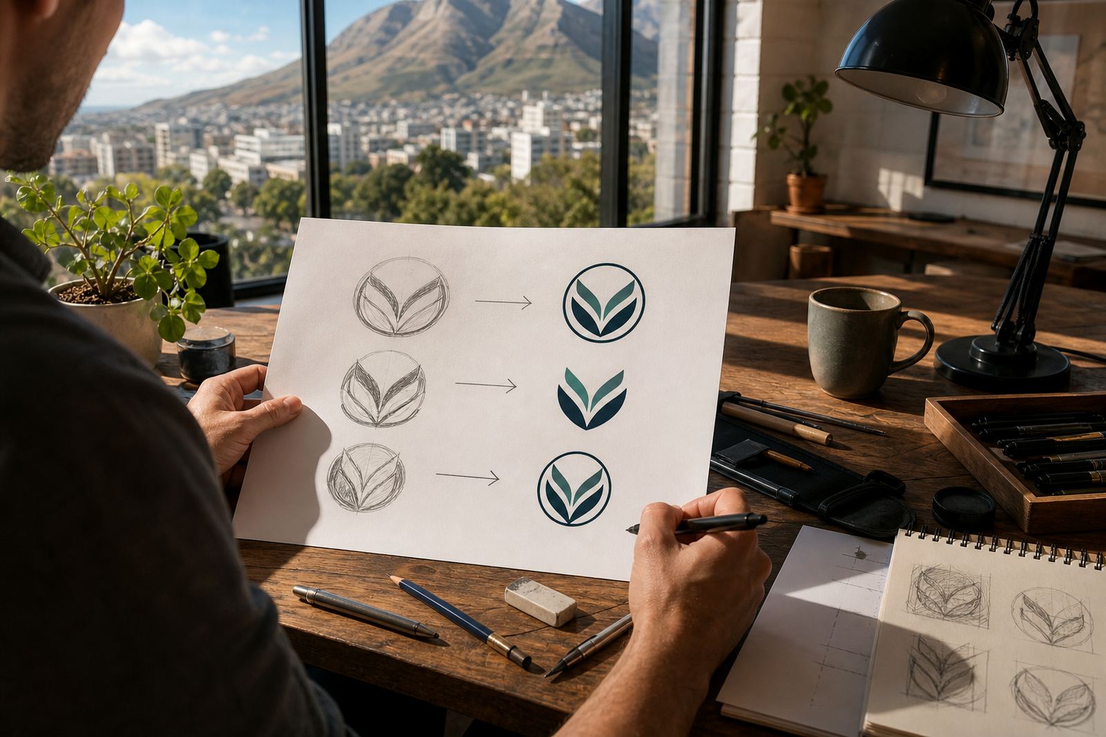
A hand redraw is different from tracing because the artist rebuilds the logo from scratch in vector form. This is usually the better option when the original file is poor, the artwork has been altered over time, or the logo needs careful correction. The process takes more judgement, but it gives better control over line weight, spacing and balance.
For example, a restaurant in Observatory may bring in a logo that was photographed from an old takeaway box and used on multiple flyers over the years. The text may sit at slightly different angles, and the emblem may have been stretched by different printers. A hand redraw can restore the original structure and create a file that is safe for menus, signage and delivery stickers. That kind of work matters when a brand is being used across Cape Town, Johannesburg and Durban, because every supplier may handle the art differently if the file is not tidy.
In practical terms, hand redraws are often the better choice when there is a need to preserve a brand’s character while removing noise from the source file. The result is not only cleaner, it is easier to reuse later without constant fixes.
Detail reduction matters more than most people think
Scaling a logo safely does not mean every detail must stay exactly as it first appeared. Small features that look fine on a poster can disappear on a pen, a courier van or a stitched cap. In those cases, some detail reduction is necessary so the artwork remains readable and practical. This is especially true for businesses that order a mix of print, signage and apparel work.
Good preparation often means making a small set of approved versions rather than forcing one file to do every job. A full logo may work for a brochure, while a simplified mark is better for a favicon or sticker. The aim is to keep the identity recognisable without overcrowding the format.
- Reduce tiny text that will not survive small sizing.
- Simplify fine decorative lines for embroidery or vinyl cutting.
- Keep clear space around the mark so it does not feel cramped.
- Prepare a one colour version for stamps, labels and certain municipal submissions.
File formats that help printers and sign makers do their work
Different jobs call for different file types, and it helps to know what each format is good for. SVG is handy for digital use and scalable artwork on screen. PDF is useful when a printer needs a clean proof or a portable file for approval. EPS remains common in production workflows because many suppliers can open it easily. AI files are useful when editable layers must be kept for future changes.
For a business in Pretoria ordering vehicle decals, or a supplier in Bloemfontein preparing branded folders, the format matters just as much as the artwork itself. A crisp vector file reduces the risk of jagged edges, missed strokes or awkward resizing. It also makes it easier to apply the same artwork to different products without starting again each time.
Before any file is handed over, it should be checked for correct spelling, outlines on text where needed, and a clear understanding of the final use. That small amount of care saves a lot of trouble later.
Rights, source files and the local example that keeps cropping up
Any redraw or illustration work should only begin when the customer owns the artwork or has the right to use it. That includes logos from a founder, marketing team or previous designer, plus old graphics pulled from packaging or a scanned sign. If the rights are not clear, the artwork cannot be properly used or passed on for production. This is not a detail to gloss over, because it affects every future print run and update.
A simple local example is a Stellenbosch wine farm that needs a vintage-style badge cleaned up for labels, tasting room signs and a menu insert. The source may be a faded scan or a JPEG from years ago. A safe workflow is to confirm rights first, then decide whether tracing is enough or whether a full hand redraw is needed. That way the final file can be used on labels, maps, social graphics and seasonal packaging without problems.
- Confirm ownership or permission before work starts.
- Keep the original source files for reference and comparison.
- Ask for the main uses up front so the artwork suits print and screen.
- Request the final formats needed for future suppliers.
What to ask for before your logo goes to print
If you are sending a logo for redraw or cleanup, ask for a version that can handle the actual jobs it must do. A file for a menu is not the same as a file for a roadside sign in Durban or a sticker sheet for product packaging in Port Elizabeth. The safest setup is usually a master vector file plus export versions for the most common uses. That gives your team and suppliers room to work without stretching or pixelating anything.
At Vectorization Studio in Observatory, Cape Town, the aim is to make logo redraws and hand drawn vector illustrations practical for real production work across South Africa. That includes custom brand icons, mascot illustration, packaging illustration, map illustration, menu illustration, sticker illustration, pattern illustration, infographic illustration, badge illustration, line illustration, scene illustration and social graphics. The better the source and the clearer the rights, the cleaner the end result. And once the artwork is set up properly, it is far easier to keep it looking right across different sizes and materials.