Why an older logo starts causing trouble
An older logo can look fine on a signboard or a shopfront, then fall apart when someone tries to use it on a small label, invoice, uniform embroidery or social graphic. Jagged edges, thick lines that close up, missing fonts and low resolution files are common problems. In Cape Town and other busy centres, suppliers often need artwork that can move from a tiny sticker to a large format print without losing detail.
A redraw is worth considering when the logo has sentimental value, but the working file is only a flat image from a scan, WhatsApp photo or old printout. In those cases the aim is not to change the brand, only to make it usable again.
- Pixelated edges on enlarged artwork
- Text that no longer matches the original lettering
- Shapes that need separate versions for print and digital use
- Artwork that cannot be supplied in clean vector format
Bitmap tracing versus hand redraw
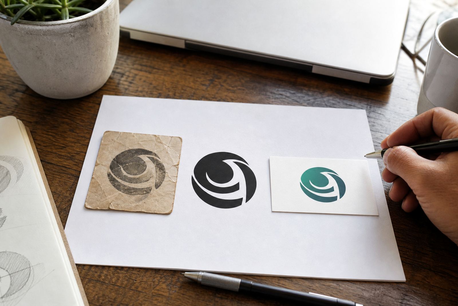
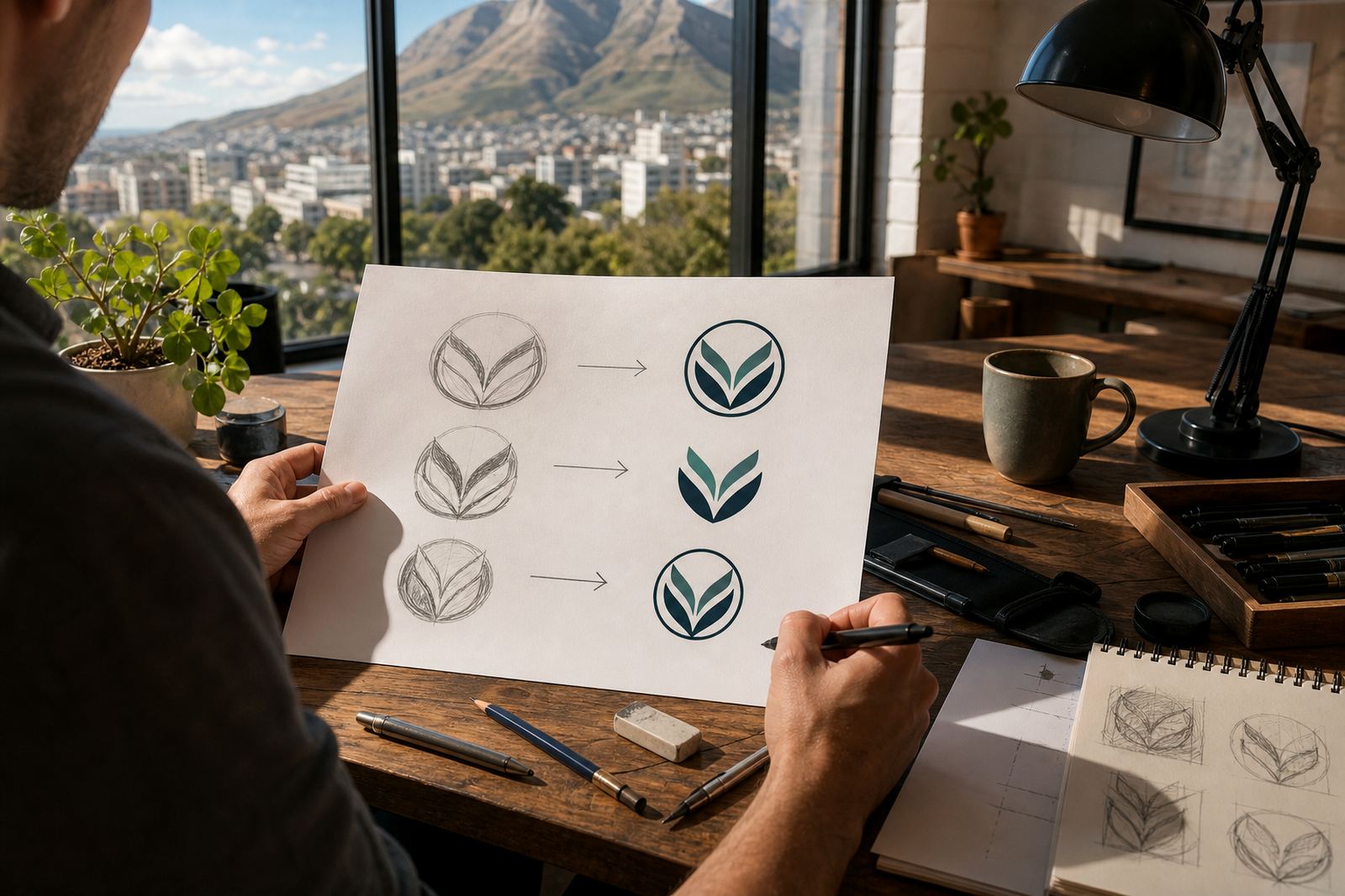
There is a difference between tracing a bitmap and redrawing a logo by hand. Tracing follows the outside of an existing image, which can be useful for very simple marks but it often copies flaws from the source. A hand redraw is more considered. The shapes are rebuilt, lines are tidied and details are checked against the original artwork or a trusted reference.
For heritage marks, a hand redraw is usually the better route because it keeps the spirit of the original while fixing the rough bits. That matters when a business wants to keep a long standing symbol, a family crest style mark or a trade logo that has been used for years across branches from Johannesburg to Bloemfontein.
In practice, the right method depends on what you have. A clean PDF with vector paths may only need a light tidy up, while a faded scan from an old brochure may need full reconstruction from scratch. Sometimes the best result comes from a mix of both, especially where lettering and emblem details need separate attention.
What a proper vector file gives you
Once artwork is rebuilt as vector, it can be supplied in formats that suit different production needs. That usually includes SVG, EPS, PDF and AI. These file types are easier to resize, separate and prep for printers, signage makers and digital use. They also hold up better in coastal humidity and on jobs that need multiple revisions, from menu boards in Durban to packaging in Paarl.
Good vector files make life easier for prepress and for any supplier who needs clear artwork with accurate edges. They also help when a logo must be used in one colour, reversed out, or adjusted for laser cutting, embroidery or vinyl cutting.
- SVG for web and scalable digital use
- EPS for print and trade output
- PDF for easy sharing and proofing
- AI for editable working artwork
When heritage should stay, and when detail should change
Refreshing an older brand is not the same as rebranding from zero. The main question is whether the logo still does its job. If it is recognisable, linked to goodwill and part of how customers know the business, then the redraw should protect those core parts. Small refinements may still be needed, such as fixing spacing, balancing line weight or simplifying very fine detail that will not print well at smaller sizes.
Local trading conditions matter too. A bakery in Observatory may need artwork that works on takeaway bags, window vinyl and stickers. A contractor in Pretoria may need the same mark to read clearly on vehicle branding, invoices and safety signage. The art should hold up across all of that without looking heavy or awkward.
It helps to decide what must stay and what can be adjusted. A good brief usually starts with the outline, lettering, main icon and any colours that are tied to the brand. From there, the redraw can be built to suit modern use without stripping away the history.
A practical process for South African businesses
The best results come when the source material is clear and the owner has the rights to use it. Customers should only send artwork they own or have permission to use. That keeps the job straightforward and avoids problems later when the files are handed to printers or sign shops.
Once the source is checked, the redraw process usually follows a few simple steps: assess the artwork, rebuild the shapes, refine the lettering, test the logo at small and large sizes, then prepare the final vector files. If the mark also needs an illustration version, that can be developed separately so the brand has both a clean logo and a hand drawn graphic style.
- Send the best source file you have, even if it is old
- Note where the logo will be used most often
- Say whether the artwork must stay close to the original or can be modernised slightly
- Confirm the final file types you need for print and digital use
A local example of a useful refresh
Picture a family run business in Stellenbosch that has used the same mark since the early 2000s. The logo has history, but the old artwork was never set up properly for signage, social graphics or product labels. The lines are uneven, the type is hard to read at small sizes and the file supplied by the previous printer is too limited for new work.
A redraw can keep the recognisable core of the brand while cleaning up the mark for modern use. The owner still gets the familiar look customers know, but now the artwork can be used on packaging, stickers, menus and event banners without the usual headaches. That kind of update is often the difference between a logo that is preserved and one that gets retired because it is too awkward to use.
For businesses across South Africa, from Cape Town to Port Elizabeth, that practical middle ground matters. It lets the brand keep its story, while giving suppliers the files they need to do the job properly.