When a wordmark needs more than tracing
Many businesses first ask for a logo redraw when the only artwork they have is a screenshot, a low resolution JPEG, or a photo of a signboard. A bitmap trace can follow the outline of the letters, but it often carries across rough edges, uneven curves and awkward spacing. That may be fine for a quick reference, but it is not the same as rebuilding the wordmark properly.
A hand rebuilt wordmark is drawn letter by letter, with attention to proportions, baseline, counter spaces and how each character sits against the next one. For brands that use their name as the logo, that difference matters a lot. It can be the difference between something that prints cleanly on a courier label and something that looks fuzzy or unbalanced.
- Best for low quality originals, old scans and photos
- Useful when the lettering needs cleaner kerning and alignment
- Better for reprints, large format signage and small scale use
Bitmap tracing versus hand redraw
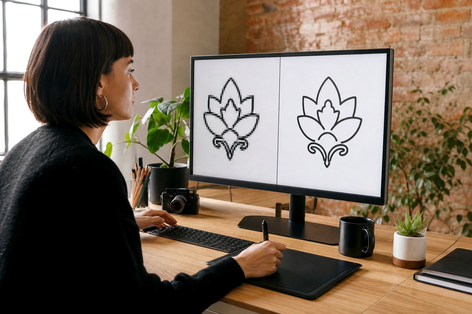
Bitmap tracing works by converting the visible outline of an image into vector paths. It is fast, but it also copies noise from the source. If the original file is blurry, stretched or badly compressed, the traced result can keep those flaws. That is why a traced wordmark may look acceptable on screen and still feel off once it is enlarged, cut in vinyl or placed on packaging.
Hand redraw goes further. The artwork is rebuilt with proper vector curves and consistent spacing, so the letters feel balanced rather than merely traced. For a company in Observatory or a supplier in Durban, that can matter when the wordmark needs to sit on invoices, uniforms, vehicle graphics and social graphics without changing shape or weight.
- Tracing copies the source image, including imperfections
- Hand redraw corrects proportions, spacing and curve quality
- Redraws are better when the logo must stay crisp at many sizes
What goes into a rebuilt typographic logo
Rebuilding a wordmark is not only about drawing the letters again. It also means checking how the text sits on a line, whether the joins are clean, and how the logo reads in black and white as well as in colour. Some wordmarks need slight optical corrections so that round letters do not appear smaller than straight ones. Others need tighter spacing in one part and more breathing room in another.
That is especially important for businesses that print on corrugated boxes, laminated menus, stickers or painted walls. In coastal areas like Cape Town and Port Elizabeth, material choice and print method can also affect how a fine line or tight gap behaves. A good rebuild takes those practical conditions into account from the start.
- Letter spacing and baseline alignment are checked carefully
- Small optical fixes are made so the wordmark reads well at size
- The artwork is prepared for print, signage and digital use
File formats that make the artwork usable
Once the wordmark is rebuilt, it should be supplied in proper vector file formats. SVG is useful for digital use and scalable web graphics. EPS and AI are commonly used for professional print and editing workflows. PDF is often the easiest file to share with printers, signage makers and office teams who just need a clean copy.
The point is not to hand over one file and hope for the best. A business should have a small set of files that work across different jobs, whether the logo is going onto a tax invoice in Pretoria, a sticker sheet in Bloemfontein, or a set of branded boxes in Johannesburg. Clear file naming also helps when teams need to find the right version quickly.
- SVG for scalable digital use
- EPS and AI for editing and production
- PDF for easy sharing with printers and suppliers
A local example from a small business rebrand
A Cape Town business in Observatory may come in with a 12 year old wordmark saved only as a low quality image. The letters may be close to what they want, but the spacing is uneven and the logo falls apart when reduced for a label. In that case, a redraw is not about changing the brand identity. It is about restoring it so the name reads clearly on a shop front, an invoice and a social media avatar.
For many South African businesses, that is a practical fix before they spend money on new packaging or a signage refresh. It also makes life easier when a printer asks for clean vector files, or when a supplier needs artwork that can be scaled up for a wall sign. A properly rebuilt wordmark saves time later, because everyone is working from the same artwork.
What clients should send before redraw work starts
Before any redraw or illustration work begins, the client should have the right to use the artwork they send. If the logo belongs to someone else, or if permission has not been granted, it cannot be redrawn responsibly. Once that is clear, the best source file is the cleanest one available, even if it is not perfect. Old PDFs, scans, business cards and photographs can all help when the original artwork is missing.
It also helps to send notes about what must stay the same and what needs improvement. Some clients want exact letter shapes but cleaner spacing. Others want a hand drawn version that keeps the name recognisable while giving it more character. A short brief usually avoids back and forth and keeps the redraw focused on the real problem.
- Confirm that you own or have rights to the artwork
- Send the best source available, even if it is low resolution
- Note what must stay fixed and what can be improved