Why a single-colour version still matters
A logo does not always need gradients, shading or multiple inks to do its job. In many everyday settings, a single-colour version is the most useful file because it prints clearly, scales well and keeps costs down when production is simple.
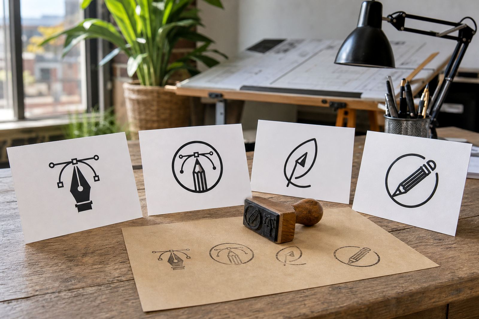
For South African businesses, this matters on items like rubber stamps, small stickers, invoice headers, municipal forms, workwear and product sleeves. When a logo is reduced to one colour it has to hold its shape properly, with clean spacing and solid line work. If the original artwork is messy, the result can look uneven or blur out at small sizes.
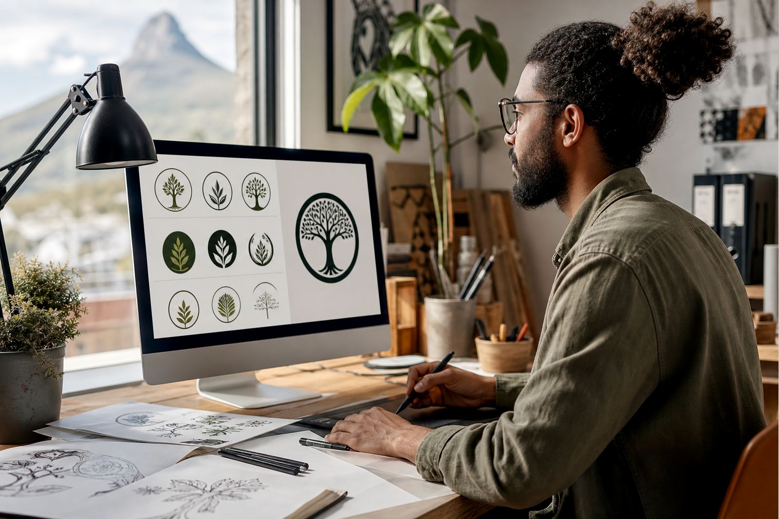
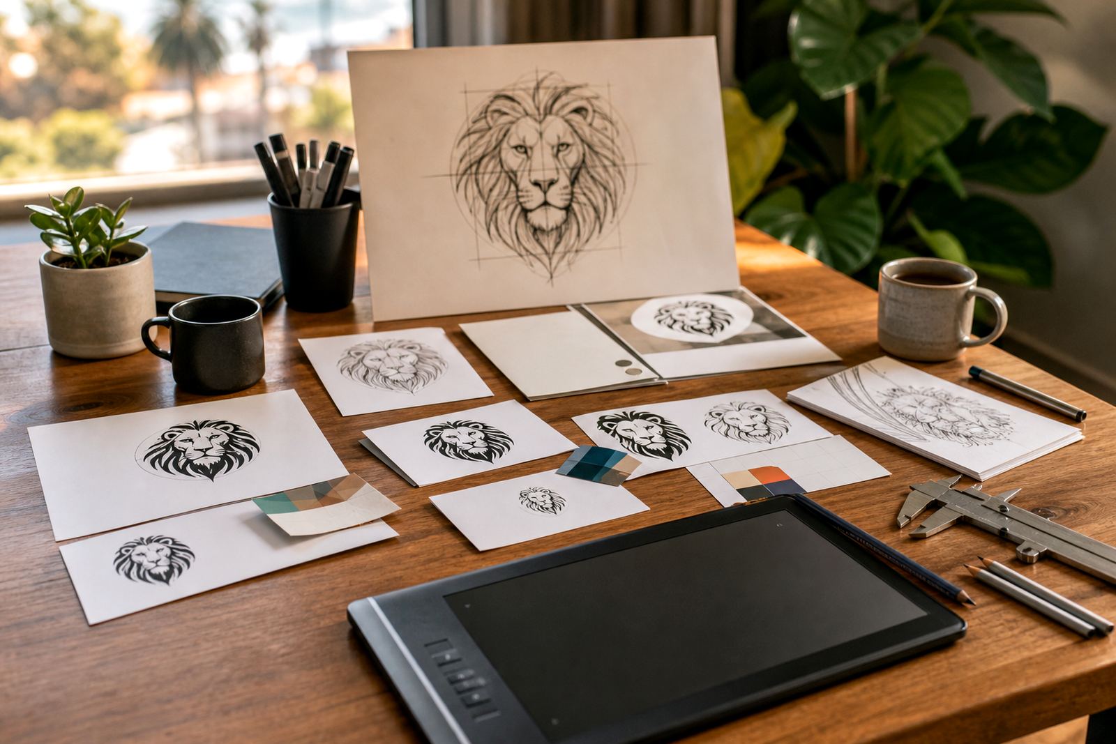
That is why we redraw logos by hand where needed, rather than relying only on bitmap tracing. A traced image can follow the rough outline of a low-resolution file, but it often keeps unwanted bumps, crooked curves and patchy edges. A proper redraw gives you a cleaner one-colour master that is ready for practical use.
Where one-colour artwork earns its keep
A one-colour logo is not just a backup file. It is often the version your printer, embroiderer or sign writer asks for first. It saves time during production because there is no need to separate layers of colour or adjust gradients for different materials.
- Stamps and embossing, where small details must stay readable
- Embroidery on caps, shirts and jackets, where fine shading is hard to reproduce
- Laser cutting and vinyl cutting, where clean outlines matter
- Single-colour stationery, delivery notes and carbon copy books
- Simple packaging, labels and cartons with limited print options
In humid coastal areas like Cape Town and Port Elizabeth, many clients also want artwork that behaves well on different substrates, from coated paper to fabric and plastic. A one-colour logo is easier to use across those materials, especially where moisture, heat or rough handling can make detailed artwork look weak.
Hand redraw or bitmap tracing: what is the difference?
Bitmap tracing can be useful when a logo is already sharp and well set out, but it is not always the best answer. If the source file is blurry, tilted or compressed, tracing can lock those problems into the new version. A hand redraw gives the artist control over every curve, corner and letterform.
For one-colour work, that control matters. The counter spaces inside letters, the thickness of strokes and the balance between icon and text all need to be checked carefully. A logo that looks fine on screen can fail at 20 mm wide if the spaces fill up or the line weights become too thin.
We often compare both approaches before deciding on the best route. If the original artwork is clean enough, a trace may be suitable. If the logo has been photocopied, resized many times or pulled from a poor image, a hand redraw is usually the safer choice.
- Hand redraws suit damaged, old or low-resolution originals
- Tracing may suit clean, simple artwork with strong edges
- One-colour files need strong spacing and balanced stroke weights
- Small applications often reveal flaws that are hidden at large size
File formats your printer will actually use
When a logo is redrawn properly, it should be supplied in formats that work for production and archiving. Vector files are the standard because they can scale without losing quality. That means the same logo can be used on a tiny sticker or a large sign without becoming soft or pixelated.
Common output formats include SVG, EPS, PDF and AI. Each format serves a practical purpose. SVG is useful for digital use and web-friendly systems, EPS remains a common print file, PDF is handy for sharing and proofing, and AI is often kept as the editable master file. We supply one-colour versions alongside other working files where needed, so your printer has the right option from the start.
It is also important that the artwork is something you own or have the right to use. If a client sends in a logo, illustration or symbol, we work from material they are authorised to supply. That protects both sides and keeps the project in order.
A Cape Town example from a practical order
A small manufacturer in Observatory may need a logo for boxes, product labels and staff overalls, but only have one old image on a phone. The colour version might have been fine for a presentation, yet the production team needs a neat one-colour version for stamping and embroidery. In that case, the redraw has to keep the mark readable at a glance and still look professional when reproduced in black on kraft board.
This is the kind of job where local detail matters. A printer in Cape Town may ask for PDF and EPS, while an embroiderer in Johannesburg may need the artwork simplified a little more so the needle work holds properly. The same brand can still stay consistent, but the one-colour master must be planned for real use, not just for display.
We work with clients across Cape Town, Johannesburg, Durban, Pretoria and Bloemfontein, and the need is usually the same: clear artwork that travels well between suppliers.
What to send when you need a redraw
The better the starting material, the easier it is to produce a clean one-colour version. If you have several versions of the same logo, send all of them. Old letterheads, brochures, packaging photos and original artwork files can all help us match the correct shape and spacing.
- A clear image of the logo, even if it is not perfect
- Any vector file you already have, if available
- Notes on where the logo will be used, such as embroidery or stamps
- Any instructions about what must stay unchanged
If you need the logo for a municipal submission, supplier form or formal print job, it helps to say so upfront. We can then set up the artwork with the right line weight and file format for the intended use.
Keeping one-colour artwork consistent across your brand
A one-colour version should not feel like a poor substitute. It should feel like part of the brand system, with the same proportions and structure as the main logo. That means the icon, wordmark and spacing all need to be checked together, not treated as an afterthought.
For businesses with multiple branches or service areas, consistency becomes even more important. A team in Stellenbosch may use the same logo on vehicle decals as a branch in Durban uses on packaging. If the one-colour artwork is well drawn, every supplier can work from the same file and the brand stays neat across different applications.
Our team handles logo redraws and vector illustrations from Observatory, Cape Town, for clients throughout South Africa. If your current logo needs a one-colour version for stamping, embroidery or simple print, the best time to sort it out is before production starts, not after the first batch has already been made.