Why school artwork often needs a proper redraw
Many schools still have crest artwork saved as a low-resolution JPG, a photo of a badge, or an old file that no longer opens properly. That becomes a problem when the logo needs to go on report covers, sports kits, AV posters, gate signs or a hall banner. If the artwork is fuzzy or pixelated, the printer has to guess at the edges and the result can look tired or uneven.
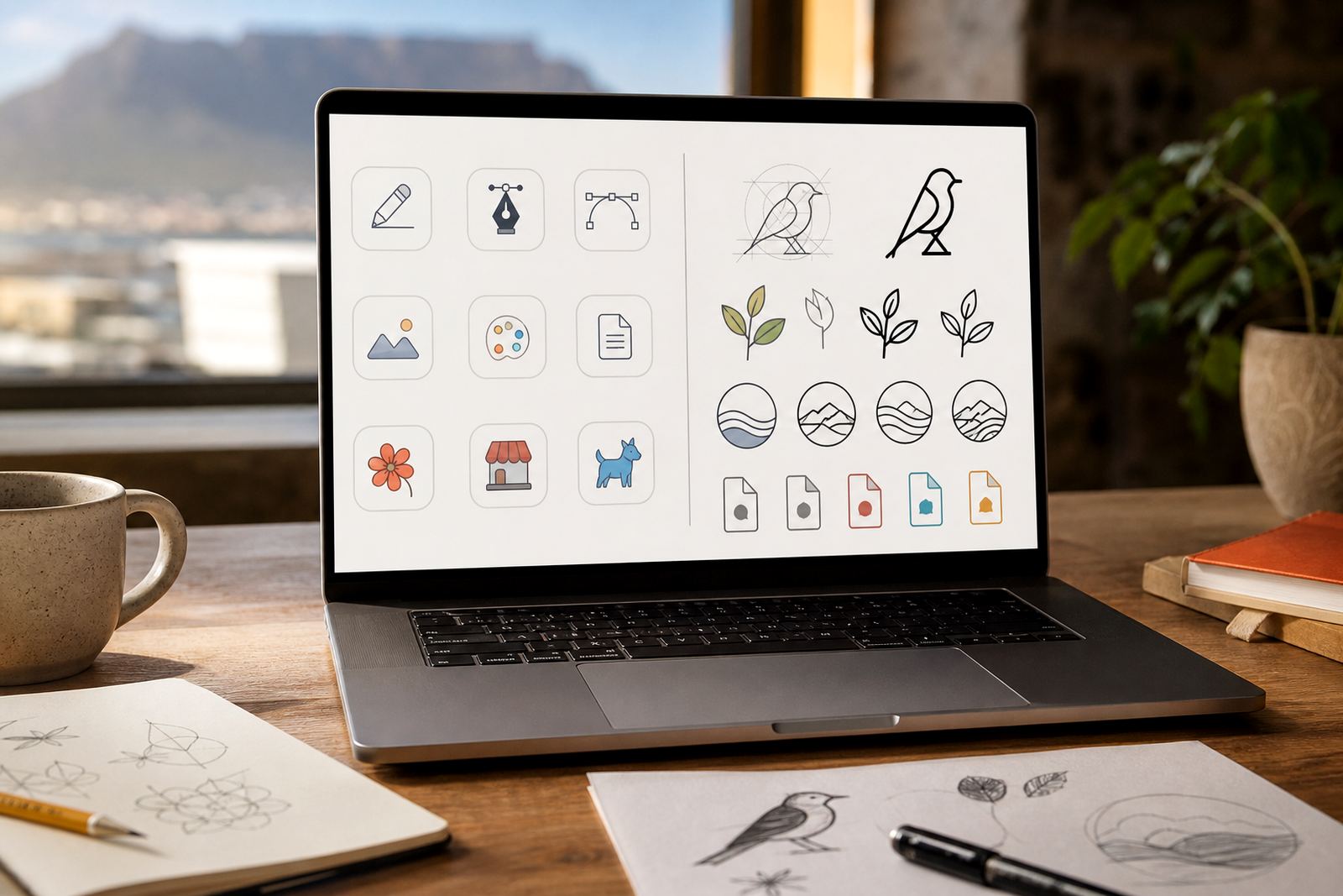
A proper redraw turns that artwork into clean vector files that scale without losing sharpness. For a school, that matters on everything from a small tie badge to a large wall graphic. We also look at the practical side: can the crest be stitched, screen printed, cut from vinyl, or used on a PowerPoint title slide without changing colour balance too much? Many schools need one master version that can be adapted for different uses, and not every file type behaves the same.
Bitmap tracing or hand redraw: what suits a school better?
There are two common ways to rebuild artwork. Bitmap tracing follows the shape of a low-quality image and converts it into vector paths. It can work well for simple marks with clear outlines, but it often copies the flaws in the original, such as wobbly curves, broken corners, or uneven lettering. If the source file is very rough, tracing can end up looking like a polished version of a bad original.
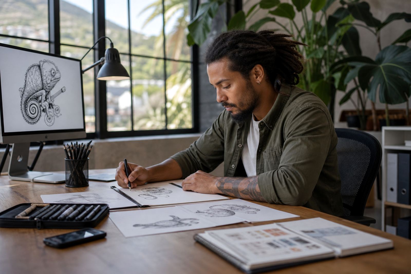
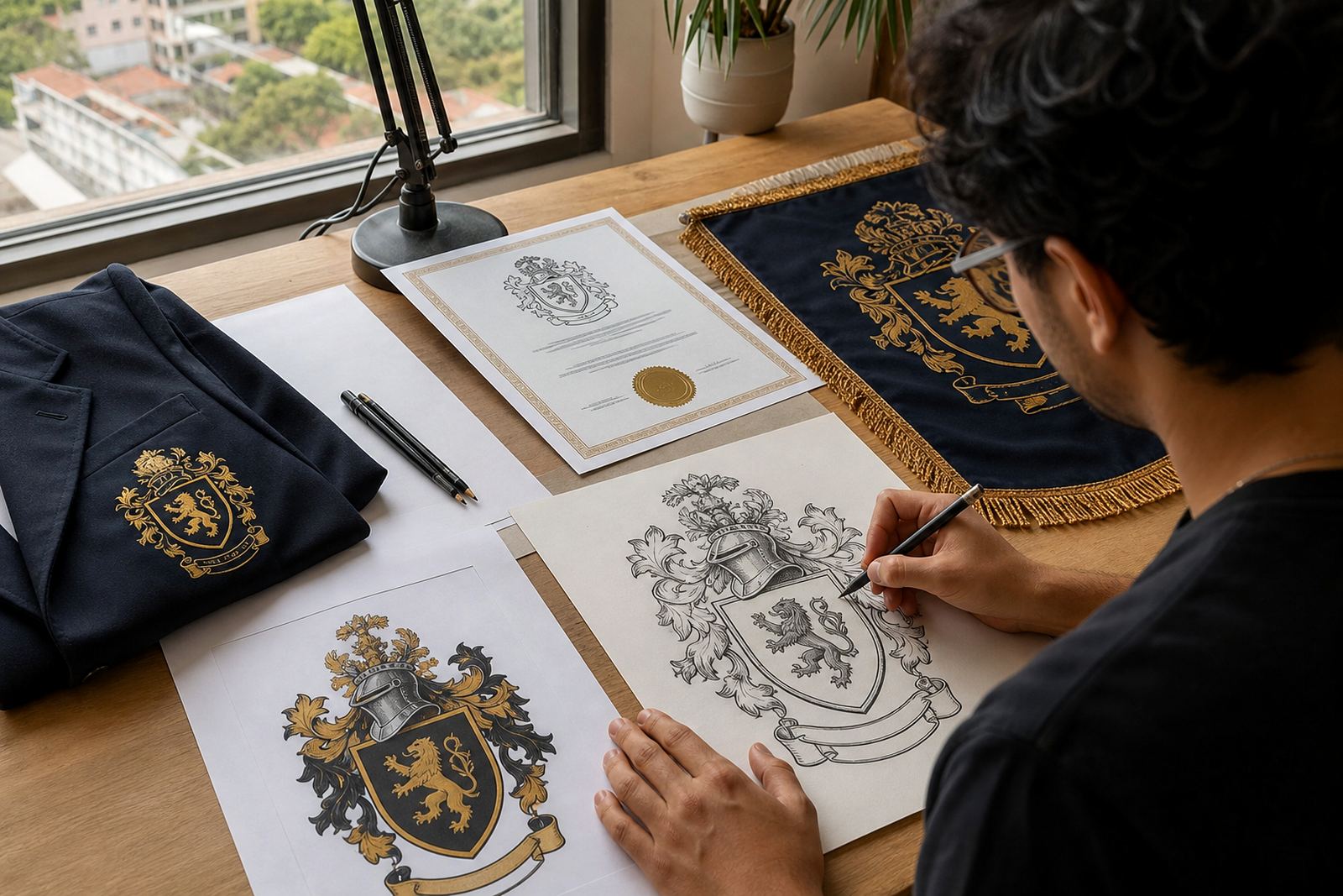
Hand redraw and illustration gives more control. We rebuild the crest, badge or mascot from scratch, matching the original intent while correcting the details that matter. That is usually the better choice for schools with older crests, shields, animals, books, flames or emblems that need neater linework. It also helps when the school wants a simplified version for small applications, or a more detailed version for a centenary banner, fundraiser poster or matric farewell layout.
- Best for crests with text, symbols and small internal details
- Better colour separation for print and embroidery use
- Cleaner edges for signage, certificates and digital headers
File formats schools usually need on hand
Schools often need artwork in more than one format because different suppliers ask for different files. A printer may want PDF, a designer may ask for AI, a sign maker may prefer EPS, and a website or online notice board may need SVG. If the file is set up correctly, the same artwork can be reused across uniforms, stationery and campus wayfinding without rebuilding it each time.
We prepare files in formats that suit common school workflows: SVG for screen use and editable vector reference, EPS for older production systems, PDF for general print handover, and AI for professional editing where required. If a school has multiple campuses or colours, we can keep versions organised so the main crest does not get mixed up with sports house artwork or event graphics. It saves a lot of admin later, especially when a secretary or marketing coordinator needs to send the correct file quickly.
- Master file for future updates and supplier handovers
- Colour version and simple one-colour version where needed
- Print-ready export for banners, certificates and newsletters
Typical school uses: uniforms, documents and signage
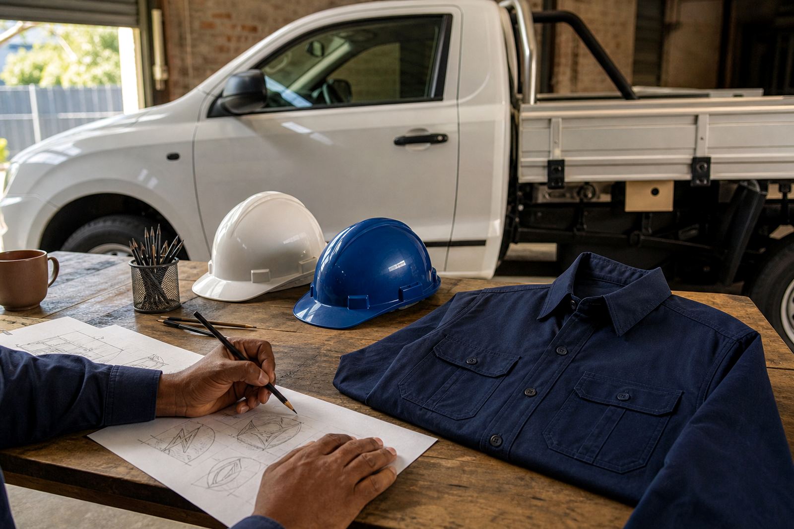
Schools in Cape Town, Johannesburg, Durban, Pretoria and Bloemfontein usually need the same artwork across many surfaces. A crest on a blazer pocket has different demands from a crest on the front page of an admission pack. Uniforms need simplified details that stay legible at small size. Documents need neat edges and consistent colour. Outdoor signs need artwork that holds up against sun, dust and coastal humidity, especially in places like Observatory, Stellenbosch, Paarl and Port Elizabeth where weather can affect finishes over time.
We also help with event-specific artwork. That can include sports day graphics, speech day banners, open day signs, inter-house competition badges and learner handbooks. For schools with older buildings or municipal sign restrictions, layout matters too. A signboard should not be overcrowded, and the crest should have enough clear space around it so the name remains readable from the street or main gate. The same principle applies to campus signange inside the grounds, where too much text makes directions harder to follow.
- Uniform crests and sports badges
- Certificates, handbooks and letterheads
- Gate signs, directional boards and event banners
Planning notes for school managers and SGBs
Before any redraw starts, it helps to gather the best source material available. That may be an old badge, a scanned image, a photo of the wall emblem, or a clean digital version from a previous supplier. If possible, send the artwork you have rights to use, along with any notes on colours, spelling, motto text, house names or older versions that should be preserved. Schools sometimes discover that a crest has been altered in small ways over the years, so it is worth checking what should stay exactly as it is.
It also helps to decide how the artwork will be used. If it is mainly for embroidery, the design should stay simple. If it is for a new prospectus or foundation phase mural, more illustration detail may be suitable. We often recommend choosing one primary version and then a simplified companion version for small print or single-colour reproduction. That makes production easier for local printers in Cape Town or Joburg, and it avoids having several slightly different crests floating around the school.
- Confirm the correct spelling of the school name and motto
- Choose the main use first: embroidery, print, signage or digital
- Check whether old colours need to stay exact or can be matched closely
Common mistakes schools run into
One common mistake is sending a blurry image and expecting it to print cleanly at A2 or larger. Another is asking for one artwork file to do every job without considering the different production methods. A detailed crest that works on a hall banner may not stitch well on a blazer pocket. Likewise, an illustration drawn for a newsletter header may need simplification before it can be cut in vinyl or printed on stickers.
Another issue is inconsistent version control. A school may have one badge on the website, another on the admissions pack and a slightly different one on sports kit. That creates confusion for parents and suppliers. It is also worth checking budget early. A straightforward redraw for a simple badge may sit in a lower budget range, while a detailed crest with lettering, shields, animals or multiple layout versions can cost more. In practical terms, school artwork jobs in South Africa often start in the low thousands of Rand and can move into higher ranges when several formats, revisions or extra illustration work are needed. We keep the scope clear upfront so the finance office can approve it without surprises.
Working with our Observatory team
Vectorization Studio is based in Observatory, Cape Town and works with schools across South Africa. Founded in 1994, the team includes Luyanda Mthembu, Ayesha Mafokeng, Pieter Skosana, Zanele Kajee, Teboho Molefe and Megan Khoza. For a school project, that means the artwork is checked from more than one angle: clarity, colour accuracy, layout, file type and final use. It is a careful process, because a school crest often carries history and it needs to look right on everything from a sports day poster to a formal certificate.
If you need a crest redraw, badge illustration, event graphic or a cleaner set of files for long-term use, send the enquiry through the contact page with the artwork you want redrawn and a short note on where it will be used. From there we can advise on the most suitable file set, whether that is SVG, EPS, PDF or AI, and which version should be used for print, web or supplier handover.