Start with the clearest file you can find
If the original artwork is gone, begin with the cleanest version you have. A crisp scan, a high resolution photo, a PDF from an old supplier, or even a signboard photo can be useful if the logo is clearly visible. What matters is not just colour, but whether the edges, letters and symbols are readable without guesswork.
For businesses in Cape Town, Johannesburg or Durban, we often see logos pulled from old invoices, social media headers or printed flyers. Those can still work if the artwork is not stretched, blurred or cut off. A clear reference saves time and gives a better result when the final file needs to be used on uniforms, invoices, vehicle graphics or packaging.
- Send the highest resolution version you have
- Include any old artwork, even if it is imperfect
- Keep all versions together so the details can be compared
- Tell us where the logo was used last, such as signage or print
Bitmap tracing and hand redraw are not the same
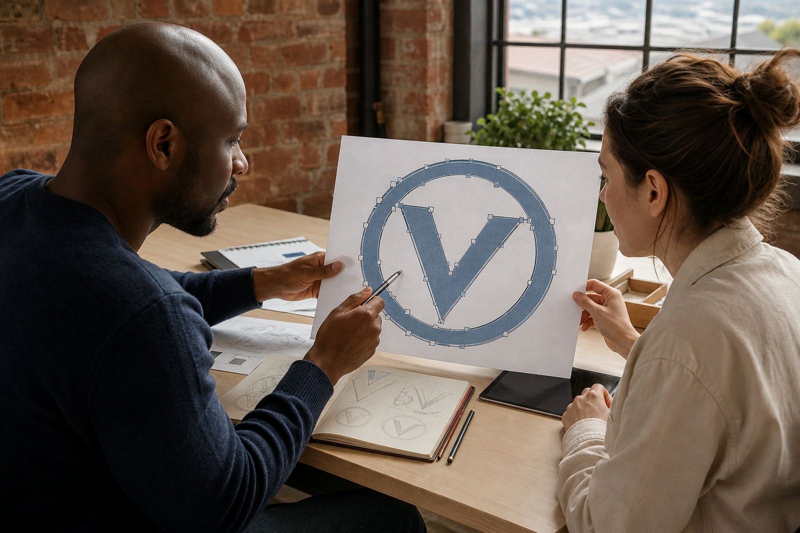
When people say they want a logo “vectorised”, they may mean different things. Bitmap tracing follows the pixels in a photo or scan and converts them into vector paths. That can work for simple artwork, but it also copies flaws like fuzzy edges, shadows and distortions from the source.
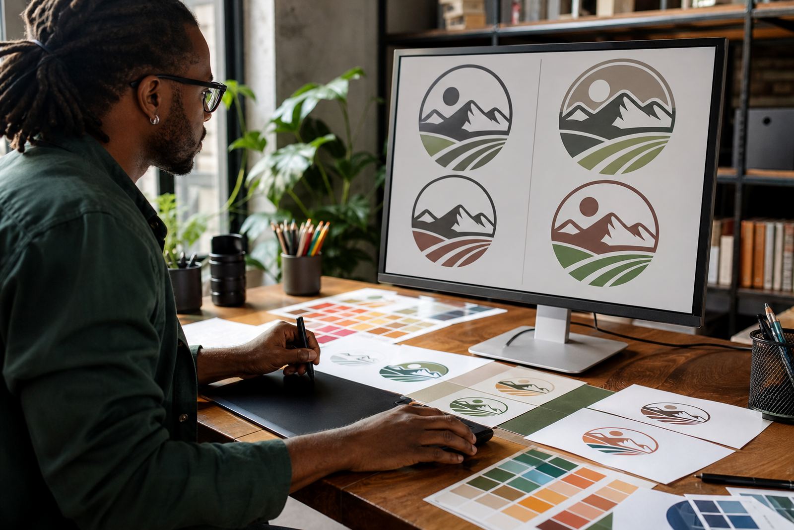
A hand redraw is more careful. The artist rebuilds the logo from the reference, cleaning up curves, spacing and line weight so the artwork is fit for real use. For a business in Observatory or Stellenbosch with an older logo that was printed badly for years, a hand redraw usually gives a better result than a quick trace. It is especially useful where the logo needs to be tidied for embroidery, laser cutting or a sharp one-colour print.
- Choose tracing for simple, clean artwork with strong edges
- Choose hand redraw when the logo is old, damaged or inconsistent
- Use redraws for logos that must look correct at small and large sizes
- Ask for a redraw if the brand has been copied from low quality files
What makes a good reference image
A useful reference shows the logo as close to its true form as possible. If the image is too small, too dark, tilted or blocked by a background, the details become unreliable. A photo taken in bright light from straight on is better than a stylish but messy crop from social media.
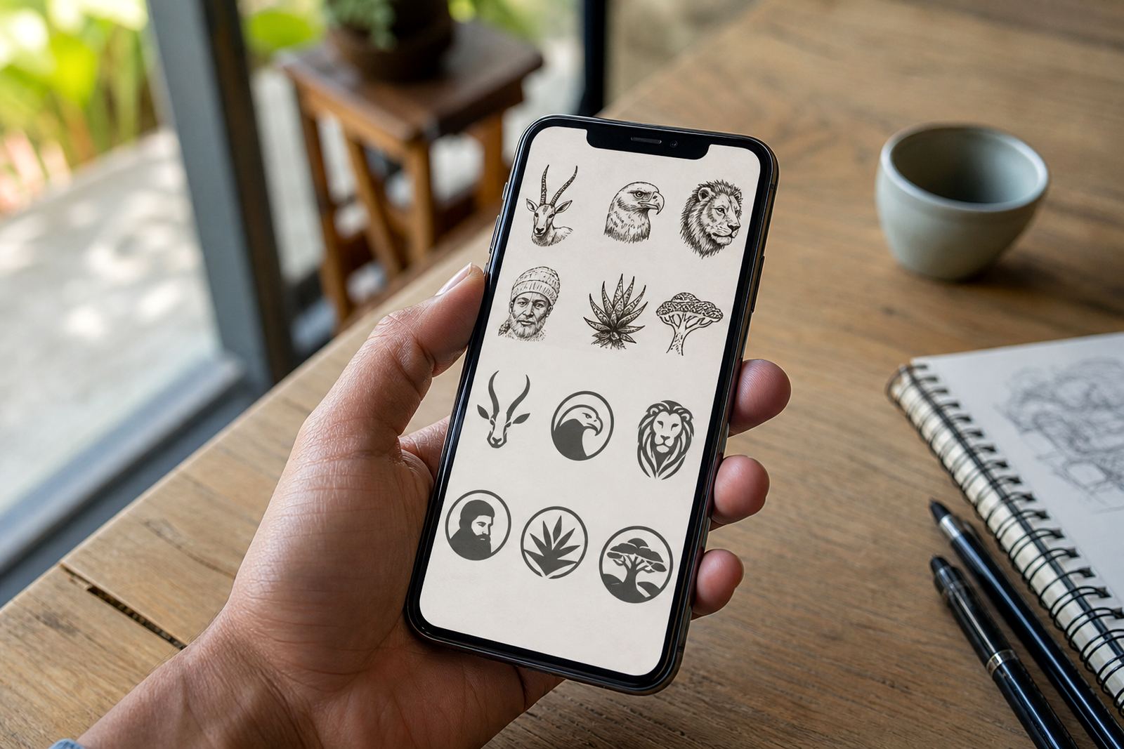
We look for letter shapes, spacing, icon proportions, borders and any custom drawing style. If there is a mascot, badge or illustrated mark, the line work must be visible. This matters for South African businesses that need artwork for municipal paperwork, product labels or retail display where the same logo may need to be used across multiple file types.
- Best: flat scan or straight photo with no shadows
- Good: PDF or printed sample with clean edges
- Useable: social media post if the logo is large and clear
- Poor: screenshots, compressed images and angled photos
File formats to ask for at the end
Once the logo has been redrawn, the final files should suit different uses. SVG is useful for web and digital work. EPS is still widely used for signwriting, print and artwork handover. PDF is practical for sharing and approval. AI is the editable vector working file, which is helpful when the artwork needs future changes.
Not every business needs every format, but it is sensible to keep a proper set on file. A shop in Paarl may need a version for invoices, while a Cape Town manufacturer may need the same logo for cartons, stickers and large format print. If your files are saved only as images, they will pixelate when scaled up.
- SVG for websites and digital use
- EPS for print and production workflows
- PDF for easy viewing and approvals
- AI for editable master artwork
Check rights before you send anything
Only send artwork that you own or have permission to use. If the logo came from a former partner, a previous supplier, or a designer who never handed over the files, it is worth checking the rights first. The same applies to mascots, icons and illustration elements pulled from other sources. We can only work from material that the client is entitled to use.
This protects everyone involved and avoids problems later when the logo is used on packaging, social graphics or signage. If you are unsure, gather whatever proof you have, such as old invoices, brand usage notes or approval messages, and settle the ownership side before the redraw begins.
- Confirm you have the right to use the artwork
- Do not send copied logos from another business
- Check whether a past designer retained any rights
- Keep permission records with your brand files
A local example from a busy Cape Town refresh
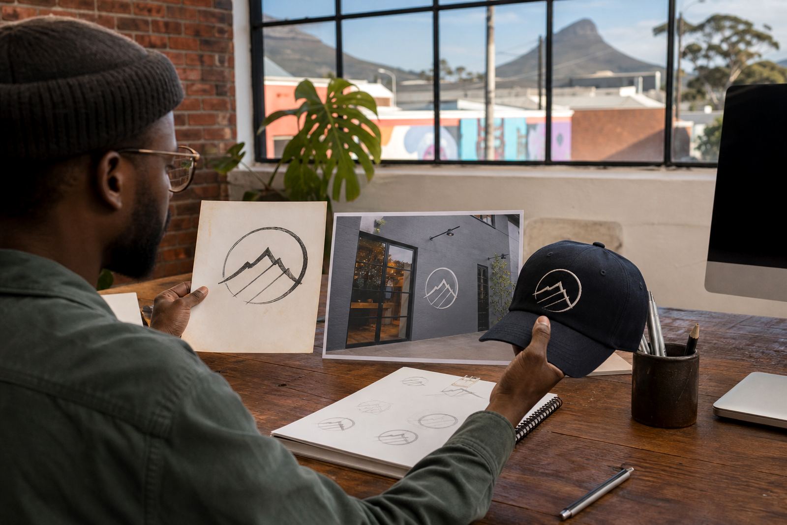
A family business in Observatory may have a logo that has been photocopied for years, then saved as a grainy JPG on someone’s old laptop. The sign is still up, the paperwork still uses the old mark, and nobody can find the original files. In that case, the best reference might be a straight photo of the sign, a scanned invoice, and one old brochure with the logo printed clearly.
With those pieces, the artwork can be rebuilt properly and exported for print, digital and signage use. That approach works just as well for firms in Johannesburg, Durban, Pretoria and Bloemfontein who need a clean, usable mark again. It is slower to guess from a blurry image, so the more honest reference material you can supply, the better the final result.
In our experience, the best logo reference is not always the prettiest one. It is the one that tells the truth about the shape, spacing and details. That is what allows a redraw to look right on paper, on screen and on the side of a vehicle, even when the original file is long gone.