Why one icon style is worth more than a mixed set
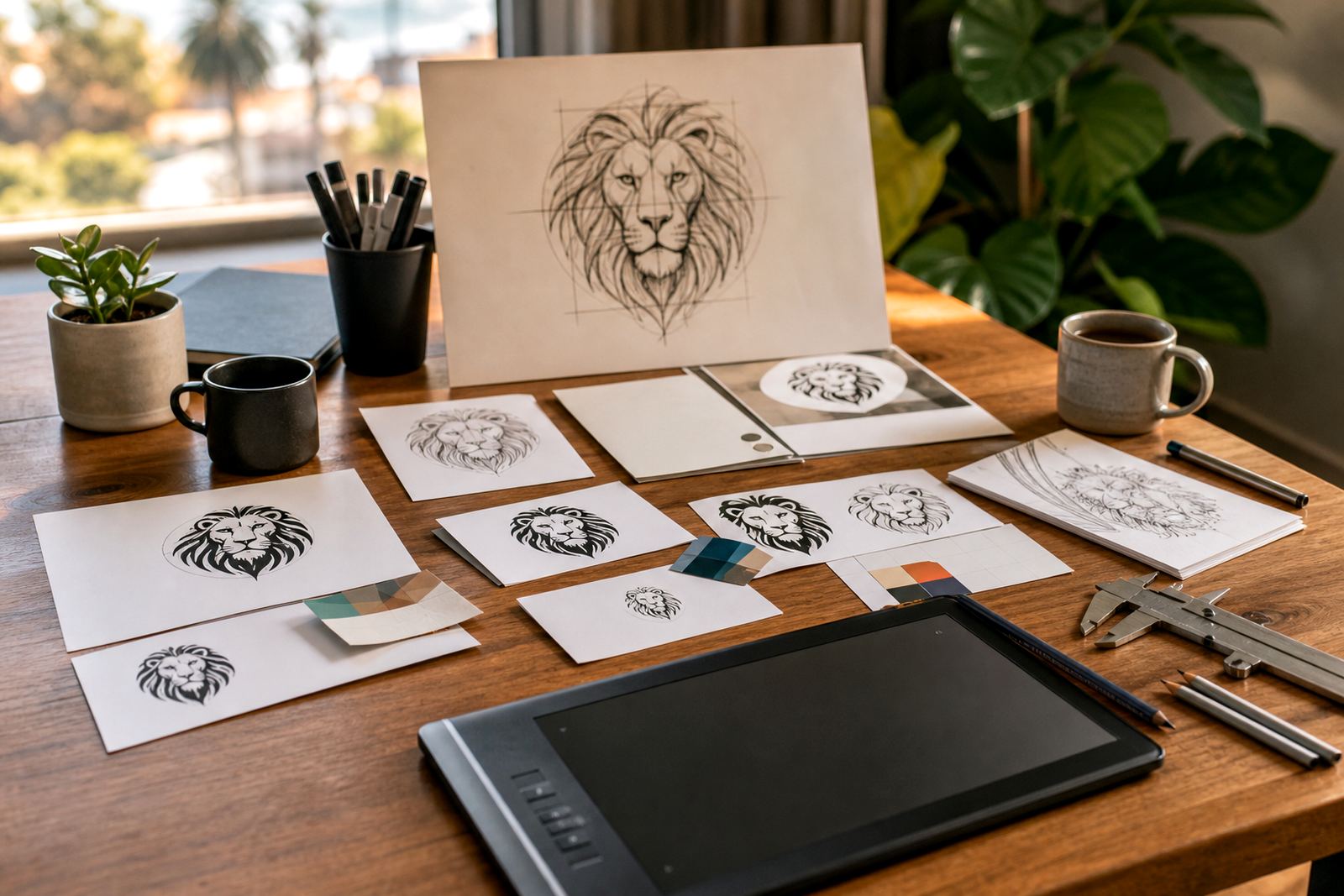
When every icon follows the same line weight, corner style and spacing, the whole brand looks more considered. That matters for businesses that use icons across product sheets, order forms, packaging, and digital slides because people notice when one graphic looks lifted from somewhere else. A matched icon family makes the brand feel organised, even when the message is simple.
We often see businesses start with a few random symbols pulled from different sources. One may be thin and neat, another heavy and clipped, and a third only works at large size. A custom set solves that by giving you a single visual system that can be repeated across every touchpoint without looking patchy or overworked.
Hand redraws and vector tracing are not the same thing
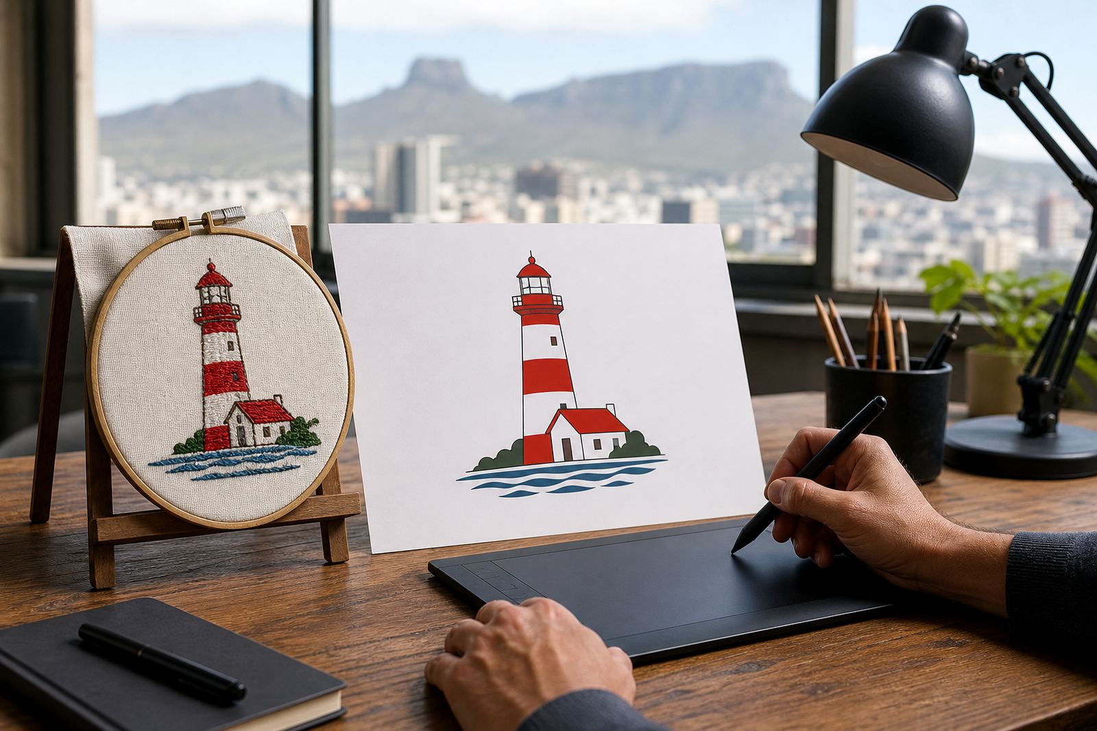
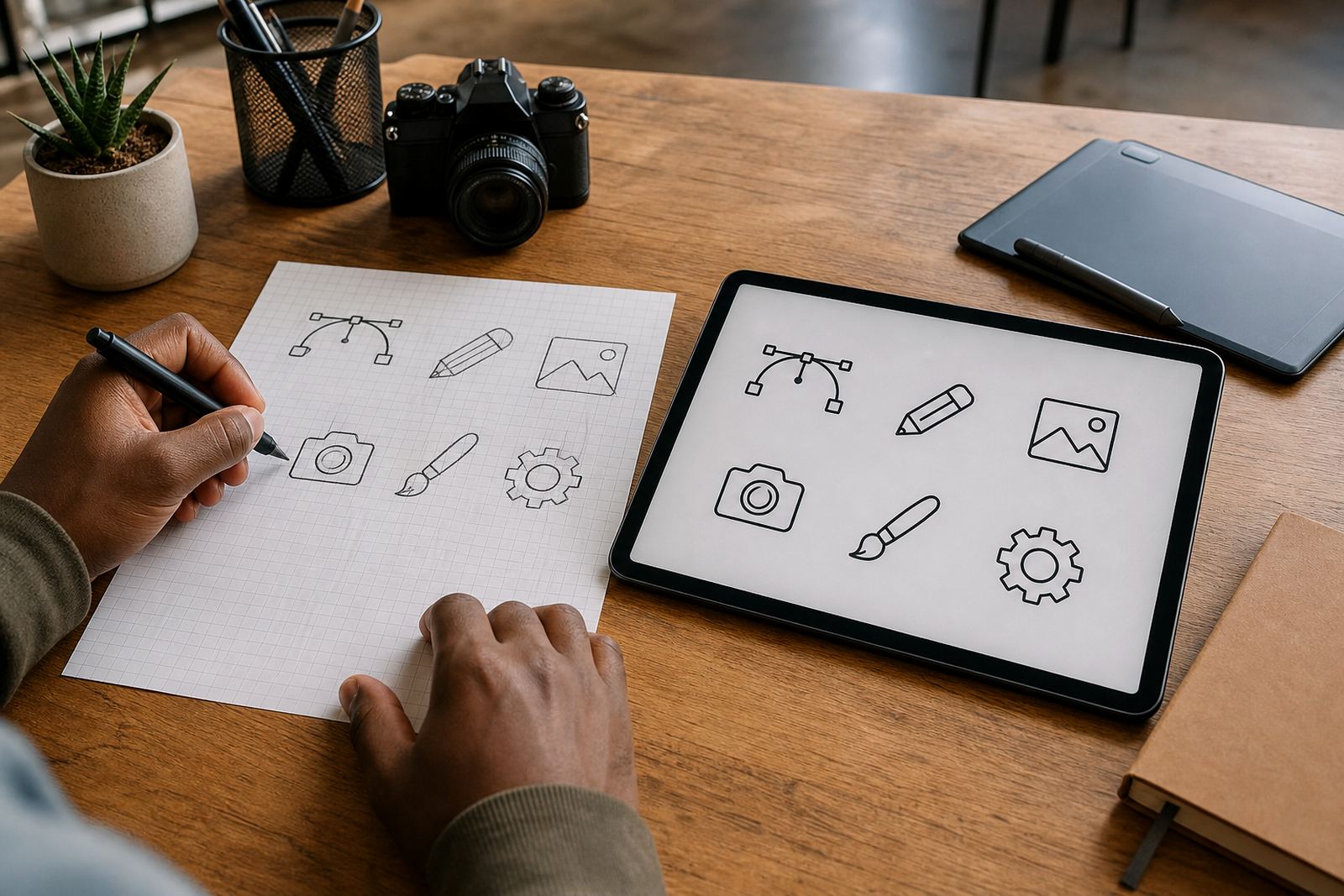
There is a clear difference between bitmap tracing and a proper hand redraw. Tracing a bitmap can be useful when the source is clean enough, but it often carries over jagged edges, uneven curves and small flaws from the original image. A hand redraw lets us rebuild the icon with proper geometry, cleaner proportions and sharper control over line detail.
For some projects, tracing is the right starting point. For others, especially where the original is low resolution or the artwork was scanned from a printed page, a full redraw is the better option. We look at the source, the intended use and the finish required before deciding which method will hold up best in print and on screen.
- Bitmap tracing works best when the source image is clear and simple.
- Hand redraws are better for weak scans, blurry logos or icons that need cleaner structure.
- Vector artwork can be scaled up or down without losing edge quality.
Where icon families earn their keep in daily use
Icon sets do quiet work in places many people overlook. On a menu, they can point out vegan options, spice levels or serving sizes. On packaging, they can show instructions, ingredients or recycling steps. On a website, they can guide users through services without long blocks of text. In a retail sheet, they can summarise delivery, payment and care instructions in seconds.
A clear icon system still communicates when the page is small, the print run is tight, or the artwork has to sit beside other regulated information.
- Print collateral: brochures, catalogues, labels and instruction cards.
- Digital use: websites, social graphics, presentations and message headers.
- Operational use: internal guides, packing slips and training documents.
What we need before we redraw or build icons
Before any work starts, the artwork you send must be yours to use or you must have the rights to share it. That can be your own hand sketch, a file from your business archive, or approved artwork that you are legally allowed to adapt. If the source is unclear, it is better to check first than to reuse something that should not be passed on.
We also need to know where the icons will live. A small set for a social media template is handled differently from a library that must work on packaging, presentation slides and signage. The more practical the brief, the better the result, because icon sets are often judged by how well they survive repeated use, not by how they look once in isolation.
- Tell us the number of icons you need and what each one must represent.
- Share any existing brand rules, such as stroke thickness, colour limits or shape style.
- Let us know the final formats required, especially for print and editing.
File formats that keep the artwork useful later
We supply vector files in formats such as SVG, EPS, PDF and AI, depending on what the job needs. SVG is useful for digital use and responsive layouts, while EPS and PDF are common for printers and sign makers. AI is often used when a design team needs to keep editing the source artwork in a structured way.
Choosing the right file format saves time later. A well-prepared file should open cleanly, print sharply and remain editable if colours, sizes or labels need to be changed. If the icons may be used in several branches or by different suppliers, we usually keep the set simple and consistent so that nobody has to fight with messy files later.
That practical approach is especially useful for businesses working across Cape Town, Johannesburg, Durban, Pretoria and Bloemfontein, where the same icon set may be handed to a printer in one city and a marketing team in another.
A local example: one set, many touchpoints
Consider a Cape Town food business with outlets in Observatory, Stellenbosch and Paarl, plus distributors in Durban and Pretoria. The team wants icons for allergens, storage instructions, delivery options and social media highlights. If those symbols are drawn in different styles, the packaging feels uneven and the digital pages look stitched together. A single icon family gives the whole range a more settled look.
That same set can then be adapted for a menu board, a printed label, a staff guide and a social post without needing a fresh visual language each time. It saves admin and it helps the brand stay recognisable even when the message changes. Small details matter here, because a clear icon can do the work of a full paragraph with no fuss, and that counts in a busy shop floor or at a trade counter.
Our base in Observatory, Cape Town, gives us a practical view of how brands are used by South African businesses that deal with both local customers and suppliers in other provinces. Some need fast updates, some need careful prepress checks, and some need a set that can be used across multiple branches without drifting off style.
When a custom icon family is the better choice
If your brand uses the same symbols again and again, a custom set is usually worth the effort. It is especially useful when you need more than one person handling the artwork, or when the files must travel between design, print and operations teams. You are not just buying a picture, you are getting a visual system that can keep working as the business grows.
For many clients, the decision comes down to control. A tailored icon family lets you decide the stroke width, shape language, corners, spacing and level of detail, so the artwork matches your brand instead of forcing your brand to fit somebody else’s style. That is where the value sits, and it shows up every time the same symbols appear on a label, a screen or a signboard.