Why embroidery changes the way a logo must be drawn
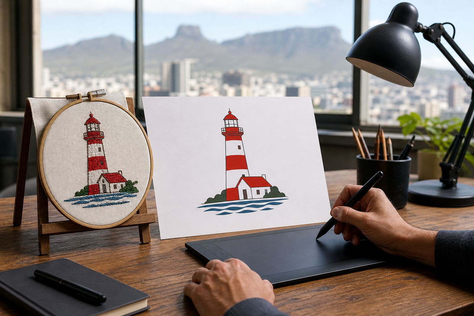
Embroidery thread has thickness, fabric stretches, and the stitch count has limits. A logo that looks crisp on a screen can become muddy on a cap, shirt pocket or work jacket if it is copied exactly as a bitmap or low resolution image. That is why many logos need a proper redraw before they go to a digitising house or embroidery machine.
For clients in Cape Town, Johannesburg, Durban, Pretoria and Bloemfontein, the main issue is usually not style but structure. Thin outlines, tiny text, gradients and very small detail may need to be simplified so the logo still reads well from a few metres away, even on dark fabric or textured garments.
Bitmap tracing is not the same as a hand redraw
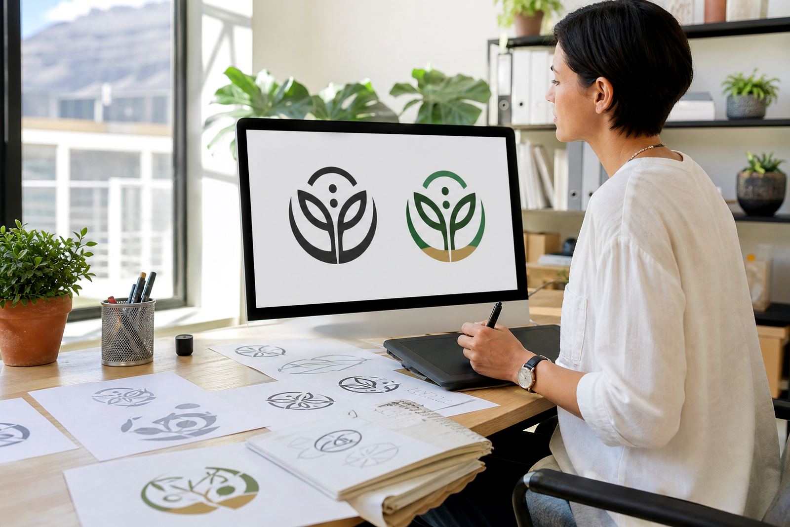
A bitmap trace can be useful when the original artwork is clear and simple, but it is not always the best route for embroidery work. Tracing follows the pixels in an image, so any blur, jagged edge or old scan mark can come through in the new file. A hand redraw gives more control over each line, curve and proportion, which matters when a logo must be neat at a small size.
Where a mark has detailed lettering, uneven strokes or a rough original scan, a hand redraw usually gives a better base for embroidery and future print use. It also makes it easier to clean up spacing between letters and remove little faults that show up only after stitching starts.
- Use tracing for simple, clean artwork with strong edges.
- Use hand redraw when the image is low quality, cropped or distorted.
- Use hand redraw for logos that need exact control of line weight and spacing.
- Use redraws when the design will be used across uniforms, caps and bags.
Detail that often needs simplifying before stitches go in
Some logos carry too much fine detail for embroidery at pocket size or on a cap front. Small stars, tiny script, hairline outlines, shading marks and complex gradient effects often need to be redrawn into stronger shapes. The aim is not to lose the brand, but to make sure it still reads clearly once the needles and thread do the work.
Common simplifications include closing open shapes, thickening very thin lines, reducing the number of colours, and adjusting small type so it does not fill in. This is especially important on knitwear, towels and workwear used in coastal humidity or on-site conditions, where thread and fabric movement can affect the finish.
- Keep lettering large enough to stitch cleanly.
- Replace tiny shaded areas with solid fills.
- Limit very narrow gaps between elements.
- Check how the logo works in one colour as well as full colour.
The file formats embroidery teams usually ask for
For embroidery planning, vector files are the starting point. SVG, EPS, PDF and AI files all hold clean paths and scalable shapes, which makes them far better than a flat image when a logo needs resizing for a cap, chest badge or back yoke. They also help the artwork stay sharp when it is passed on for digitising or production.
Different workshops may prefer different file formats, but the key point is consistency. The logo must be built cleanly, with proper curves and no hidden rough edges. A tidy vector file also helps if the same artwork later needs print, signage or packaging use across multiple branches.
At Vectorization Studio in Observatory, Cape Town, the process is usually to redraw the artwork carefully first, then prepare the final vector files in the formats needed for production. That way the logo is ready for embroidery while still being useful for other brand uses too.
A local example from workwear in Cape Town
Think of a small hospitality team in Cape Town needing shirts for a restaurant floor crew, aprons for the kitchen and caps for deliveries. The original logo may have fine script and a detailed crest, but the embroidery version needs to be stronger and easier to read at a glance. A redraw can keep the brand feel while removing the tiny parts that would disappear in thread.
That same file can then be adapted for teams in Stellenbosch, Paarl, Port Elizabeth and beyond, with each garment size adjusted for placement. A cap front is not treated the same as a jacket back, and a logo that works on a left chest may need another version for a small sleeve mark.
What to send when you want an embroidery-ready redraw
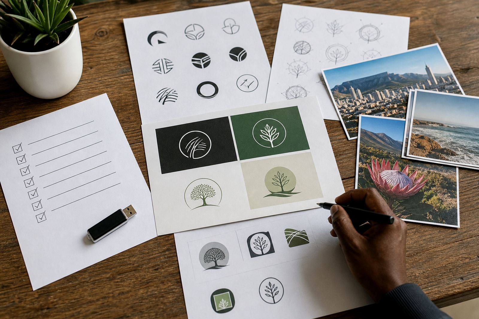
The best starting point is the clearest artwork you have, plus any notes on what must stay the same. If there is an old scan, a photographed signboard, a printed label or a rough digital file, send the cleanest version available. If there are brand colours already in use, share those too, although embroidery thread colour may still need practical adjustment.
It is also important that you own the artwork or have the right to use it. If a logo belongs to another business, the redraw cannot proceed unless you have permission from the rights holder. That protects both the client and the production chain.
- Send the highest quality original file you can find.
- Tell us where the logo will be stitched: cap, shirt, jacket or bag.
- Let us know if the design must work in one colour.
- Confirm that you own the artwork or have permission to use it.