What line art does well in a brand system
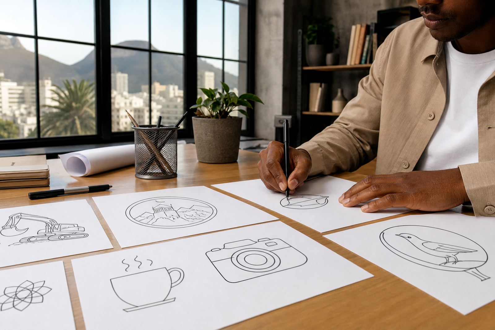
Line art is built from strokes rather than filled shapes, which makes it useful when a logo or illustration needs to feel light, precise and easy to recognise. It suits icons, badges, labels, menus and supporting graphics where a busy image would distract from the message. When done properly, the line weight, corners and spacing all work together so the artwork still holds up on a small label or a large shopfront board.
For South African businesses, line-based artwork is handy when print conditions vary. A café in Observatory may need a menu icon that works in black on cream paper, while a contractor in Bloemfontein may need the same mark on a one-colour invoice, a vinyl decal and a stamped delivery note. If the structure is strong, it can move between those uses without losing its character.
- Best for clear outlines, simple symbols and neat brand markers
- Useful where one-colour reproduction is needed
- Easy to scale for small and large applications
- Works well for packaging, signage and digital icons
Bitmap tracing versus hand redraw
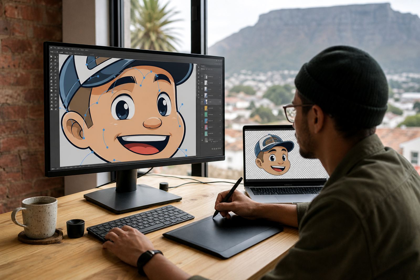
Many clients send a bitmap image first, usually a JPG, PNG or screenshot. Bitmap tracing means converting that raster image into vector paths. It can be a practical starting point, but it depends heavily on the quality of the source. If the original is blurry, pixelated or compressed, the traced result often inherits those problems. Fine corners turn soft, curves wobble and small text can become uneven.
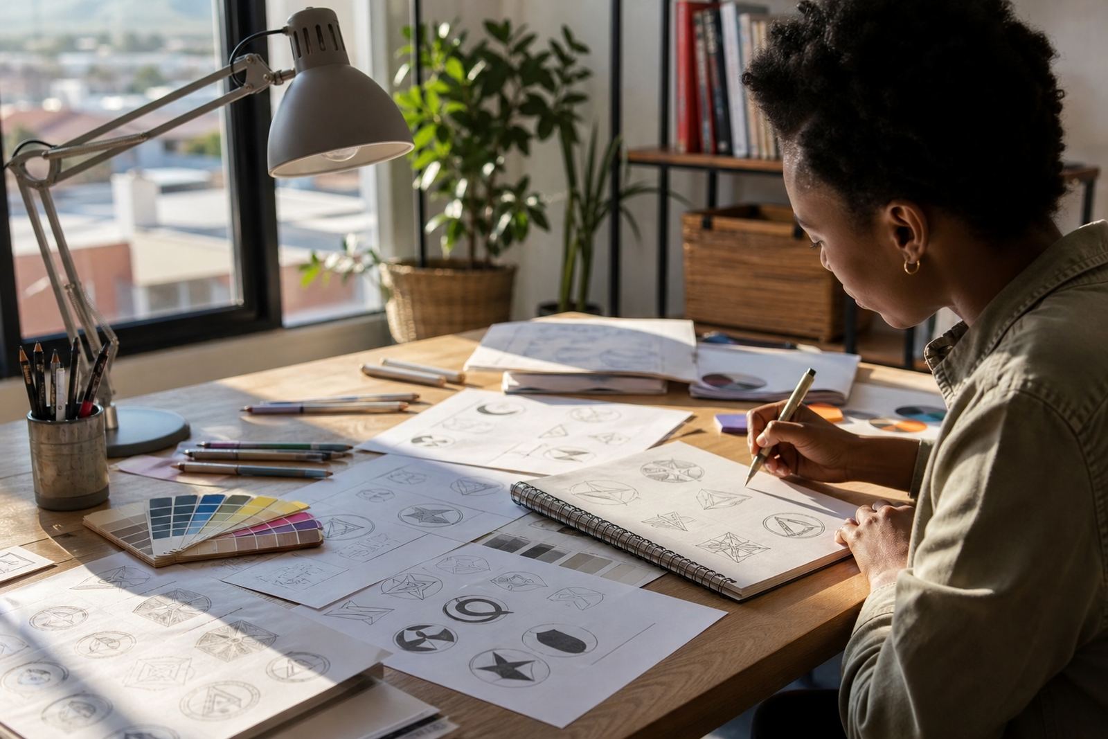
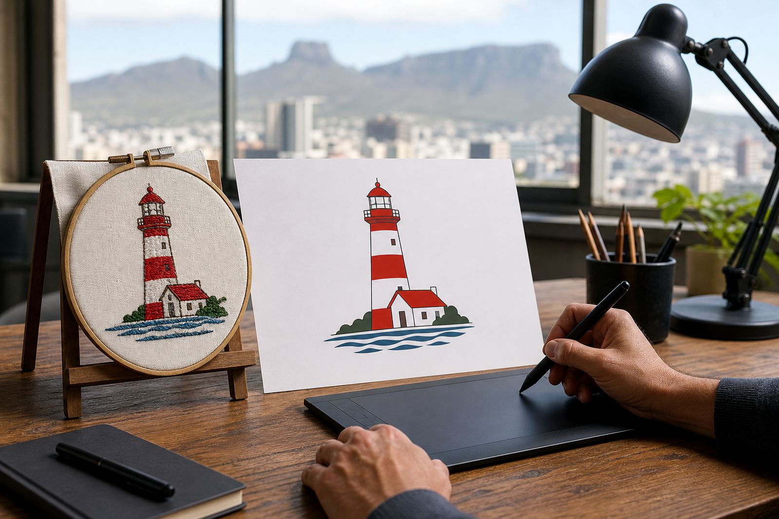
A hand redraw is different. The artwork is rebuilt from scratch with the original image as a reference. That gives more control over line thickness, symmetry and spacing, which matters when a logo needs to be used on letterheads, product labels or cut vinyl. For heritage marks or hand-drawn illustrations, a redraw usually gives the cleaner and more dependable finish.
- Trace when the source is clean and the structure is already sound
- Redraw when the image is rough, low resolution or poorly proportioned
- Redraw for better control over joins, curves and line consistency
- Use the method that matches the final use, not just the fastest route
How line weight changes the final result
Line weight is one of the first decisions we make, because it affects readability and style at the same time. Thin lines can feel elegant and technical, but they may disappear when printed small or reproduced on textured stock. Thicker lines hold better on signage and packaging, though too much weight can make the design feel heavy. The right balance depends on the artwork, the print method and where it will live.
In coastal areas like Cape Town and Port Elizabeth, humidity can affect certain print stocks and adhesive materials, so clean line work gives you more breathing room when the final output is made on less predictable surfaces. A line illustration that keeps its form in black and white is often easier to manage across different materials and municipal requirements for notices or branded decals.
Practical checks that help:
- Test the artwork at small sizes first, not only on a large screen
- Keep line thickness consistent unless variation is part of the style
- Avoid tiny gaps that may fill in during print
- Check how the artwork looks in reverse, on dark and light backgrounds
File formats that businesses should ask for
Vector artwork is usually supplied in formats such as SVG, EPS, PDF and AI. Each one serves a slightly different purpose, but the main idea is the same: the lines remain editable and scale without becoming blocky. That matters when a logo needs to be sent to a printer, sign maker or packaging supplier, or placed into a layout for a presentation pack.
For most businesses, the safest approach is to keep a master vector file and a separate set of working files for day-to-day use. A PDF is often the easiest format for sharing, while SVG is useful for digital applications and EPS is still common in production workflows. AI files are often kept for design handover and future edits. A good supplier will make sure the final files match the job, rather than sending one file and hoping for the best.
- SVG for web and digital use
- EPS for print and production handover
- PDF for sharing and proofing
- AI for editable master artwork
A local example: line art for a Cape Town menu and decal set
Think of a small restaurant in Observatory that wants a simple fish line drawing for its menu, window decal and takeaway packaging. The artwork needs to be light enough for a clean menu layout, but still strong enough for a cut vinyl decal facing afternoon sun and sea air. If the illustration is traced from a poor image, the fins may distort and the line breaks may look messy. A careful redraw gives a better result and keeps the style consistent across every item.
That same artwork may later need to be adapted for a sticker, a social graphic and a wall menu. Because the structure is vector-based, the file can be adjusted without starting over. The business keeps one clear visual asset that can be reused across several touchpoints, which saves time and avoids mismatched artwork between suppliers.
Before you send artwork for redraw
Clients should only send artwork they own or have permission to use. That includes logos, sketches, mascots, maps, patterns and any reference images that will be used as the basis for the redraw. If the source belongs to someone else, the rights need to be in order before any work starts. This protects both the client and the supplier, and it keeps the process straightforward.
It also helps to send the clearest source available, along with notes on where the artwork will be used. A logo for a vehicle decal has different demands from one for a letterhead, and a packaging illustration may need finer detail than a badge icon. The more practical context you share, the better the line work can be matched to the job.
- Send the cleanest source image you have
- Explain where the artwork will be used
- Confirm that you own or may legally use the artwork
- Mention any line thickness, spacing or style preferences