Why signature marks need careful redrawing
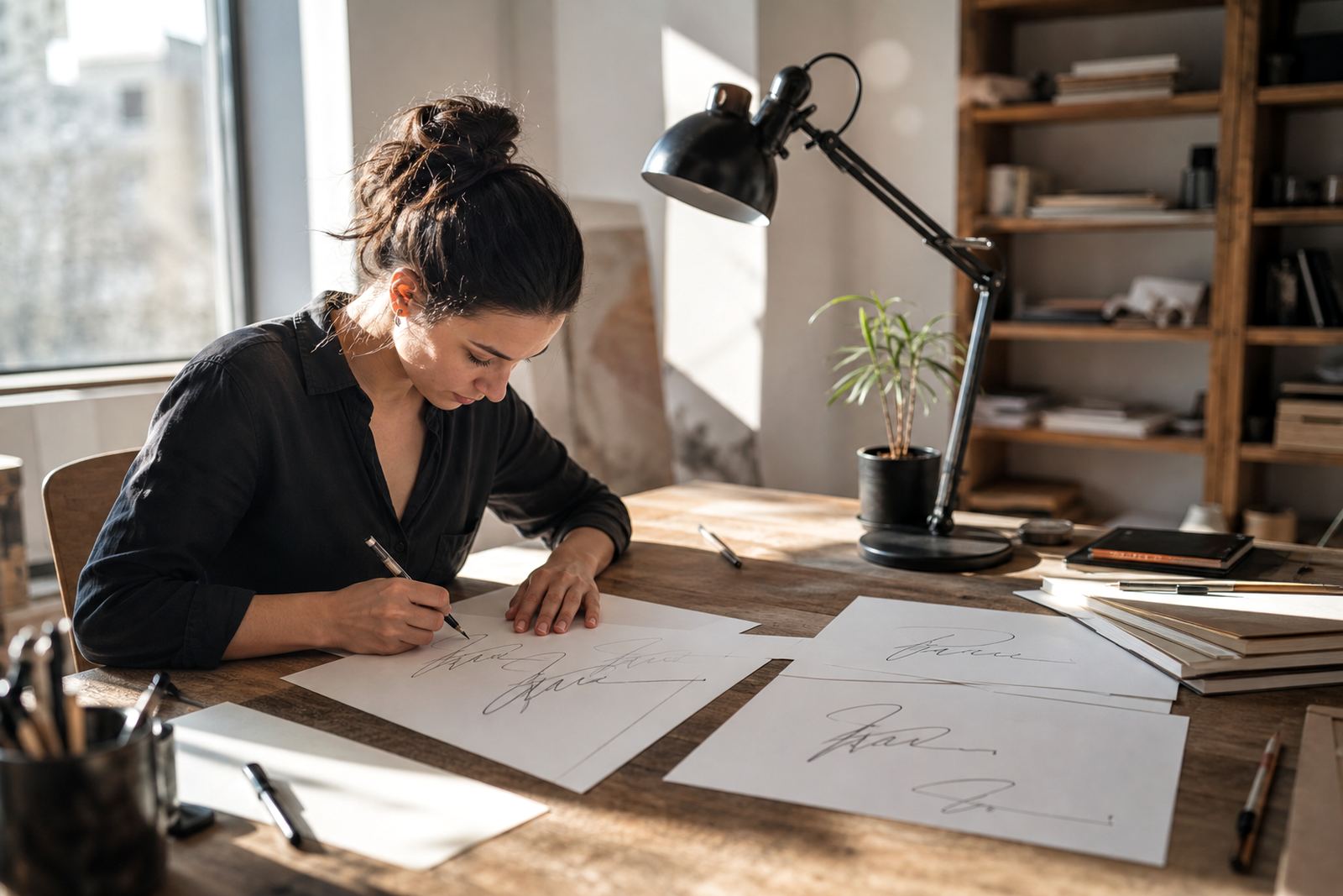
A signature logo often starts as a scribble, a scan from an old letterhead or a photo of a mark someone signed with a pen years ago. The charm is in the uneven line weight, the rhythm of the strokes and the small quirks that make it feel personal. When that artwork is traced too quickly, those details get lost and the result looks stiff.
The better route is a proper logo redraw. That means studying the original mark, cleaning the structure and rebuilding it as vector artwork so it can be used at any size. For a business in Observatory or a restaurant in Durban, that matters because the same mark may need to sit on a menu, a shopfront, a stamp and a website header without breaking apart.
It also helps to decide what should stay imperfect. A slightly uneven loop or a hand drawn tail can carry real personality, while a stray scan mark, blur or paper shadow should be removed. That balance is where the finished mark starts to feel intentional, not just tidied up.
Bitmap tracing versus a proper hand redraw
There is a big difference between bitmap tracing and a hand redraw. Tracing follows the pixels in a low quality image, which can copy every bump, jagged edge and stain from the original file. That is useful for a rough starting point, but it is rarely enough for a logo that needs to hold up on print and signage.
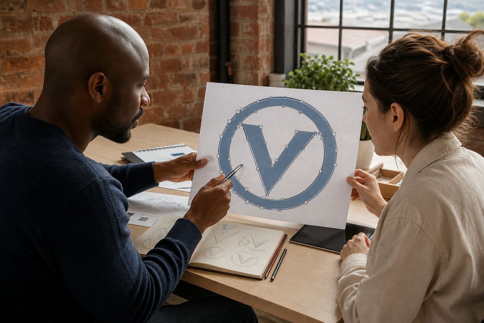
A hand redraw is more deliberate. The artist rebuilds the letterforms, spacing and curves so the artwork reads clearly at small sizes and still feels human at larger ones. It gives more control over line endings, balance and spacing, which is important when a signature style needs to look right on A4 documents and on large format boards in coastal humidity.
- Bitmap tracing copies the image as it appears, including flaws.
- Hand redraw rebuilds the shape for cleaner scaling and better spacing.
- Illustrated details can be simplified or strengthened where needed.
- The finished artwork is easier to place on print, digital and signage files.
Keeping the hand drawn feel without sacrificing clarity
The best signature logos keep a human feel while still being practical. That usually means preserving the main flow of the stroke, then tightening the edges and correcting anything that would cause trouble in production. If a line turns too thin, it may disappear in small applications. If the spacing is too loose, the mark can look unfinished instead of relaxed.
For South African businesses, practical use matters. A cafe in Cape Town may want a signature mark on takeaway cups, chalkboard menus and stickers. A company in Johannesburg may need it on vehicle decals and proposal documents. In both cases the artwork must remain readable when printed on different stock, from coated paper to uncoated labels.
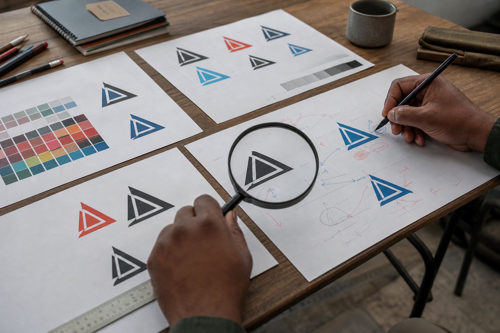
Colour choice also needs care. Some signature logos work best in black only, especially when they need to be stamped or laser engraved. Others need a restrained colour version for digital use and a single colour fallback for quick printing. The redraw should support those uses without changing the feel of the original line.
The file formats that make the artwork usable
Once the redraw is complete, the artwork should be supplied in formats that suit different jobs. Vector files are the standard because they scale without losing quality. That means the logo can be used on a small social tile, a signage proof or a large banner without pixelation.
- SVG for web use and flexible digital placement.
- EPS for print production and trade work.
- PDF for sharing proofs and final artwork with suppliers.
- AI for editable master files used in production workflows.
It is also wise to keep a clean black version, a reversed version and any approved colour versions. That saves time when a printer needs a fast supply file or when a municipal sign permit asks for artwork in a specific format. In practice, the neat file is just as important as the redraw itself.
What to send before the redraw starts
Good source material makes a better result. Customers should only send artwork they own or have the rights to use. That includes sketches, old scans, photos of hand lettering or existing logos that are cleared for redraw work. If the file is faint or damaged, it still helps to send the best version available along with any notes about what must stay unchanged.
Useful details include the preferred wording, whether the mark must stay close to the original, and where it will be used most often. A packaging mark for a food producer in Paarl may need stronger contrast and cleaner edges than a social media avatar for a startup in Pretoria. The more specific the instructions, the better the final file will serve the job.
- Send the clearest source image you have.
- Confirm that you own the artwork or have rights to use it.
- Note any parts that must remain recognisable.
- Explain where the logo will be used most often.
A local example from Observatory to nationwide use
A small Observatory business might arrive with a hand signed wordmark drawn years ago on paper and now needed for invoices, labels and a shop sign. The original could have a lovely slant and a loose final stroke, but it may also be too thin for vinyl cutting or too fuzzy for a print supplier to work with. The redraw keeps the slant and the movement, while cleaning the edges and balancing the spacing so the mark works in real use.
That same file can then be adapted for businesses across South Africa, from Bloemfontein to Port Elizabeth. A line drawing may become a badge, a packaging mark or a simple icon set for menus and social graphics. The value is not only in making the artwork neat, it is in making it flexible enough for the next job without starting over.
Vectorization Studio works from Observatory, Cape Town, with clients in Cape Town, Johannesburg, Durban, Pretoria, Bloemfontein, Stellenbosch and Paarl.
When a signature logo needs illustration support
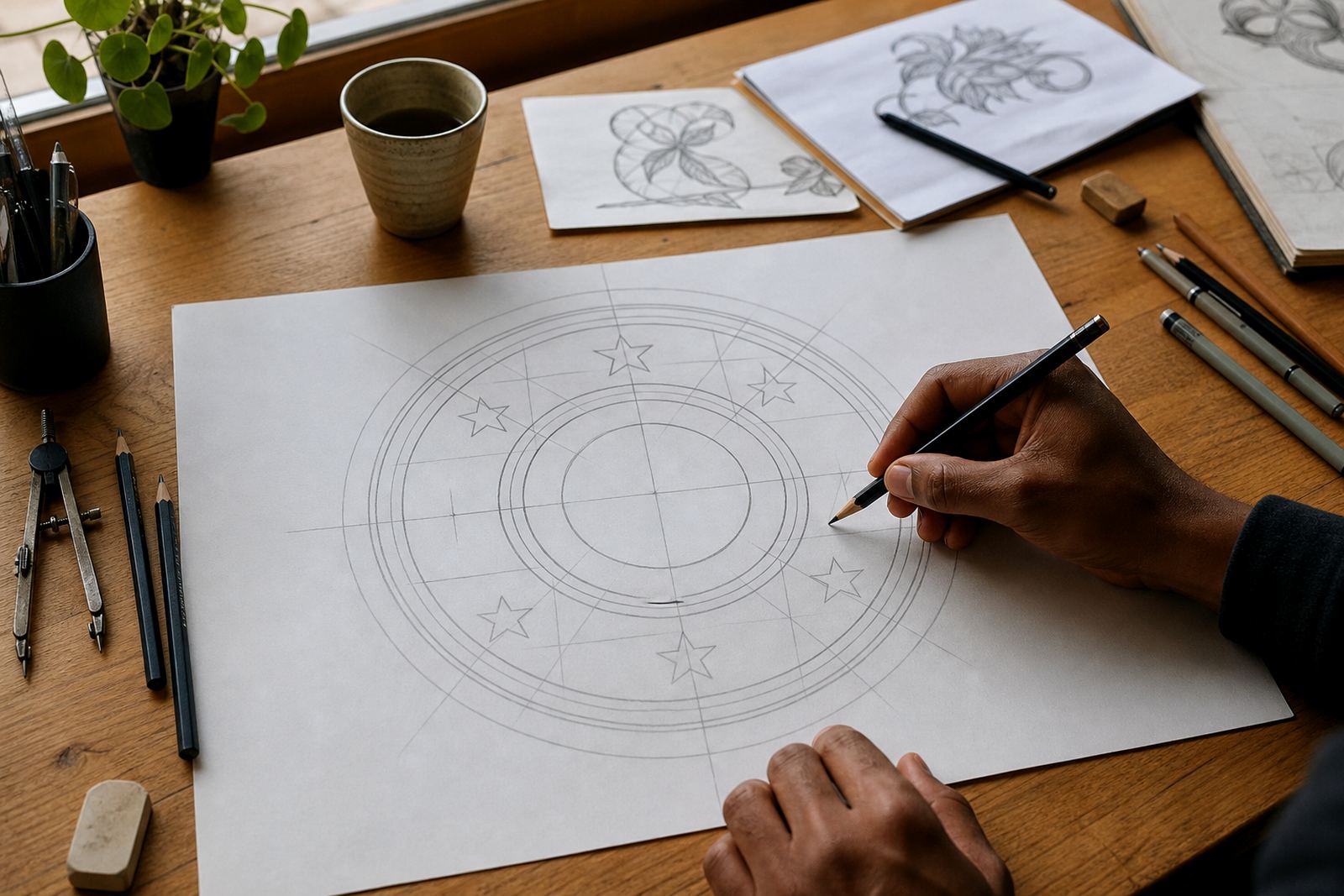
Some signature marks are more than a name. They need a monogram, a small mascot, a badge or a line illustration to support the main mark. In those cases the redraw can be paired with custom brand icons, packaging illustration, menu illustration, map illustration, sticker illustration, pattern illustration, infographic illustration, badge illustration, line illustration, scene illustration or social graphics.
That is useful when the logo must live across a wider brand system. A bakery may want a signature wordmark plus a set of small flourishes for boxes and wrappers. A salon may need a hand drawn icon that sits beside the name on appointment cards and price lists. The artwork still comes from one visual language, so it feels joined up rather than patched together.
For businesses that want a signature mark to hold its character, the goal is simple: keep the hand made feel, clean away the noise and supply files that actually work. That is the difference between a nice picture and a working brand asset, and it matters every time the logo leaves the screen.