Start with the right artwork and usage rights
The first step is simple: send the clearest version of the artwork you have, plus any notes on how it will be used. A crisp PDF or a high resolution image is far better than a small screenshot from a WhatsApp message, especially when the original logo has been resized many times. If the mark is old or damaged, a scan at 300 dpi or more helps, and we can work from printed material if that is all you have.
We only take on artwork that you own or have permission to use. That matters for business names, mascot art, maps, packaging graphics and any illustration that may be registered or licensed. If there is any doubt, settle the rights before the redraw starts, otherwise the file set can not be issued cleanly.
Choose between bitmap tracing and hand redraw
Bitmap tracing is useful when the source artwork is already neat, with clear outlines and solid shapes. The image is traced into vector paths so it can scale up for signage, uniforms, labels and vehicle graphics. It is a practical option for simpler marks or clean line art.
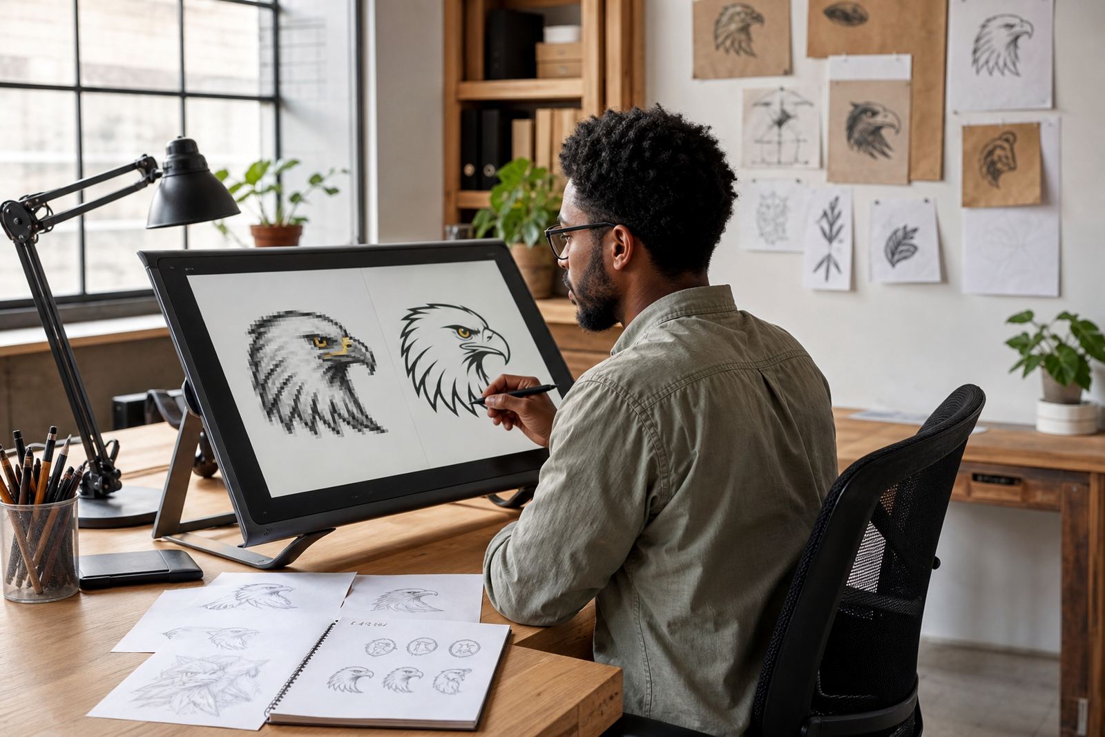
A hand redraw is better when the source is uneven, pixelated or has been stretched over the years. In that case the artist rebuilds the forms manually, checks spacing, and corrects curves so the logo feels balanced again. For detailed mascots, line illustrations or map work, hand redraw often saves time later because it gives you cleaner art to work from.
In short, tracing copies what is there, while a hand redraw improves what is there. Sometimes the best result is a mix of both, with trace work for simple shapes and manual correction where the artwork needs proper attention.
How the redraw is built from rough to refined
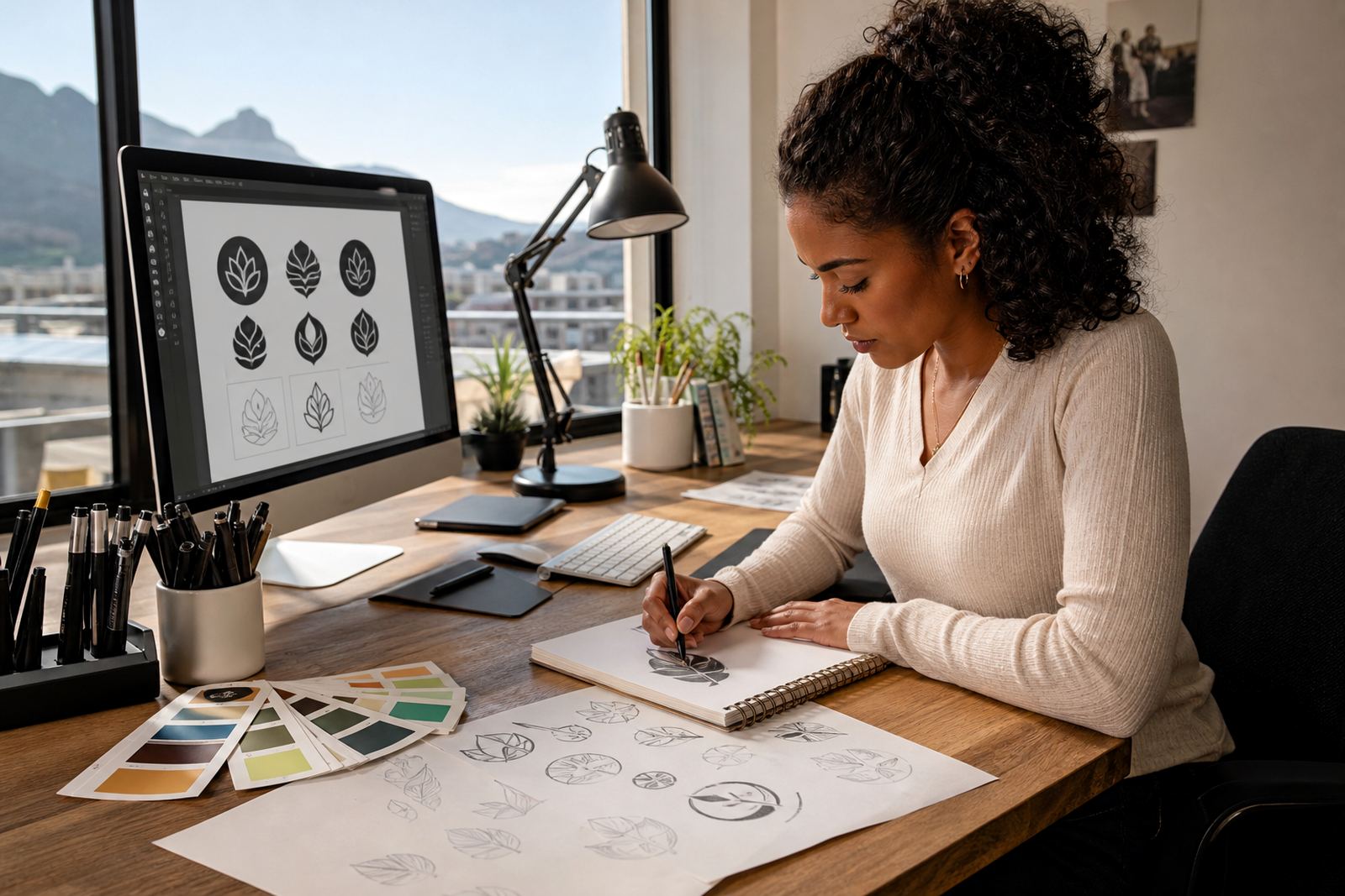
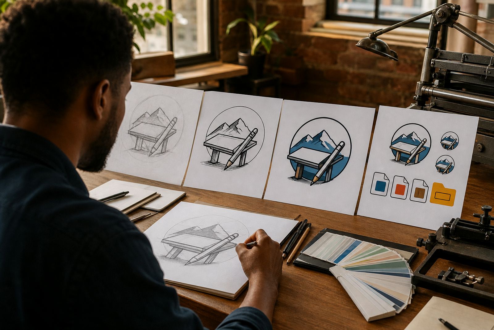
Once the reference is approved, the redraw moves through a few practical stages. The first version is usually a clean outline or structure pass, followed by proportion checks, line weight adjustments and spacing changes. If the artwork includes text, that text is rebuilt as live vector type or carefully converted to outlines where needed for consistent output.
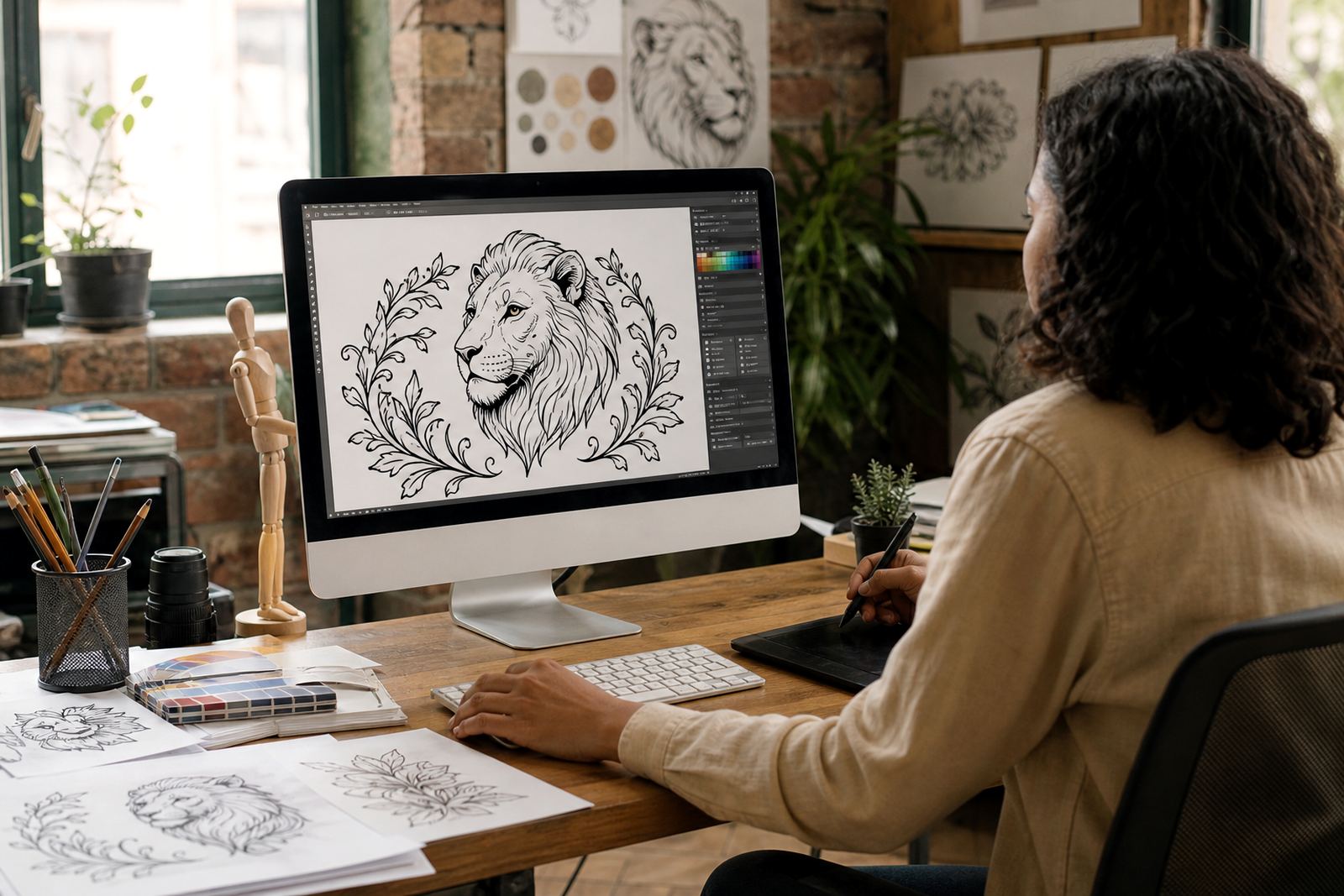
For illustration jobs, the build can include separate layers for outline, fill, shading and small detail changes. This helps when the same artwork needs to be used on different substrates such as vinyl, fabric, paper or corrugated packaging.
- Reference received and checked for clarity
- Artwork rights confirmed by the client
- Trace or redraw method chosen
- Initial vector structure completed
- Details cleaned, spacing adjusted and colours matched
- Final checks done before export
What final vector files you should receive
A proper redraw should leave you with usable files, not just one export. The usual set includes SVG for web and flexible digital use, EPS for print workflows, PDF for sharing and proofing, and AI for editable master storage. If your printer needs a specific format, say so early so the file can be prepared with the right settings.
The final pack should also include the correct colour versions, such as full colour, black, white and single colour if needed. For municipal signage or small label work in towns with strict size limits, a simplified version may be included so the mark stays legible at smaller sizes. The artwork should open cleanly, with no stray points or unwanted bitmap pieces tucked into the file.
Checks before the files are signed off
Before delivery, the artwork is checked for curve quality, alignment, spelling, stroke consistency and colour accuracy. This is the stage where small issues get caught, like a letter that sits too close to the edge or a curve that looks fine at screen size but breaks when enlarged. It is also where a print proof is useful if the logo will sit on packaging or a menu board.
If the redraw includes a mascot, badge, pattern or scene illustration, the final review should confirm that the line work is clean enough for future use across Johannesburg, Durban, Pretoria or Cape Town suppliers. Coastal humidity, dusty workshops and frequent handling can all expose weak file prep, so the finish needs to be neat and practical, not just pretty on screen.
- Zoom in and check corners, joins and curve smoothness
- Test the logo in black and white
- Open the file in the formats you need
- Check spelling on any text elements
- Confirm the artwork still reads at small sizes
How to brief a redraw project properly
A clear brief saves time and avoids extra rounds. Tell us where the artwork will be used, whether it is for signage, packaging, stickers, menus or social graphics, and whether you need a simple logo redraw or a fuller illustration. If you have colour references, old print samples or a brand guide, send those with the enquiry so the direction is easier to follow.
Clients across Cape Town, Stellenbosch, Paarl, Bloemfontein, Port Elizabeth and the rest of South Africa usually get the best results when they specify what must stay the same and what may be improved. If a logo is heritage heavy, the spacing and proportions may need care. If it is for a new product range, the artwork might need to work in one colour first, then expand later. Clear notes at the start make the whole process simpler, hey.