Restaurant artwork that works from pass to pavement
Food businesses usually need one visual system to carry a lot of jobs. A logo may have to sit on a menu header, a cocktail list, a takeaway box, a coffee cup, a staff apron, a window sticker and a social media post, all in the same week. That is where clean vector artwork helps. It scales up for shopfront signage and scales down for loyalty cards without turning blurry or pixelated.
For restaurants, the work often starts with a redraw of an existing logo or a fresh hand-drawn illustration built around the brand’s food style, service style and neighbourhood. A seafood spot in Durban may need a more coastal feel, while a steakhouse in Pretoria may want something more direct and formal. The aim is not decoration for its own sake, it is to make the brand readable at busy service times when customers glance quickly at a menu board or window.
We work from Observatory, Cape Town and support restaurants in Cape Town, Johannesburg, Durban, Pretoria, Bloemfontein, Port Elizabeth, Stellenbosch and Paarl. Coastal humidity, kitchen heat and frequent cleaning also matter. An artwork line that looks fine on screen can fail on laminated menus or printed vinyl if it is too fine, too crowded or too light. Small practical choices save a lot of reprint trouble later.
When bitmap tracing is enough, and when a hand redraw is better
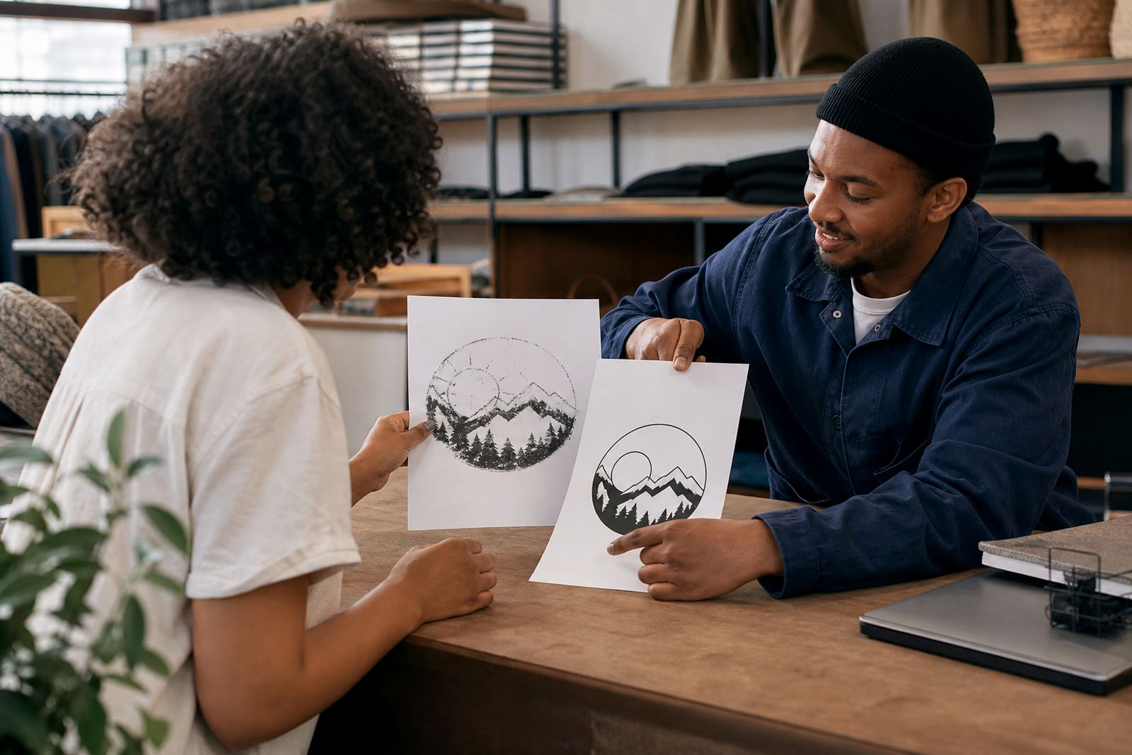
Some restaurant owners send us a logo in a JPEG or PNG and need it prepared for print. In simple cases, bitmap tracing can be enough, especially where the mark is already neat and the shapes are solid. Tracing follows the existing image and turns it into vector paths, which is useful when the source is old or only available as a flat file.
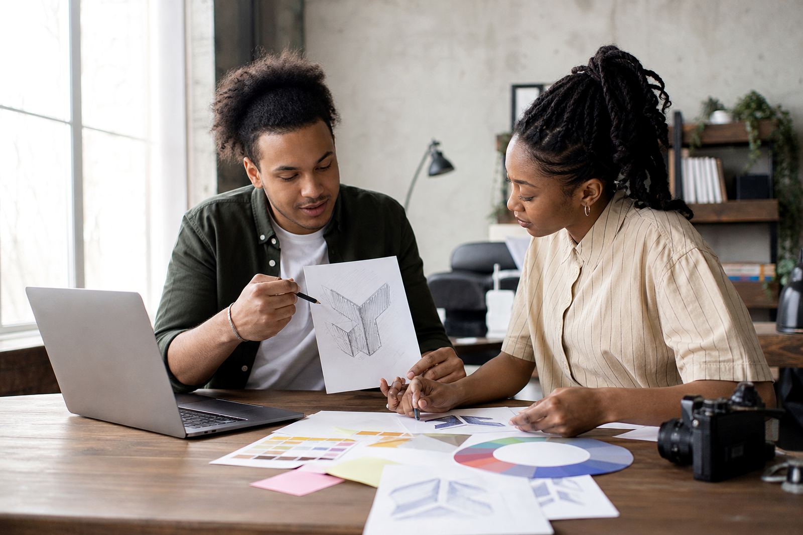
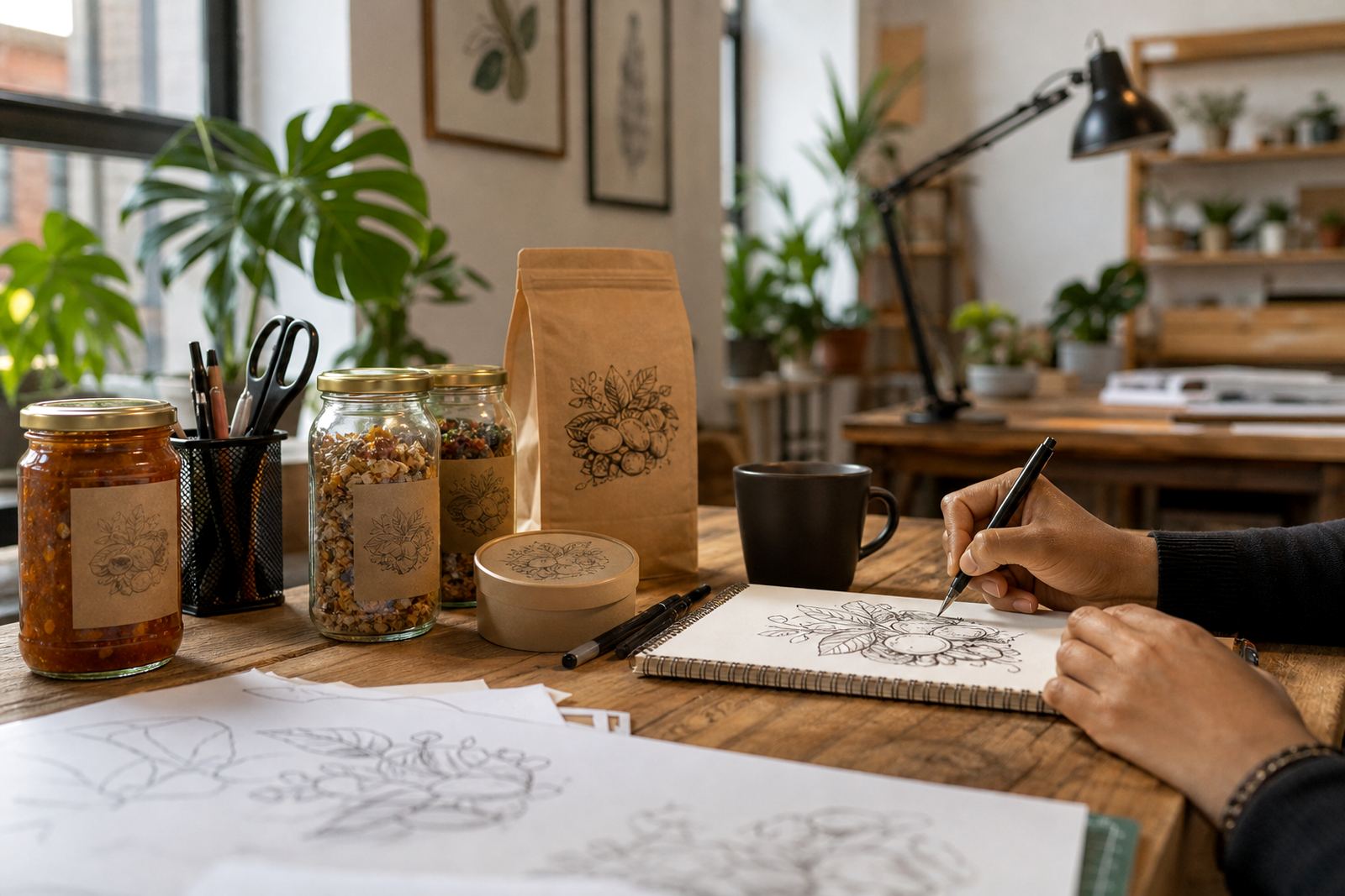
But if the source is low quality, noisy or has been copied too many times, tracing can preserve all the rough edges as well. That is when a hand redraw gives better results. We rebuild the logo by eye, clean the curves, balance the spacing and make sure the artwork holds up on a menu, apron or window cut vinyl. If needed, we can also develop supporting illustrations, such as a chef character, a fish motif, a spice pattern or a badge for a specials board.
Clients must own the artwork they send or have the right to use it. That includes old restaurant logos, supplier artwork and anything taken from a third party. If the rights are not clear, it is better to sort that out before production. It saves time and avoids problems when you later print on packaging or use the artwork across multiple branches.
File formats restaurants actually need
For print and signage, restaurants usually need editable vector formats and usable export files. We prepare artwork in SVG, EPS, PDF and AI, depending on how it will be used. SVG is handy for web and digital menus, EPS is often accepted by printers, PDF is useful for proofs and production handoff, and AI remains practical for working artwork where a designer may need to make later changes.
Good file planning prevents a lot of last minute issues. If a logo will be used on a dark apron, we supply a version that reads clearly in one colour or reversed out. If it will go on window vinyl, we check line thickness and spacing so it does not disappear at a distance. If it will sit on packaging, we keep the layout clean and consider folds, seals and moisture from hot food. In some kitchens the heat near prep areas is no joke, so the artwork has to stay legible under real use.
- Use full colour artwork for menus, social media graphics and printed brochures.
- Use simplified one colour versions for embroidery, embossing and small labels.
- Keep a reversed version ready for dark backgrounds and window film.
- Save print ready PDF files separately from editable master files for easier production control.
Planning the layout for menus, packaging and windows
A restaurant rarely needs only one version of its brand. A single logo may need a stacked version for square spaces, a horizontal version for menu headers and a small icon for favicons or sticker seals. If the brand also uses illustrations, those should be planned as a family, not as random extras. A badge can support a burger menu, while a line illustration can sit quietly on a wine list or dessert insert.
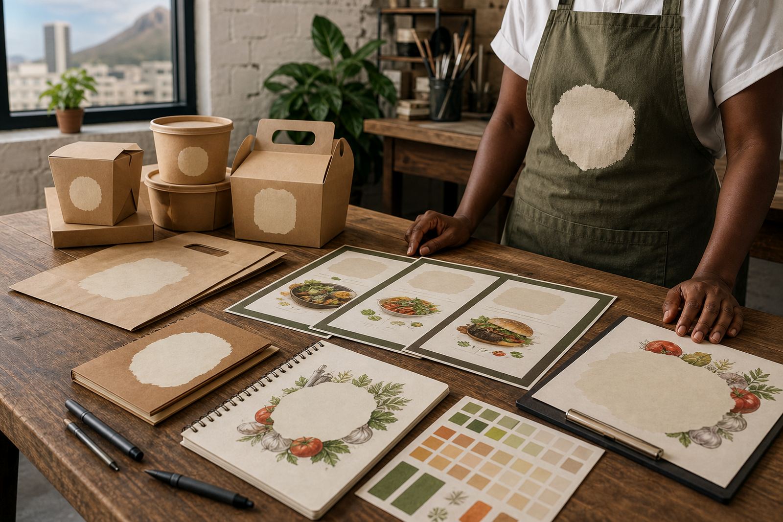
Menu layout is especially important. Too many decorative elements can crowd prices and dishes together, which makes service slower and menus harder to update. A clear hierarchy helps customers find starters, mains and drinks quickly. For takeaway packaging, leave space for nutrition, ingredient notes and statutory details if your operation needs them. For windows, think about viewing distance from the street and the amount of light behind the glass, especially in bright Cape Town or Durban sites.
- Choose one main logo lockup and one simplified version for tight spaces.
- Keep linework bold enough for small print and vinyl cutting.
- Allow margins around the logo so it does not clash with menu text or food photography.
- Match the illustration style to the food type, not just to a trend.
Common mistakes that cost restaurants time and reprints
One common problem is sending a tiny image from a social post and expecting it to become a print file without any rebuilding. Another is using too many colours on packaging that will be printed on kraft board or textured stock, which can push up cost and complicate production. Thin outlines, tiny type and busy detail often disappear once the artwork is pressed onto a cup sleeve or folded carton.
Restaurants also run into trouble when the logo changes from one branch to the next without a clear master version. That can happen when people in different locations use different files, or when a printer crops the file too tightly. It is worth keeping one central set of approved artwork and using that for every branch, whether the site is in Stellenbosch, Paarl, Port Elizabeth or the city centre. Consistency matters when customers see your brand in person, online and on delivery packaging.
If your menu boards, social graphics or kitchen printouts are updated at short notice, you need files that are easy to open and export. Simple naming, clear versions and a clean file structure make the whole process less stressful.
Budget ranges for restaurant logo redraws and illustrations
Budgets depend on how much artwork needs to be rebuilt, how many versions are required and whether the project includes a simple logo redraw or a broader illustration set. A straightforward logo redraw for a small restaurant may sit in the lower budget band, while a full set of menu icons, packaging illustrations and social graphics sits higher because there is more drawing and more file preparation involved. As a general working range, many restaurant projects fall somewhere between R1,500 and R12,000, with larger multi-use packs moving beyond that when the scope is wider.
It helps to separate needs into layers. One layer may be the logo itself, another the menu symbols, another the packaging marks and another the illustrations for campaigns or seasonal specials. That way you can stage the work around cash flow and openings. Startups opening their first site in Cape Town or Johannesburg often begin with the main logo and menu system, then add extra illustration pieces as the business grows. Established groups may need a fuller refresh across several branches, which takes more planning but usually gives a cleaner result.
We price on scope rather than guesswork. The enquiry form on our contact page is the best way to send through your current logo, a quick note about where it will be used and any print sizes you already know. From there, we can advise whether a trace, a hand redraw or a new illustration direction is the better fit.